How to Benefit from Color Psychology in Your Website Design
Even without researching the topic of color psychology, you probably already know that certain colors can spark different emotions and meanings.
Your favorite colors are often underlying factors behind the way you decorate your house, the clothes you wear, the car you drive, and even the food that you’re most drawn to.
Color choice is significant in branding, marketing, and web design, too. In fact, color can be up to 85% of the reason people decide to buy from a company. Color can build or demolish brand trust, increase or destroy customer loyalty, and form 90% of a customer’s opinion of a brand... all within just 90 seconds.
So when you set out to commission either your first website or a redesign of an outdated one, it should be no surprise that your web designer will quickly ask about your preferences regarding website color.
Before you blurt out an answer based on your personal favorites, read through our tips for making smart web design decisions based on the psychology of color.
Step 1: Consider the meanings associated with each color.
To a certain extent, you may already understand the meanings associated with common colors. You may be drawn to the color blue when you need to calm down, while something about the color orange may not seem appropriate for formal business documents.
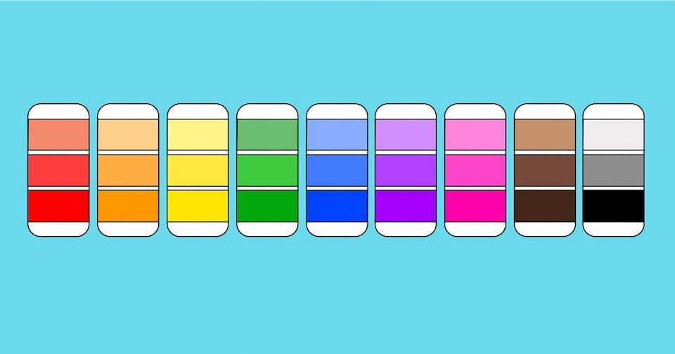
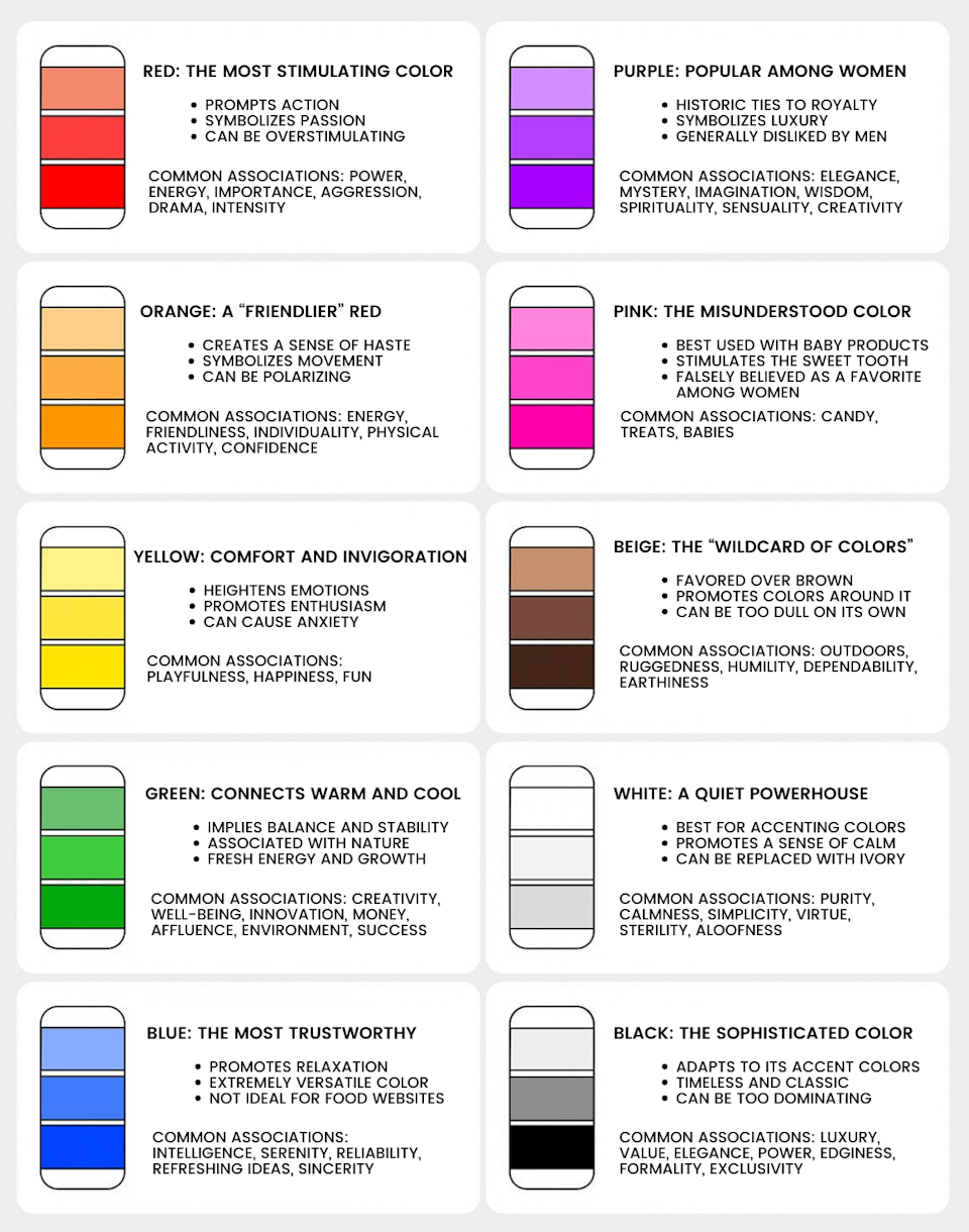
Some of these characteristics can explain why certain colors are more popular in particular industries. For example, blue is a color often used by banks, while red is highly recommended for brands involving dating services. Meanwhile, a customer who visits a bright yellow website to read articles about relaxation and deep breathing may feel that something isn’t right — even if they can’t explain why.
Consider these common meanings associated with certain colors. Which ones could you already sense? Which surprised you?
Blue
Blue naturally suppresses appetite, so using it on a food-based website may be off-putting to visitors. Many people suspect that the reason for this is that there aren’t many everyday foods that are blue. But outside of the food world, blue is one of the most popular colors with both men and women. Because so many people naturally gravitate toward it, businesses often choose this color when they want to reassure or inspire trust.
Yellow
Yellow is fun and playful, but you have to remember that it’s also used for warning signs. It’s an energetic color that heightens emotion, which builds excitement for your website visitors when used in small doses but quickly becomes abrasive and overwhelming in larger amounts. As an accent color, yellow can be the perfect solution for calling attention to a specific call to action.
Green
Green has such strong associations with nature and being environmentally friendly that the color alone can send a message that a company is ethical. Also, green is becoming more and more popular since it offers both the relaxing qualities of blue and the energizing effects of yellow. Other common associations include money and growth, making this an increasingly popular choice across a variety of industries.
Orange
Orange is the new black the new red, but it’s a tricky color to work with. Although it’s a favorite among kids, most adults either love it or hate it. So incorporating it into your website that’s targeted at adult buyers should be done strategically. Orange is strongly associated with energy, excitement, enthusiasm, and warmth, so for certain businesses, this color can play a key role in establishing your brand’s personality and getting site visitors to take action.
White
If you’ve ever heard the term “white space,” you may have some idea of how important the color white is in web design. White conveys a sense of freedom, which allows your site visitors the visual breathing room needed to absorb the information you present.
But white comes with a pretty important drawback, too: It can be difficult on the eyes when true white (#ffffff) is paired with true black (#000000), and can be seen as cold, stark, or off-putting. A thoughtful solution is to use an off-white like ivory, which offers the same benefits as white but has a slightly warmer tone that is more comforting.
Black
Black is certainly one of the most commonly used colors, but be careful with it, as it has many conflicting associations. For example, it’s edgy, but it’s also corporate; formal, but also traditional. When used sparingly, black can lend a grounding effect, but can easily dominate your entire design when used too liberally.
The good news is that both black and white have many, many tones between them, so using darker shades and lighter tints can offer the same advantages with fewer drawbacks.
Red
Red evokes strong emotions, perhaps because it’s one of the most visible colors in the spectrum. Red is typically associated with love, passion, and drama, but can also signify power, aggression, or even anger. As such, it’s recommended in small doses.
Since it so strongly promotes action, many web designers argue that it’s the best option for buttons and other calls to action. Research doesn’t necessarily support this claim, so don’t feel it’s your only option — we talked in depth about our approach to compelling calls to action in a previous blog post.
Purple
Like orange, purple can be polarizing — it will likely draw in female customers but immediately repel male customers. Purple combines the power of red with the stability of blue, which contributes to its sense of regal luxury. Purple can also signify mystery, creativity, or wisdom. It certainly isn’t recommended for all industries, but for a select few, it can be the perfect choice.
Pink
Pink has strong associations with gender and is often used to symbolize femininity and softness. In lighter hues it can seem delicate and fragile, like a flower, while in more intense shades, it can seem euphoric or boisterous. Like red, pink signifies love, but it’s a gentler, more intimate type of love than the burning passion we associate with red. This softness lends itself well to baby products, as well as confectionery.
Brown
Brown is the least popular color for web design. Both men and women dislike it, and it can be difficult to pair it well with other colors. Its positive connotations are dependability and ruggedness, but it takes a keen eye for design to keep it from looking bland and dark.
A modern alternative to both pink and brown that has become increasingly popular over the past few years is blush, a very specific tone of nude pink that verges on beige. Businesses that cater to women, especially women in their 20s and 30s, often use blush in place of tan or beige as a neutral with more feminine undertones.
Step 2: Consider which colors are recommended for your industry
While your business’ goal is likely not to completely blend in with your competition, there are certain colors that just work well with particular industries (and other colors that can send your users running away).
Common colors across industries include:
Blue: Medicine, science, utilities, government, healthcare, recruitment, legal, information technology, dental, corporate
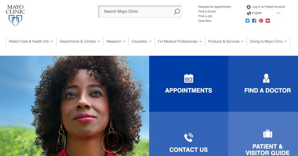
Mayo Clinic relies on a blue website to build trust with their patients.
Green: Medicine, science, government, recruitment, ecological business, tourism, human resources, finance
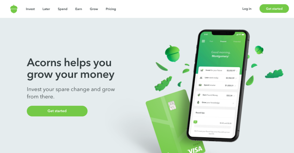
Investment app Acorns uses green to signal account growth.
Black: construction, corporate, oil, finance, fashion, manufacturing, cosmetics, mining, marketing, tradesmen

We designed a black website for experiential marketing agency BTWN Exhibits.
Grey: automotive, journalism, sportswear, technology
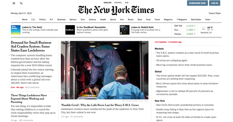
The New York Times uses gray for their website’s buttons and text.
Red: fashion, makeup, food, dating, video games, retail, automotive, hardware, video streaming
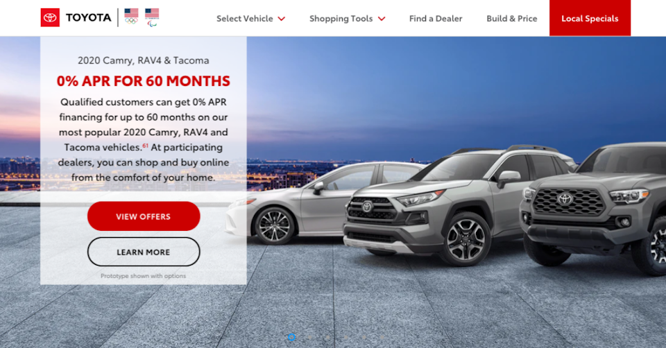
Toyota’s red website accents associate its vehicles with power and passion.
Orange: drinks, retail, fitness
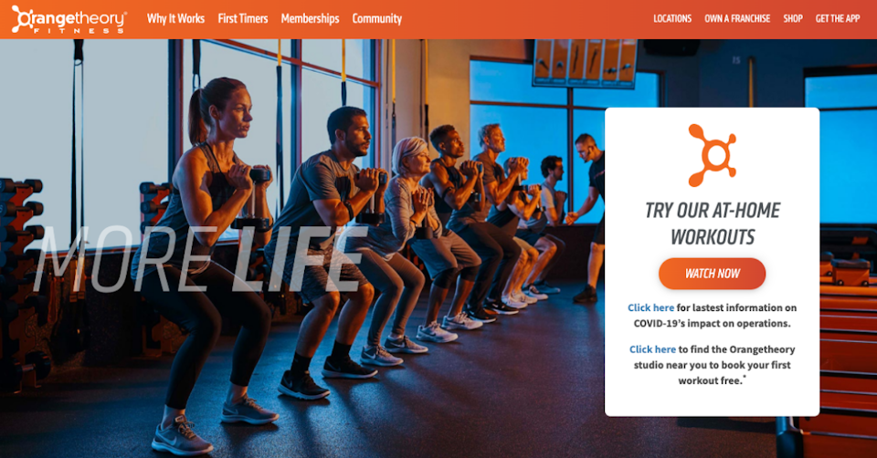
Orangetheory’s website capitalizes on the energy found in its signature color.
Yellow: automotive, retail, food, technology, construction

We incorporated the bright yellow of Helicopter Express’s choppers into their website design.
Pink: Medical (pediatrics, OB/GYN), food, cosmetics, retail
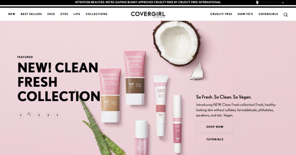
Covergirl embraces delicate femininity with a light pink website.
While these trends shouldn’t restrict you as you choose the colors for your website, they are trends for a reason. Chances are, your company’s overall message is pretty similar to that of your closest competition, so choosing a color that’s a complete curveball for your industry could hurt (by sending the wrong message to customers) more than help (by making your brand stand out from your competitors).
But sometimes, straying from the industry norm pays off. Thinx, a company that makes period underwear, opted for a blush color scheme for their website rather than the hot fuchsias and magentas typical of most feminine care brands.
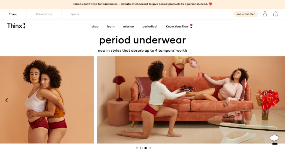
Thinx’s blush color scheme echoes the brand’s message of inclusivity.
That’s because Thinx’s audience isn’t just women — it’s “people with periods,” regardless of gender identity. And while blush is technically still in the pink family, it’s a warm, neutral tone that echoes the gender-neutrality of Thinx’s product and tells site visitors they belong there, even if they don’t identify as women. And because it verges on brown, it subtly reminds them that the products are also earth-conscious.
A truer, sweeter pink would have been in line with industry standards but could have alienated a large section of Thinx’s potential audience. Think carefully about what sets your company apart from everyone else in your industry, and consider how you can use color to help convey that unique approach.
Step 3: Consider your target customer and their preferences
Step one also included a bit of information about color preferences across genders, but did you know that there have been pretty in-depth studies conducted on this very topic? It’s more than just “women like purple and men don’t.” There’s actually a ton of interesting information about gender and color preferences:
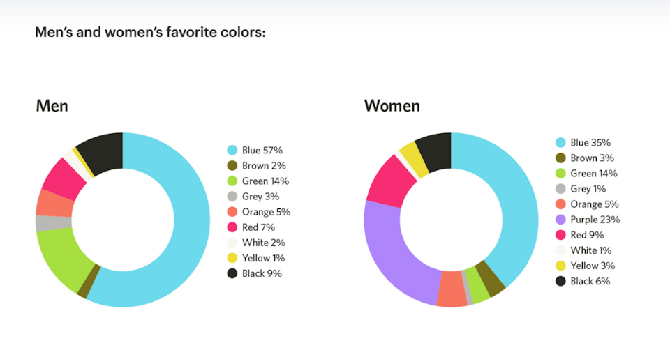
The world’s favorite color is blue (with 57% of men and 35% of women saying it’s their favorite color).
Men’s favorite colors are blue (57%), green (14%), black (9%), and red (7%). Fewer than 5% of men said that orange, yellow, brown, grey, or white was their favorite color, and 0% of men said purple was their favorite color.
Women’s favorite colors are blue (35%), purple (23%), green (14%), red (9%), and black (6%). Fewer than 5% of women said that orange, yellow, brown, grey, or white was their favorite color.
Across both genders, orange and brown are the least favorite colors, with 22% of men and 33% of women disliking orange and 27% of men and 20% of women disliking brown.
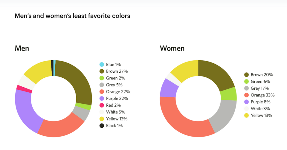
Overall, men prefer bright colors and women prefer softer colors.
But your target demographic can be defined by much more than gender. There are also color psychology-related statistics regarding age, class, education, and even climate. Check out these interesting facts:
- Young children prefer brighter colors of red, yellow, blue, orange, green, and purple. They also prefer solid blocks of colors over patterns.
- Teenagers often prefer black and are open to more graphics and sophisticated colors than their younger counterparts.
- In general, most adults prefer subdued colors and their color preferences are set in stone.
- Adults older than 65 tend to dislike yellow and prefer blue, pink, and green. They tend to prefer calmer hues over bright, stimulating ones, and purple becomes even more popular among women the older they become.
- People in the working class tend to prefer bright variations of the primary and secondary colors. Meanwhile, wealthier people tend to prefer more complex colors, often preferring tertiary colors with a variety of shades.
- The more educated an individual is, the more sophisticated their color choices usually are. Well-educated people tend to prefer tertiary colors, while less educated people tend to prefer primary and secondary colors.
- People tend to prefer colors that duplicate the colors relating to their climate. People from tropical climates respond best to bright, warm colors, while people from colder climates prefer more subdued colors.
- In Western cultures, white symbolizes purity and cleanliness, so is often used in weddings and hospitals. But in Eastern cultures, white symbolizes death and sadness and is often used in funeral rituals.
Now you can combine your personal color preferences, the emotional meaning associated with colors, the common colors used in your industry, and the preferences of your target demographic to build a rather complex profile. This can be good news for those of you who were reluctant to blend in with your competitors — even if you’re in the same general industry, the specific demographics of your target market can lead to some differentiation between your companies.
Step 4: Remember that what matters more than the colors you choose is how you combine them.
At the end of the day, two websites that use blue and white as their main colors can look and function completely differently. Color psychology involves more than just picking that one color you want to use to represent your brand — it involves factors like color schemes, white space, and strategic placement of particular colors, providing a wide spectrum of variety even with the same key color.
Many web designers recommend that each website has at least a background color, a base color, and an accent color. Many also recommend what’s called the 60-30-10 rule, where you choose three colors and use one 60% of the time (as the dominant), another 30% of the time (as a secondary), and the third 10% of the time (the accent).
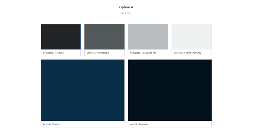
Here at Trajectory, we typically only use one accent color. This makes our designs visually cleaner, which keeps visitors’ focus where we really want it: on your strategically placed calls to action.
Speaking of calls to action, the way you combine colors can affect how visitors behave on your site. Bright colors such as orange, green, and red typically get the most clicks, but depending on your website’s color scheme, a different color may offer better contrast — a crucial element in getting users’ attention.
If you think back to elementary school and the color wheel, you may remember that you can evoke all sorts of different feelings by pairing different colors (if you don’t remember, check out Adobe’s free color wheel palette generator for a quick refresher). Before you know it, you have nearly endless color scheme possibilities even after you choose your base.
Then when we add in components like the amount of white space and the tints, hues, shades, and shadows, suddenly, one website using red, white, and black looks completely different from another with the same color scheme. And that’s before we even start talking about the layout of the site!
Final Thoughts
It’s clear that there’s more to color psychology than simply gravitating to the colors you personally like. Even just using color psychology to better understand your target customers can be beneficial as you continue to market to them.
If you’re feeling overwhelmed by all the options available, remember a few key points:
First, remember, that color perception is subjective. While there are broader messaging patterns in the way people perceive color, so much of it is dependent on personal experiences. Just because the statistics point to one set of colors for your target market doesn’t mean that’s the fool-proof choice.
And if you already have a logo with a set of colors you want to stick to, there are still steps you can take to use color psychology to your advantage without entirely reworking your brand. Simply adding different calls to action and varying the amount of white space on your website can make a huge difference.
Finally, it doesn’t all boil down to the specific colors you choose. While colors do have different meanings and certain demographics have their preferences, the most important factor is how a user perceives the color as relating to your brand. Your color choice may evoke emotions that seem completely unrelated to your brand, which can be just as off-putting to customers as their least favorite colors.
And, of course, there is always room for following your gut — even in business. If all the research tells you to choose a color that really feels wrong for your brand, listen to your instinct. You may be surprised by how perceptive your customers can be, and when you choose colors, branding, and strategies that you can stand by, your customers will be able to tell.
Still have questions about your website’s color scheme? Reach out to us and let us know what you’re struggling with.
Ready for a stellar new website?
We’re ready for takeoff! Tell us a little about your business and we’ll reach out to get your project underway.