Want a Better Website? 20 Steps You Can Take Right Now
Whether your website has high bounce rates, it doesn’t lead to a lot of sales, or you simply dislike the way it looks, you’ve found yourself wishing your website were just a bit better. Maybe you’re not yet ready for a full website redesign, but you want to be able to make improvements in the meantime.
The good news is that there are several small steps you can take to dramatically improve the look, feel, and functionality of your website. Some of them require more technical knowledge, but many of them can be knocked out on your own so long as you have access to edit your website. We’ll walk you through the steps and empower you to make changes on your own that will help, inform, and delight your site’s visitors.
Provide a consistent experience by considering the bigger picture
1. Figure out your site’s main goal
This is always one of the first questions we ask our clients, and it’s one of the first questions you should ask yourself when improving your website: “What main thing does the site need to accomplish?” This goal could be more abstract, like increasing brand awareness and modernizing your web presence, or it could be quantitative, like driving more inbound leads and increasing sales through the website. Whatever it may be, determine the main goal (and even a secondary goal) you want your website to accomplish.
2. Make sure every page actively support this goal
As you make updates to the site, consider this main goal and ensure that everything you do supports it. If brand awareness is your target, ask yourself whether or not each page provides a consistent brand experience for the user. If you’re trying to increase sales, what can you do so that your product, about, and contact pages help drive users to become customers? Ask these questions at each stage and with every change. This will help you cut through the clutter and keep you focused on that one important goal your website needs to accomplish.
Improve user experience by re-prioritizing your site structure
We just wrote about how your site structure should strategically highlight your product from several different angles, address users’ search intent, and make it easy for visitors to understand your business.
Creating your website’s site structure is one of the most important steps of developing your website. When we work with clients on redesigning their website, the importance of site structure has often been neglected by their previous web designers.
A structure that’s too complicated confuses users and crowds your site’s navigation, while one that’s too simple can leave your users wanting more information and leaving your site when they don’t find it. Capture their attention, make browsing simple, and clean up your navigation:
3. Audit your site structure to reorganize pages
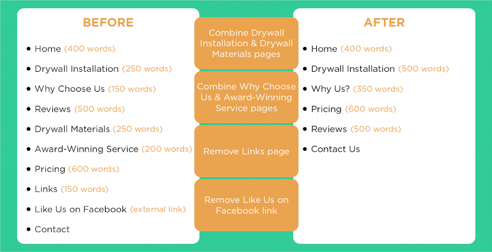
One great exercise you can do is to create a bullet list of the pages in your website’s navigation and include their word count. If you have several pages with fewer than 500 words, there’s a chance that some pages could be combined to provide more cohesive information. Or maybe you just have two pages with 1,000+ words each, signaling that the topic could be narrowed down for each page. If you have links in the navigation that send users away from your site, you can almost always remove them. You can also remove pages that exist for the sole purpose of linking to other websites. Here’s an example of how this exercise can help you find a balance between having enough pages and having enough words on each page — all without writing a single word of new content:
4. Consider adding an About page
As you restructure your site and consider your site’s main goal, you may realize that key pages are missing. One highly recommended page for many websites is an About or History page. Whether your company has been around for 30 years or 3, users like to know about its background and will often visit this page first after looking through your homepage. Your About page can cover topics like your mission, your company philosophy, your community involvement, and even your team members. An About page should answer what your company does and why it does it. Plus, adding information about your staff (and headshots, if they’re comfortable with it) builds a ton of rapport with the user, establishes credibility, and makes visitors more likely to trust your brand.
Decrease bounce rates by shortening page load time
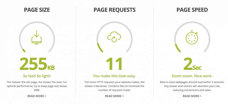
47% of consumers expect a web page to load in 2 seconds or less. If a website takes more than 3 seconds to load, 40% of people will abandon the website, and even a 2-second delay when using a website can result in bounce rates as high as 87%.
If your website is consistently experiencing bounce rates well into the 80%+ range, slow page speeds could be the culprit. One quick way to measure your site’s loading times is to head to HubSpot’s free website grader tool. Plug in your website’s URL and the tool will evaluate factors like page size, browser caching, SEO performance, and — of course — page speed.
Looking to speed things up for your users?
5. Remove Flash elements from your site
Using Flash on your site restricts basic usability for your visitors, like highlighting contact information, navigating between pages, and bookmarking your website. Not only that, but Flash elements are nearly invisible to search engines (so forget about a boost in rankings) and many users now disable Flash altogether (so they’ll see errors in place of the content). Without Flash, your site will be more functional, visual elements will stay intact, and page speeds will increase.
6. Cut complicated elements like music, extra large images, and splash pages
While some of these elements can make your site stand out, users won’t be interested in them if they’re slowing down your website’s loading time. Even videos can slow down site performance if not handled professionally. If you’re comfortable using just a bit of code, this article provides a step-by-step tutorial for making videos load after the page loads, which will increase the speed and provide little interruption for the user.
7. Check file sizes, HTTP requests, and code quality
Oftentimes, you can’t even see the things that are slowing down your website. Common culprits of slow loading include too-large file sizes, too many uncompressed files, too many page elements (resulting in too many HTTP requests), and messy JavaScript and CSS coding. If your site is hosted through WordPress, use the tips in this article to identify and address elements that are slowing down page speeds. You could even consider hiring a freelance developer for a few hours of their time so they can conduct an audit of these factors.
Increase conversion rates by making it easy for users to contact you
A visitor to your site could be completely entranced by your content and design and still never reach out to you. Why? It may not be obvious to the user what their next step should be. In many aspects of web design and development, users are looking to move quickly. They want pages that load quickly, information that answers their questions quickly, and links and buttons that move them around a site quickly.
Keep in mind that you have 8 seconds to keep your website visitor’s attention. In that short amount of time, users will form their first impression of your brand and decide whether or not to stay on your site. If your goal is to encourage users to contact you or sign up for your services, you have such a small window of time to make that happen.
Make it as easy as possible for them:
8. Include your key call to action above the fold
The fold is the part of your website users see without scrolling down the page. If you want to encourage them to become customers, make it very clear how they can take that step. Whether that’s including your phone number or offering a link to sign up, your users will appreciate how quickly they can move forward through the sales pipeline. Notice how Help Scout illustrates this principle by offering both a “log in” and “sign up” link right at the top of the page:
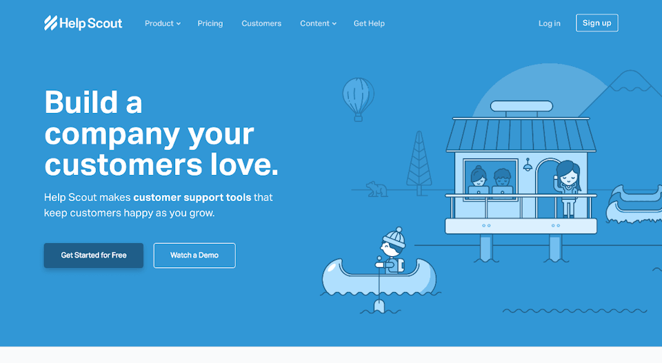
Help Scout makes it very clear what users are supposed to do next
9. Include clear calls to action on each page.
When we create websites for our clients, we always include some sort of CTA on each page. One of our clients asked, “Is that really necessary?” The short answer is “Yes, absolutely.” One key reason for this is that you never know which page your users will visit first. Especially if your site has great SEO, visitors could land on any page and be compelled to work with you. If there isn’t a clear call to action moving them forward, your bounce rates can skyrocket and — more importantly — you can miss out on customers who were initially excited about what you have to offer. Want to offer a CTA on each page without being repetitive? Try a) Including different headings and content for each page’s CTA and b) Tailoring the CTA to where you predict users of that page are in the buying cycle.
10. Add your business hours, address, and social links to your footer
When users do go out of their way to search for contact information, they typically scroll to the footer and expect to find everything they need there. Use your footer to provide whatever they’re looking for by including your address, phone number, email, social media links, and, if applicable, your business hours.
Captivate your audience by improving the content
The sad truth of website content is that most people don’t read it. People are inherently visual, so they will almost always choose to look at photos, videos, and other visuals over reading paragraphs of content. Does that mean content doesn’t matter? Absolutely not.
Even if most people won’t read every single word, some people will. And many people will read a sentence here and a sentence there. Content helps define your brand, and websites with easy-to-read, personable content throughout will leave a stronger impression. Content also plays a huge role in your SEO, and it can be one of your website’s greatest sales tools.
Give your content the love it deserves:
11. Check for typos and remove keyword stuffing.
Bad grammar sends away users and can even harm your SEO. Thankfully, you can improve the quality of your site’s content without an in-house writer. First, head to Grammarly to pop in your content and receive instant feedback on its quality. Grammarly isn’t perfect (most often misunderstanding the purpose of your commas), but it will definitely catch glaring typos and other grammatical hangups. Second, if you or a previous content writer focused on keywords rather than high-quality writing, give the content a good sweep for unnatural keywords. Every time a keyword phrase makes you stumble through the message of a sentence, remove it. I can’t say it enough: Keyword stuffing is outdated SEO, it turns off users, and it will harm your rankings in search as Google gets better at penalizing it. Focus on writing natural content, including target keywords when they naturally fit in the sentence, and including strategic keywords in your URLs and H1 headings — not artificially stuffing them into the content.
12. Add testimonials/consider adding a Reviews page.
Here’s a surprising fact: Your best marketing material is written by other people. Even with the most well-written content, users are still wary to trust your claims. Meanwhile, 88% of consumers trust online reviews as much as personal recommendations. If your business has reviews hiding all over Yelp, Google, and industry-specific review sites, use those reviews to your advantage by including them on your website. If you have many reviews, you may even want to add a Reviews or Testimonials page. You won’t get dinged for duplicate content and you’ll establish a great level of trust with your users. Check out how Heroku uses testimonials as sales material on their homepage and how Jazz offers a full page dedicated to customer success stories:
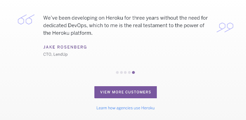
Heroku uses testimonials as a sales tool on their website
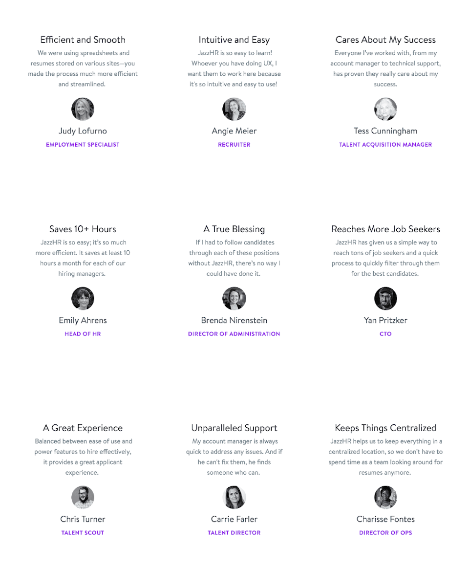
Jazz takes reviews a step further by creating a full page about them
13. Break up content length with shorter paragraphs and lists
Take your existing site content and focus on breaking it up into easier-to-read snippets. Things like paragraph breaks and bulleted lists help users scan and digest content more easily. It also naturally provides more white space, making the page more visually appealing and less overwhelming. When presenting similar ideas listed one after another, try forming them into bulleted and numbered lists (like this post, for example). Reformat the content so that most paragraphs are roughly 5-10 lines long. You may be surprised at how this one simple step makes your content so much more presentable.
14. Use your headings to improve SEO and guide the user
H1 tags (or the title of the page) are one of the most important elements Google looks at when scanning your page’s content. H2 and H3 tags (and H4 through H6, though used much less often) signal to Google that this content is more important than the streams of paragraphs that follow. Headings also help users quickly find information. The best headings are catchy and descriptive, and they often include one (one!) keyword phrase in them. Including your target keyword phrase in your H1 will also do more for your SEO than stuffing keywords throughout the page’s content. Here’s a great beginner’s guide to headings for further reading.
Leave a strong first impression by improving the design
15. Embrace white space and use it to your advantage.
This is probably one of the most common tips web designers have for cleaning up outdated websites — and for good reason, too. Not only does white space look more polished and professional, it’s scientifically proven to be much less overwhelming for the user. One e-commerce company made three changes to their design, one of which was using more white space. Their conversion rate increased by 13.6%, their bounce rate lowered by 23.2%, and the visit duration increased by 44.6%. White space also does wonders to draw the user’s eyes to a specific place on the page. That’s why you’ll almost always see a light, neutral background on Apple’s product pages:

Apple’s smart use of white space makes their products the main highlight
16. Match your company branding throughout the site
Your website has the potential to be one of your greatest marketing pieces. And, like any marketing material, it needs to be consistent with your branding. When most people think of branding, they think of logos. But logos are just one piece of the branding puzzle. It includes colors, overall style, typography/fonts, and the messaging you send with your content. Anytime someone comes in contact with your brand, whether it’s with a flyer, on social media, with a business card, or on your website, they should experience consistency. Not only does consistent branding make your company more memorable, it also helps customers trust you and be more likely to purchase from you. In fact, email marketers constantly struggle to get more than 20% of recipients to open their emails. Meanwhile, 64% of people will open an email simply because they trust the brand.
17. Have your logo professionally designed
We’ve been in the process of redesigning the Trajectory logo, and we’ve been in this process for a few months now. Why? Because, while logos aren’t the only part of branding, they are an extremely important part of it. They are often the first thing a user notices about your brand, and they can even pique people’s curiosity and make them want to learn more about the company. Consider your current logo and what it says about your brand. Even if you don’t want to change it, could the styling use some updating? Brands like Facebook have kept the same general message but continue to update the logo as time goes by. Whether your current web design team will knock out a logo redesign for you or you need to hire a logo designer to do a complete overhaul, take some time to make sure your logo gives the best possible first impression for your company.
18. Differentiate hyperlinks from regular text
One of the easiest, yet underrated, tweaks you can make to your design is to ensure that your hyperlinks stand out from other text on a web page. Every link on your website serves as a call to action, whether you’re linking to another page on your site or you’re sending users to another website for more information. If users can’t easily see hyperlinks, and if they can’t tell them apart from the text that surrounds them, you can confuse and frustrate them. Eliminate the negative feelings by clearly distinguishing between regular content and links. Plus, you don’t have to overthink it. When in doubt, simply underline link text and make it dark blue — it’s simple and users are accustomed to it.
Avoid search engine drops with two SEO audits
19. Check your site’s mobile experience
Responsive web design. You’ve heard the term before. While responsive web design is the future and is slated to soon impact SEO, it’s clear right now that sites that don’t function well on mobile can see a ding in their search engine rankings. Not sure how your website stacks up? You can use Google’s mobile-friendly test to see how your site looks on a mobile device. Want to know if your site is responsive? Simply head to your site and manually resize the window. If the design is fluid, meaning that it looks great at every size, it’s responsive. What do you do if your site doesn’t look good on mobile? If you’re using a templated CMS like WordPress, consider switching to a template with a mobile-friendly design. You can also improve the mobile experience by increasing font size and padding, making forms short enough to fit on a phone screen, and simplifying your navigation menu. We strongly encourage choosing responsive design when you get your website redesigned, but taking the steps above will at least help you retain mobile visitors and potentially avoid a drop in search rankings.
20. Catch and fix your 404 pages
One of the fastest
ways to make your bounce rates skyrocket is to leave 404 pages in their
current state. When a user navigates to a broken or nonexistent page on
your website (most often through an outdated or mistyped link), they
will see a 404 error. Use Screaming Frog
to input your website’s URL, view a list of all links on your website,
and catch broken or missing pages/links. For 404s, determine which page
the link is meant to direct to and set up a redirect. Or, consider
designing a unique 404 page that still produces an error but can help
guide users to where they need to go (rather than backing out of your
site).
Small steps can add up to make a big impact
If you’ve taken the time to accomplish these steps — or even if you’ve just looked into the ones that most apply to your website — you’ve taken great leaps to make browsing easier, improve the look and feel of your website, and convert users from leads to customers.
Ready for a stellar new website?
We’re ready for takeoff! Tell us a little about your business and we’ll reach out to get your project underway.