Imagine a subway system. New York’s subway system, for example, has many routes that snake their way through the city’s five boroughs, reaching most of the city’s population. The subway is somewhat well planned, labeled, and predictable.
Its designers have used colors, numbers and letters to help differentiate between routes, which are displayed prominently on the side of cars to help riders make connections. Subway maps, just the same, show the various routes with corresponding colors and nomenclature, and they’re displayed in stations alongside labeled signs above subway platforms.
Architecture—the subway’s logical and physical planning—and interface—visual cues and guidance—work together to help New Yorkers make decisions and plan routes.
As a metaphor, this is the job of website navigation design. Site navigation—both how your site is structured and how it communicates that structure to your audience—plays a central role in our experiences on the internet.
Designed strategically, effective navigation provides users access to information in a way that enhances their understanding, reflects your brand, and lends credibility to your business.
This is why we’ve chosen to tackle website navigation design from A to Z. If you’ve organized your site’s content in a meaningful, logical way, you’ve built a solid infrastructure to support active users. But well-designed navigation goes a step further. Your navigation interface—like a main navigation bar or dropdown menu—must be carefully planned to guide users through the complexities of your site.
Getting this right means creating a website that’s easy to understand, effective in its communication, and ultimately successful in transforming site visitors into customers.
How do you define “navigation” on a website?
When imagining website navigation design, it’s easy to focus on prominent and common visual features, like a website navigation bar. But taken more broadly, website navigation represents a lot more.
Generally, the navigation structure of your website creates an integrated system of information that helps users understand your website and locate information.
Take, for example, the homepage of the New York Times’ desktop site.
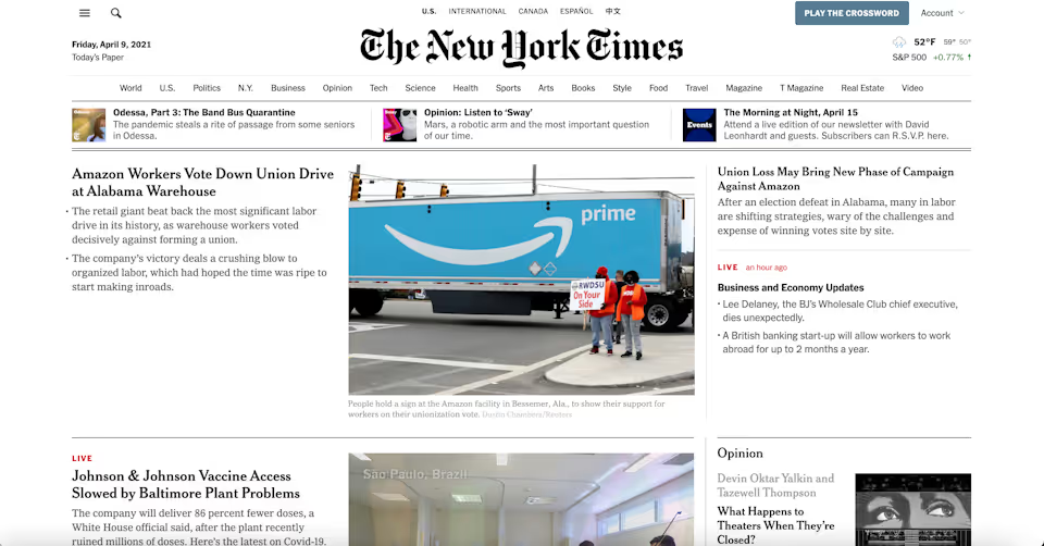
The desktop homepage of the New York Times utilizes several systems of navigation simultaneously.
The New York Times’ homepage features a ton of information, from headlines and article summaries, to breaking news, recent or notable podcast episodes, and the weather. Yet, carefully designed, the homepage engages several systems of navigation to seamlessly provide access to every major corner of their site.
Like the best navigation design, the structure of their homepage navigation is underwhelming and intuitive. Users can access varied topics and news sections from a navigation bar, toggle between different international editions of the paper, search for news by keyword, open expanded menus, and access user account information.
Beyond these systems, users are also led to understand that clicking on the bolded headlines of the site’s featured content will bring them to full articles. More, the site’s hierarchy of articles and prominent masthead label orient users to understand that they’re on the homepage, where the most important news content is located.
The breadth of options in the navigation bar communicates the paper’s range of worldwide coverage and quickly situates the user in the impressive context of the New York Times.
Search, hierarchical navigation, drop down menus, and local navigation are all employed on the New York Times' header.
Defined as a whole, site navigation is:
- The theory and practice of how people move from page to page on a website
- The process of goal-directed seeking and locating hyperlinked information
- All of the links, labels, menus, and other elements that provide access to pages and help people orient themselves while interacting with a given website
And, in summary, effective navigation design should
- Provide access to information
- Show one’s location on a site
- Show the “aboutness” of a site
- Reflect your brand
- Enhance your credibility
- Impact conversion
Navigation Design
While website navigation encompasses a breadth of functions in web development, how web designers develop those structures and systems—and use them to achieve certain goals—is website navigation design.
Of course, the core function of website navigation is to provide access to information. And web designers employ various mechanisms of navigation to help users find what they’re looking for.
How a web designer mixes and matches various navigation systems to fit the needs of your website is the foundation of good navigation design.
Consider, for example, a few basic navigation systems on their own:
Content-Linking
The linking of content—usually from one page to another—is an essential local navigation tool. But imagine a collection of pages on a website linked to one another with no hierarchical organization or pattern of linking. All the links are embedded in text, and a user navigates through the website only through linked pages.
In this imagination, the site is a big, confusing, and impossible web of related—but impossible to sort—information.
Keyword Searching
Many websites employ a search bar to help users find targeted information on a site using keywords. On a website like the New York Times, this might be an essential tool to navigate archives extending decades in the past.
Yet, imagine a website where there is no navigation or linking, but visitors perform keyword searches for information. Search may provide an efficient way to find relevant content, but can only be effective if the item being sought is known in advance. Without prior knowledge or intent, important information is hidden behind a user’s own proficiency.
Structural Browsing
Nearly all websites employ structural browsing—like systems of menus or sidebars—to help users find pages and like groups of content.
But imagine a website where navigation is only possible through menus, submenus and sidebars. Users may click through a hierarchy of navigation to find content, but to locate or leave a page, users must navigate back up and down the site’s structure.
Creating a System of Balanced Navigation
Of course, these examples are purposefully ridiculous. No site would ever be structured this way. But looking at these models demonstrates the necessity of using various mechanisms of navigation to create a balanced and efficient website.
A well designed navigation system will employ many—and likely all—systems of navigation, and most users will intuitively use various modes of seeking to target the exact information they’re looking for.
In reality, web navigation on a site will almost always look like this: A designed system of structural browsing, content linking, hierarchical information, and search, all kept in balance.
Navigation Structure
Beyond devising the systems and mechanisms that a user employs to find information, web designers also approach navigation by devising a website’s navigation structure.
Communicated visually, a website’s navigation structure shows the amount of clicks or interactions it would take for a user to access the deepest information on a website.
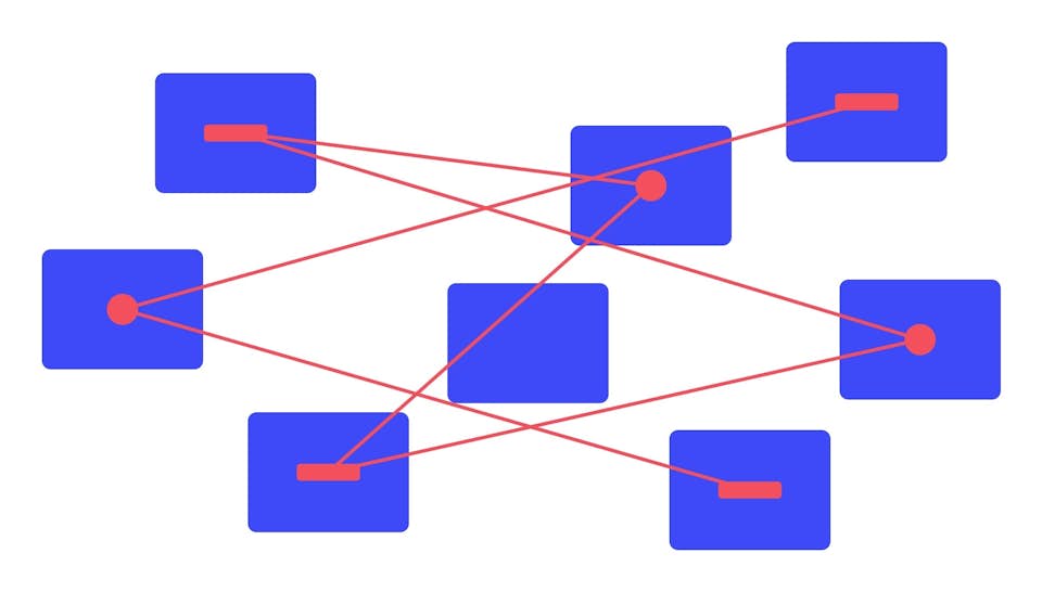
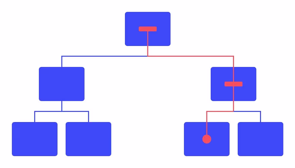
Take this navigation structure, for example:
With a homepage, section pages, subpages, and two layers of additional subpages, this structure represents a website with a deep navigation system. To find information, users must navigate 5 vertical levels of pages. A website like this would likely be overwhelming, confusing and difficult to navigate.
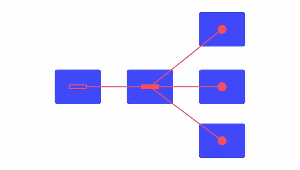
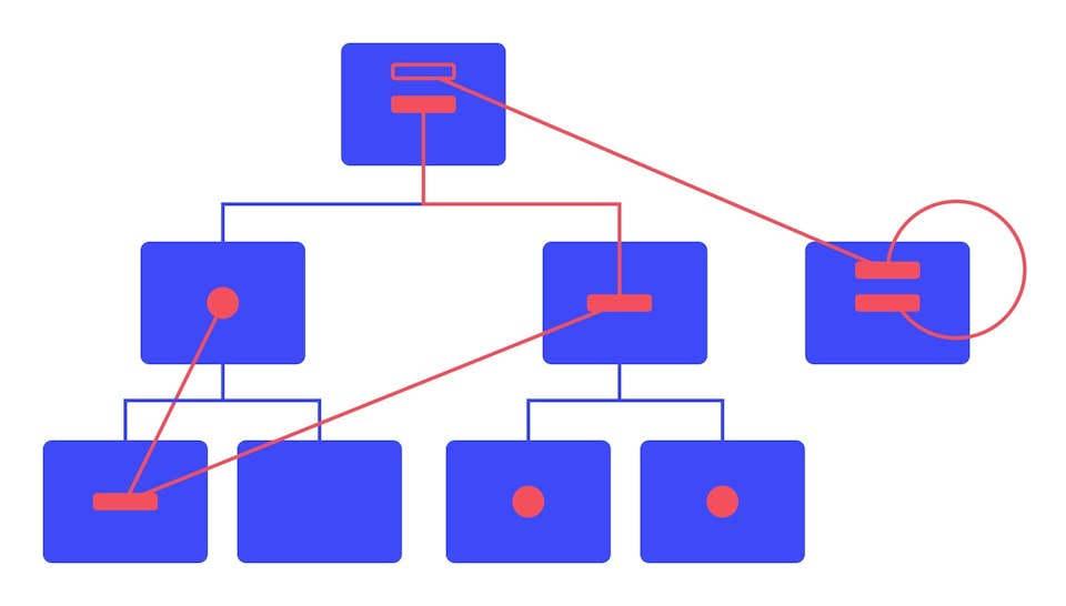
This is why navigation structure is particularly important. As we see it, the key to navigation structure is a flat hierarchy, where users can access all the information on a site in 2-3 clicks. Reorganized, the above structure might be flattened to look like this:

Regardless of a website’s needs, content is always more discoverable when it’s not buried under multiple intervening layers. Finding a balanced way to structure your site’s content without overwhelming your user is essential. More, categories that are specific and distinct are always easier to understand. This is more apparent in a flat hierarchy, since specific pages prevent unneeded subcategories.
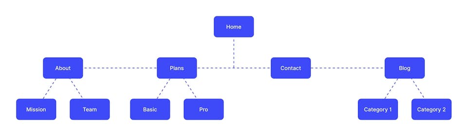
Contextualized, a flat hierarchy might look like this—a homepage; about, service, contact and blog pages; and relevant, though digestible subcategories:
Global Website Navigation
Global website navigation is among the most common navigation systems used today, particularly in light of a growing emphasis on maintaining flat hierarchies and uncomplicated navigation structures.
In general, global website navigation describes a main navigation bar—as well as its component subpages—that is identical across all pages of your website. Global navigation usually includes a header main menu, like on our site, as well as a footer navigation menu.
While global navigation may contain subpages, clicking through to a page or subpage does not reveal an additional hierarchy of menu items. Navigation menus stay the same regardless of where a user is on your website, helping to maintain an uncomplicated hierarchy of information.
Broadly, global navigation is guided by a system of best practices, and when including a global navigation bar or footer on your site, we find these basic rules to be fundamental.
1. Establish groups of content and assign each of these groups a name.
In order to have a navigation bar made up of linked pages, you must decide which pages to include and group together. This seems obvious, but the process by which you select these pages—or which pages are included as subpages—is essential and always tailored to the needs and characteristics of your website or business.
Often, global navigation bars include links to service pages, product pages, contact pages, blogs or case studies. For example, our global navigation header includes “Work,” “Process,” “About,” “Blog,” and “Contact”—a carefully structured list to introduce previous projects, workflow, senior team members, and company expertise.
2. Put them in the right order.
Once you’ve decided which pages to include in global navigation, you must decide how to order them—often an analytical and data-driven decision.
In short, what information is most useful to your customer or potential customer after viewing your homepage? Broadly, data suggests that 86% of site visitors and consumers want to see information about a company’s “products and services” after viewing the homepage. As such, these pages often lead navigation bars.
But what order or associations you make is ultimately up to what’s best for your company. For example, “Work,” featuring case studies of previous clients, leads our global navigation bar, since we’ve found that our potential customers are often most curious to see examples of previous projects once learning about our company.
In deciding which order to put menu items, we also consult the Serial Position Effect, which states that users have a propensity to best remember the first and last items in a series. Placing the least important items in the middle of lists can be helpful because these items tend to be stored less frequently in memory, and positioning key pages on the far left and right can aid navigation to your most important assets.
For this reason, the second-most important item in your navigation bar shouldn’t go in second place, but in the last. This is why we often anchor global navigation bars with the “Contact” page.
If unsure which page order makes the most sense for user behavior on your website—and your website is already live—we often use Google Analytics to make data-driven decisions about positioning. Using Analytics, web and UX designers can track user navigation paths and flow throughout a site to determine which pages should take precedence in navigation.
3. Implement the same top-level navigation bar in all regions of the user interface
The “global” in global navigation refers to your whole site, and therefore, global navigation bars or menus should exist identically on all pages.
Most importantly, they should exist in the same place on all pages. Changing the placement or design of your global navigation menus can prove confusing, disorienting, and ineffective.
4. Inform the user of their current position through a change in visual design
This, we find, is a particularly important aspect of global website navigation. Because global navigation looks the same on each page, web designers must indicate to users where they are on the site. When designing for clients, we often indicate position by bolding text, underlining, changing colors, or including icons.
Hierarchical Website Navigation
Hierarchical website navigation means that navigation menus change depending on the context of each page. Sometimes, hierarchical website navigation is paired with a global navigation bar. Other times, websites are structured in a strict hierarchical fashion. Most newspapers, content-based websites, and retail companies feature hierarchical navigation, since their websites are usually structured around detailed categories of content or products.
Take our earlier example of the New York Times.
When visiting the homepage, users see links to the top news sections in the header menu.
The New York Times' main navigation bar features hierarchical news and feature sections.
If the menu were global in structure, the menu’s pages would remain the same after clicking to a different category, but because the New York Times uses a hierarchical system, clicking on a section reveals a new page with new links that lead to additional subcategories.
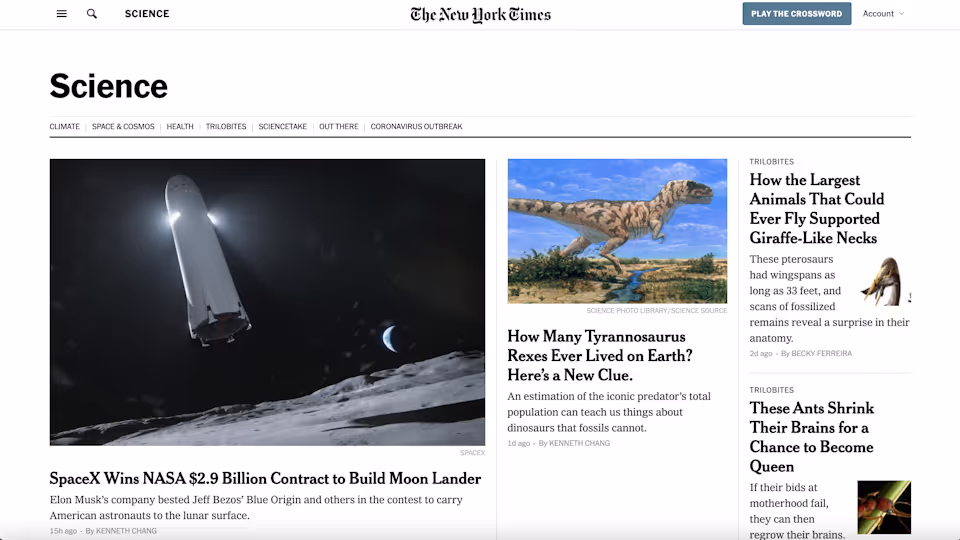
The Science section, for example, features additional subpages like "Climate," "Space & Cosmos," and "Health."
Back on the homepage, clicking the optional dropdown menu to view the site’s full list of pages reveals the hierarchical structure of the website—complete with sections, pages, and subsections.
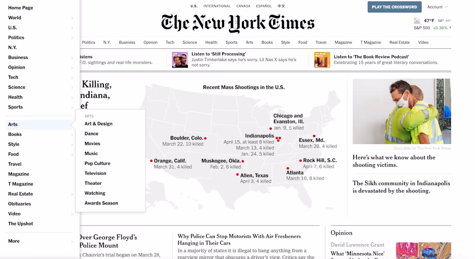
Opening the dropdown menu reveals the hierarchical structure of the New York Times website.
Hierarchical site navigation makes sense for many businesses, but when designing a similar system for a client, we tend to tread very carefully. By nature, hierarchical structures communicate tons of information through pages and subpages. A structure like this must be carefully designed and thought out, or else you risk overwhelming your user with confusion, uncertainty and haplessness.
To strike the right balance, we tend to follow a few best practices.
1. All navigational elements should display their subpage links or none of them should.
If your hierarchical navigation structure begins with an array of primary navigation items, like main pages and subcategories, all main navigation elements should display subpage links, or none of them should.
This is less complicated than it sounds. If menu items on your main navigation bar drop down to reveal subpages, all of them should do so. Often, a “Contact” or “Donate” page in the navigation bar does not have a dropdown menu, and, instead, features a change in design to indicate a lone page item.
Clicking on a section header reveals a dropdown menu of section pages.
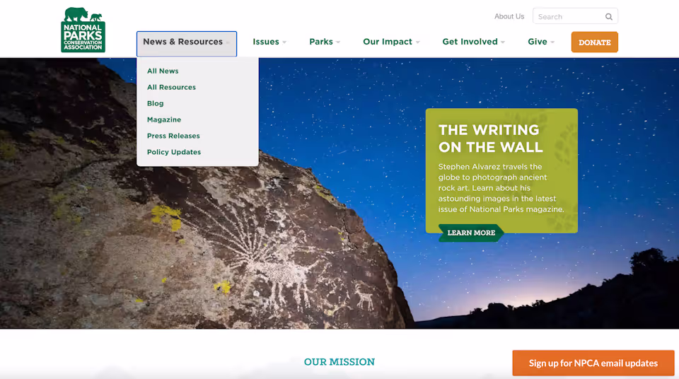
On the homepage of the National Parks Conservation Association, for example, hovering over each main navigation item reveals a primary set of subpages, while “Donate” to the far right is designed to appear like a button.
2. All primary navigation items should link to landing pages, or all should be section headers for secondary navigation links.
Take again the homepage of the National Parks Conservation Association.
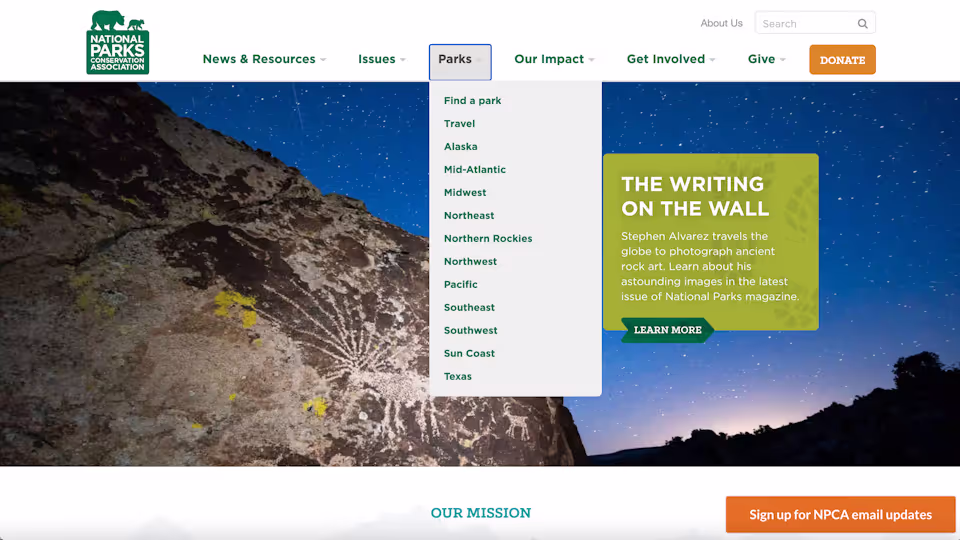
The section headers of the National Parks Conservation Association website do not lead to section landing pages.
When hovering over the main navigation bar, categories like “Parks” do not lead to a main “Parks” page. Instead, “Parks” serves as a section header for a set of subpages. This is kept consistent and made clear through design, since clicking on the section header drops down the list of subpages and is viewed like a tab.
If your primary navigation item is a link to a landing page, keeping this consistent and clear through related actions, verbiage, or visual design is key.
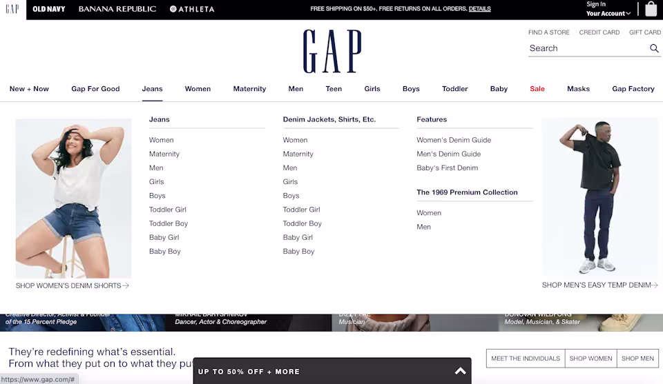
GAP indicates that clicking on a section header will lead the user to a section landing page.
On GAP’s website, for example, hovering over a main menu item, like “Jeans,” reveals hierarchical pages and underlines the main item. Users are meant to understand that clicking on “Jeans” will bring them to a main landing page for this clothing type, or they may preemptively toggle to a subpage from the dropdown menu.
3. Use breadcrumbs when applicable
Breadcrumbs are used as a navigation aid to help orient users within a website, particularly when many categories and subcategories of pages are involved. Breadcrumbs are also important when a user lands on deeper pages of your website from an external source or search engine.
Breadcrumbs usually appear as a list of pages and subpages the user has traveled through to arrive at their current content, usually highlighted in some way. Take this page, “Graduate School of Education Career Services,” on Fordham University’s website.

Fordham University's website, an expansive collection of pages, uses breadcrumbs to help orient users.
If a user were to arrive on this page from a search engine, the top section of the page features the hierarchical structure in which this content is found—“Home / Resources / Career Resources / Career Services / Career Services Info for Graduate Students / Graduate School of Education Career Services.”
Local Navigation
Local navigation works alongside global and hierarchical navigation to aid way-finding within certain subpages—or serves as a means to jump from page to page through linking. Usually, a user is given a set of additional menu items at the same hierarchy as their current page. Or users come across a link embedded in text to navigate to other relevant pages on the website.
Local Links
Newspapers, magazines, and content publishers often use local links in their articles, and many companies may employ local links on their blogs.
In the context of a publisher, local links are often used to help readers explore the deeper context of an article. If an article mentions a topic covered in the past, publishers may link to that article instead of explaining it in-depth.

Local links are used in a New York Times article to direct users to other relevant content.
In addition to aiding horizontal way-finding, local links are also important techniques to aid SEO. Internal link building with site content is a key tool to aid Google in “crawling” your site—or how the search engine finds, indexes, and ranks your pages. If Google indexes one of your pages, an internal link to another page will allow Google to access, index, and rank the secondary page, as well.
Page-Level Navigation
Local navigation can sometimes take the form of page-level and page-specific navigation menus, which show users other page options at the same hierarchy as their current position, as well as the options below the current page.
Page-level navigation may allow users to transition from page to page within a single hierarchy or may provide context and related content to a certain page or position. As a result, page-level navigation is often used in hierarchical e-commerce settings.
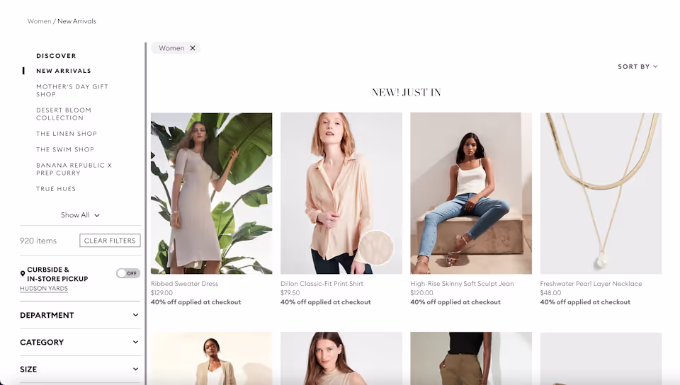
Banana Republic, like many e-commerce sites, uses page-level navigation to orient users within a site subsection.
Viewing the “Women” page on Banana Republic’s website, for example, shows users additional lateral or vertical movements within the context of women’s clothing.
Navigation Best Practices
So: What are the essentials—and maybe not-so-obvious essentials—needed to create the most intuitive, optimized and associative navigation design to communicate your business best to your site visitor?
In other words, what are the key practices that we use to tie site architecture and interface together in an easy-to-use navigation structure?
Plan your navigation structure, and choose the right pages.
Intuitive navigation design is just as important as your site’s visual composition, content, and structure.
Take a detailed look at your website—its goals, functions, and content. Devise a plan to structure your navigation as simply as possible and as intuitively for the functions and type of website your business requires.
When working with clients, we always ask: What tools and navigation mechanisms will users need to find the information they’re looking for? What kinds of pages does the website require, and what is the best and least complicated system of organization?
Most importantly: How should a visitor navigate through the website to find the right information to convert into a customer? How can navigation design and structure best aid this sales funnel?
Flatten your navigation structure
After you’ve answered the above question, simplify your navigation and devise a structure that is as flat as possible. When working with clients, we do our best to ensure that users can access all the information on our clients’ websites in 2 or 3 clicks.
Maintaining a flat navigation structure ensures that navigation is as easy as possible, discouraging confusion, haplessness and clutter.
Instead of linking to a handful of pages from your homepage, then expanding with ever-more sub-pages and categories, keep things simple, specific and precise. Group pages in tailored and targeted categories, rather than ever-expanding headings of general topics.
Don’t forget your footer
Footers are a particularly overlooked and important aspect of site navigation. Visitors who keep reading and scrolling to the bottom of your website are more engaged than the average user, so take advantage of their interest and use the space at the bottom of each page to highlight valuable content.
Since the footer isn’t eating up extra space on your page, get granular and include multiple categories of specific information, highlighting vital pages and articles.
Footer menus often include things like:
- Privacy policies
- Terms of use
- Career pages
- FAQs
- Press articles or information
- Customer support
- Newsletter and blog sign ups
Most of all: Don’t forget mobile
We can’t stress this more. Essential to UX, 83% of mobile users say that a seamless experience across all devices is critically important. Further, nearly 8 in 10 consumers say they would stop engaging with content that doesn’t display well on their device.
In short: Navigation design must be responsive—and evolved—for mobile use, which now accounts for the majority of internet usage.
While many desktop designs may be adaptive for mobile—meaning they can be reformatted within their current design to fit the ratio of a mobile screen—they must be responsive, or redesigned specifically for the behaviors and preferences of a mobile user.
Just because menus and navigation structures look great on desktop doesn't mean a site’s navigation design is complete. If navigation isn't mobile-responsive, even the most well thought out navigation design is rendered useless.
Take, as a final example, our ongoing discussion of the New York Times website.
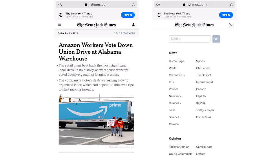
The New York Times homepage and dropdown on mobile, side by side.
When viewed on mobile, the New York Times’ main header menu is gone, since a menu of that size would be overwhelming and unusable on an average phone screen. The “Account” option navigation is simplified and replaced with a universal user icon, and all menu navigation is located within a single drop down menu—sometimes called a "hamburger menu.”
When opened, the mobile menu sorts all sections of the site into groups, and a search bar is featured above the menu items.
Entirely redesigned, the New York Times’ navigation structure now makes sense for the actions, behavior, and accessibility of mobile use.
Getting mobile right—alongside effective desktop design—means users can navigate successfully through your website regardless of medium. Aiding the accessibility of relevant information, architecture and interface—taken together, the building blocks of navigation—work cohesively to create an enjoyable and ultimately effective user experience.