Your B2B website should be generating leads. If it's not, the problem usually isn't one big thing. It's a dozen small things: vague messaging, buried calls-to-action, a design that looked great three years ago but now feels dated, and technical debt that's quietly tanking your search rankings. The frustrating part is that most B2B website design advice makes this harder, not easier. Every agency publishes the same list of best practices, and none of them tell you which ones actually matter for your business.
Business-to-business web design isn't one discipline. It's messaging, user experience, technical performance, trust-building, and conversion strategy working together. And the bar keeps moving. AI-powered search is changing how buyers find you. Self-service expectations keep climbing. Mobile-first indexing means your phone experience isn't optional anymore. What worked two years ago may already be costing you leads.
This guide covers the B2B website design best practices that actually move the needle, organized by impact. Each section links to a deeper dive if you want the full playbook on a specific topic.
Start With Strategy, Not Design
The most expensive B2B website mistake happens before anyone opens a design tool: skipping strategy. It's tempting to jump straight into layouts and color palettes, especially when stakeholders are excited about the visual refresh. But a beautiful website built without a clear strategy is just an expensive brochure.
Before anything gets designed, your website needs to answer three questions. What problem do you solve? Who do you solve it for? And why should someone choose you over the alternatives? If your homepage can't communicate all three within five seconds, everything downstream suffers. Your conversion rates, your search rankings, your sales team's ability to close. All of it traces back to whether visitors understood what you do the moment they landed.
Strategy also means aligning your site with your actual sales process. If your sales cycle is six months long and involves four decision-makers, your website needs content for every stage of that buyer's journey. Technical evaluators need different information than CFOs. Early-stage researchers need different content than prospects comparing their shortlist. The site architecture should create natural pathways for each persona and target audience, not force everyone down the same funnel.
Fastenal: Strategy-Driven Site Architecture
Fastenal is an industrial distributor with a massive product catalog, yet their homepage immediately makes sense. The navigation is organized around how customers actually buy: by product category (Fasteners, Safety, Cutting Tools, Electrical), by solutions, and by industry. Below that, they highlight their technology and inventory management solutions, which speaks directly to the operations managers and procurement teams who are their core buyers.
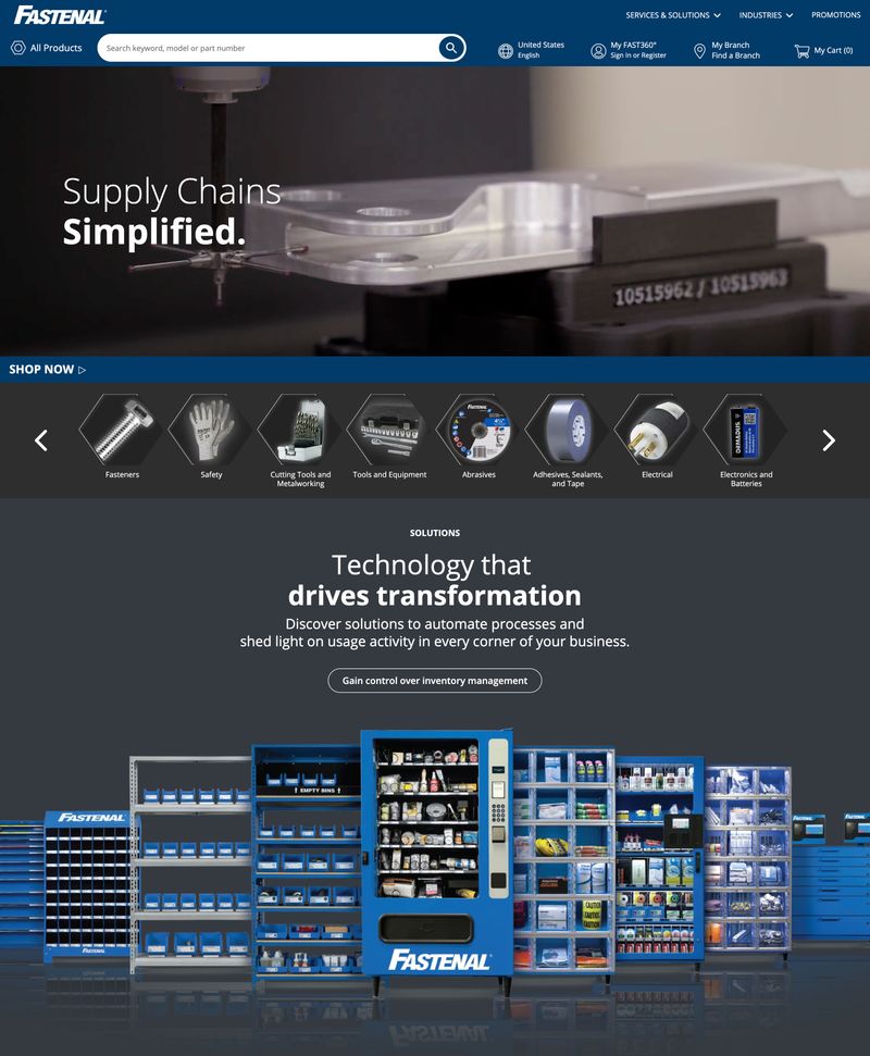
Notice what's missing: there's no vague "About Us" hero, no generic mission statement. The site is built around how their customers think and shop. That's strategy showing up in design.
Most B2B companies skip strategy because it's harder than picking fonts. But the companies that invest in B2B marketing strategy before design consistently build high-performing sites, while those that skip it don't. The site becomes a tool that supports your sales team instead of something they have to work around.
For a deeper look at aligning your site with your sales process:
- B2B Website Strategy: Building a Site That Supports Your Sales Process
- B2B Buyer Journey Mapping: Building Websites That Convert
Messaging That Speaks to Buying Committees
A B2B purchase isn't one person making a decision. It's a committee. The technical team wants to know if your solution integrates with their existing systems. Finance needs to understand ROI and total cost of ownership. End users care about whether it will make their jobs easier. And the executive signing the check wants confidence that you won't embarrass them.
Your messaging needs to serve all of these stakeholders without creating confusion. That starts with a value proposition strong enough to pass the five-second test. When someone lands on your homepage, can they immediately understand what you do, who you do it for, and why you're different? Most B2B companies fail this test. They lead with vague claims like "innovative solutions for modern businesses" or bury their actual value under a hero video that takes eight seconds to load.
Strong value propositions focus on outcomes, not features. "We help manufacturing companies reduce quality defects by 30% through AI-powered visual inspection" immediately qualifies the right prospects while filtering out poor fits. Compare that to "cutting-edge quality solutions." One gives the visitor a reason to stay. The other gives them a reason to hit the back button. Differentiation starts with specificity.
Victaulic: Clear Messaging for a Niche Industrial Audience
Victaulic makes mechanical pipe joining systems. Not the most glamorous B2B product, but their homepage messaging nails it. "Delivering Confidence in a Coupling" tells you exactly what they make and ties it to a benefit (confidence, reliability) that matters to the engineers and contractors who specify these products.
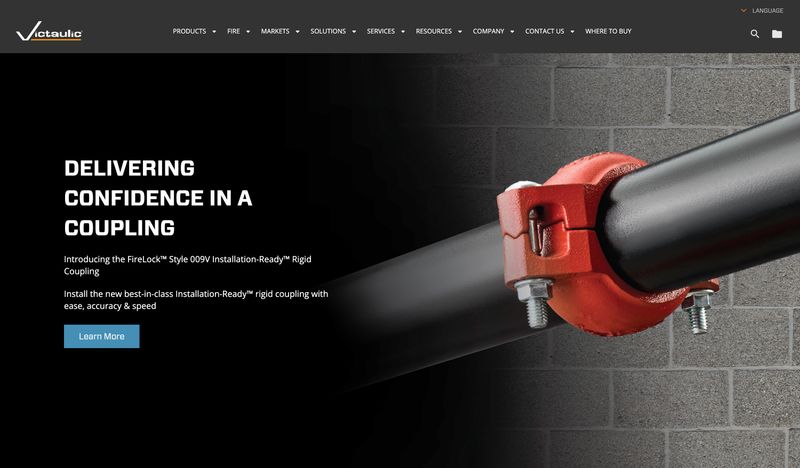
The navigation reinforces the messaging strategy: Products, Fire, Markets, Solutions, Services, Resources, Company. Each label is clear and organized around what different visitor types are looking for. An engineer evaluating products follows one path. A fire protection specifier follows another. Nobody has to guess where to go.
Once your value proposition is clear, the rest of your messaging needs to acknowledge that different decision-makers have different pain points and different decision-making criteria. This doesn't mean building separate websites. It means structuring your service pages, case studies, and resource sections so each stakeholder can find what they need without wading through content meant for someone else. Clear navigation labels and smart internal linking do the heavy lifting here.
For more on writing B2B website copy that converts:
- B2B Website Messaging Framework: Copy That Resonates
- B2B Website Copywriting: Writing for Committees, Not Individuals
- B2B Homepage Design: What the Best B2B Homepages Get Right
Content Architecture for Complex Offerings
B2B companies typically have more to explain than they can fit on a single page. Multiple product lines, overlapping service categories, different industries served. The temptation is to pack everything everywhere, which overwhelms visitors and confuses search engines. The solution is a hub-and-spoke content architecture.
Hub pages provide a broad overview of a solution area or service category. Spoke pages provide in-depth coverage of specific features, use cases, or industries. A manufacturing company might have a hub page for "Precision Machining Services" that links to spoke pages covering specific capabilities like CNC turning, five-axis milling, and surface finishing. This structure lets casual browsers get the big picture while serious evaluators dig into specifics.
Product pages and service pages need fundamentally different approaches. Product pages focus on specifications, compatibility, and demonstrations. Visitors want to see the product in action and understand how it integrates with their existing systems. Service pages shift the focus from "what it does" to "how we work with you." Process explanations, project timelines, and engagement models replace feature lists and configuration options.
Trane Technologies: Hub-and-Spoke in Practice
Trane Technologies is a climate innovation company with multiple brands and solution areas. Their brands page shows hub-and-spoke architecture at work: a parent overview page links to distinct brand pages for Trane (commercial HVAC), Thermo King (refrigerated transport), and specialized divisions like AI Lab, Life Science Solutions, and Data Center Solutions.
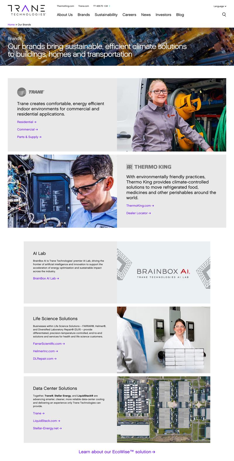
Each brand section gets a brief description and links to its own site or section, giving different buyer types a clear pathway without forcing them to wade through irrelevant content. A data center facilities manager doesn't have to scroll past residential HVAC information.
Educational content in multiple formats is the glue that holds this architecture together. Case studies, whitepapers, webinars, FAQ sections, and comparison pages serve dual purposes: they build trust by demonstrating genuine expertise, and they create the internal linking structure that helps search engines understand your site's topical authority. The key is making this content genuinely useful. A whitepaper that reads like a sales pitch earns exactly zero trust. A whitepaper that teaches something valuable, even if the reader never hires you, positions you as the obvious choice when they're ready.
For companies with ecommerce functionality alongside their service offerings, content architecture gets more complex. The sitemap needs to handle product catalogs, shopping flows, and lead generation pathways without creating confusion between "buy this product" and "contact us about a custom project."
For more on organizing your B2B site:
- B2B Website Content Strategy: From Awareness to Decision
- B2B Website Navigation: Structure That Guides Complex Buyers
Design That Builds Trust (Not Just Looks Good)
A B2B website has about fifty milliseconds to make a first impression. Visitors aren't consciously evaluating your design in that time. They're forming a gut reaction: does this company look credible? Professional design signals competence. Sloppy design signals risk. And for a B2B buyer whose job might depend on choosing the right vendor, risk is the enemy.
Trust-building goes far beyond visual polish. Social proof is the obvious starting point, but most B2B companies waste it. A wall of logos proves you have customers. It doesn't prove you can solve a specific problem. Generic testimonials that say "great service, would recommend" carry zero weight with skeptical buyers. Unlike B2C websites where a star rating might suffice, B2B buyers need proof that maps to their specific situation. Effective social proof tells specific stories: what the challenge was, what you did, and what measurably changed. Case studies with concrete numbers beat generic praise every time.
Stripe: Modern Design Meets Strategic Trust-Building
Stripe is an enterprise-scale example, but their design principles apply at any company size. The homepage opens with a bold value proposition ("Financial infrastructure to grow your revenue") and immediately layers on trust signals: a client logo bar featuring NVIDIA, Ford, Coinbase, Google, Shopify, and MetLife.
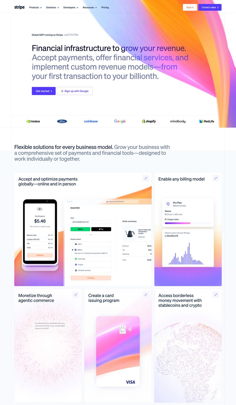
What makes this effective isn't just the big names. It's the specificity that follows. The "Flexible solutions for every business model" section shows actual product interfaces: payment flows, billing dashboards, usage meters. Visitors can see what the product looks like before committing to a demo. That's trust through transparency, not just trust through association.
Certifications, compliance badges, and security credentials matter more than many companies realize. ISO certification, SOC 2 compliance, or industry-specific credentials provide third-party validation that you meet established standards. Display them where they're relevant, not just in the footer. If data security matters to your buyers, put the SOC 2 badge on the page where you're asking for their information.
About pages are one of the most visited sections on any B2B site, yet most companies treat them as an afterthought. Prospects want to know who they're potentially working with. Real team photos, genuine company stories, and honest descriptions of how you work build more trust than polished corporate copy ever will.
Modern B2B design has moved past the "corporate blue with stock photos" era. Strong typography, bold colors, strategic white space, high-quality imagery, and purposeful animation all signal that a company is current and capable. The key word is purposeful. Micro-animations that guide attention are useful. Parallax effects that slow down the page are not. Every design choice should serve a function, whether that's directing the eye, improving comprehension, or building emotional connection.
For more on building credibility:
- B2B Website Trust Signals: Building Credibility That Converts
- B2C vs B2B Website Design: Key Differences That Impact Conversion
Conversion Strategy: Forms, CTAs, and Lead Paths
Most B2B websites have one conversion path: a "Contact Us" form. That's the equivalent of a retail store with one cash register hidden in the back corner. It works for the small percentage of visitors who are ready to buy right now. It completely ignores the other 97% who are still researching, comparing, or not yet convinced.
Effective B2B conversion strategy starts with your calls-to-action. "Contact Us" is the laziest CTA in B2B. It tells visitors nothing about what happens next. "See Pricing," "Book a 15-Minute Demo," or "Get Your Free Site Assessment" create specific expectations and lower the commitment barrier. Place your primary CTA above the fold and repeat it after your strongest proof points, not just at the bottom of the page where most visitors never scroll.
Procore: Multiple Conversion Paths for Different Buyer Stages
Procore builds construction management software, and their homepage demonstrates how to offer multiple paths without creating confusion. The hero section pairs "See pricing" (low commitment, self-service) with "See it in action" (medium commitment, guided). The navigation includes "Request a demo" (high commitment, sales-assisted). Three different CTAs for three different levels of buyer readiness, all visible within seconds.
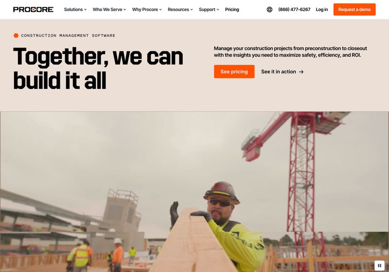
The value proposition copy reinforces the strategy: "Manage your construction projects from preconstruction to closeout with the insights you need to maximize safety, efficiency, and ROI." That's specific enough to qualify the right visitors and specific enough to be useful.
Forms are where potential leads die. Every unnecessary field reduces completion rates. Do you really need a phone number on the first interaction? Job title? Company size? Progressive profiling offers a better approach: gather minimal information upfront (name, email, company), then collect additional details across subsequent interactions. The first touchpoint should feel effortless.
Pricing transparency is one of the most debated topics in B2B website design, and the right answer depends on your market. If your competitors show pricing and you don't, visitors assume you're expensive. If you're in a market where pricing varies wildly by project scope, at least give ranges or provide a calculator. The goal is to help prospects self-qualify. Transparent pricing doesn't mean lower margins. It means fewer unqualified calls and more productive conversations with serious buyers.
Beyond forms and pricing, consider what other conversion paths your site offers. ROI calculators help prospects build internal business cases. Assessment tools let visitors benchmark themselves. Resource libraries demonstrate expertise while capturing intent data. Landing pages built for specific campaigns convert better than sending all traffic to your homepage. Even social media traffic needs a clear place to land. Each path serves a different stage of the buyer's journey and a different level of commitment.
For more on generating leads from your website:
- B2B Website Lead Generation: Turning Visitors Into Pipeline
- B2B Website Conversion Optimization: A Data-Driven Approach
- B2B Website Costs: A Complete Pricing Guide
Technical Performance as a Competitive Advantage
A slow website tells B2B buyers something about your company, and it's not flattering. If you can't keep your own site running fast, why would they trust you with their business? Page speed directly affects search engine rankings, conversion rates, and the gut-level perception of competence that drives B2B decisions.
Google's Core Web Vitals measure three things: how fast the page loads (Largest Contentful Paint), how quickly it responds to user input (Interaction to Next Paint), and how stable the layout is while loading (Cumulative Layout Shift). These aren't vanity metrics. They directly influence where you rank in search results. For B2B sites packed with high-resolution images, embedded videos, and interactive elements, hitting these targets requires deliberate optimization: compressed images, efficient code, fast hosting, and regular monitoring.
SEO for B2B websites goes beyond speed. Schema markup helps search engines understand what your company does, what services you offer, and where you're located. Organization schema, service schema, product schema, and FAQ schema can all trigger rich snippets in search results that improve your click-through rate. Local SEO matters even if you serve clients nationally, because many B2B searches include location modifiers ("manufacturing website design Atlanta," "IT consulting near me").
Mobile-first design isn't optional for B2B. Over half of B2B research starts on a mobile device, often during commutes or between meetings. If your site is painful to use on a phone, you're losing prospects before they ever see your desktop experience. Responsive design is the minimum. Mobile-first thinking, where you design for the small screen first and then enhance for desktop, produces better results.
Accessibility rounds out the technical foundation. Web accessibility has moved from "nice to have" to legal requirement for many organizations. Beyond compliance, accessible design (proper headers and heading structure, sufficient color contrast, keyboard navigation, descriptive alt text on images) improves usability for everyone. Good accessibility practices and good SEO practices overlap significantly: clear site structure, proper headings, descriptive meta descriptions, and logical internal linking benefit both search engines and humans.
For deeper dives on technical topics:
- B2B Website Speed Optimization: Performance That Impacts Revenue
- B2B Website SEO: A Technical and Content Strategy Guide
- B2B Website Maintenance Checklist: Monthly Tasks That Matter
AI and the New B2B Website Landscape
AI is changing B2B websites on two fronts, and both matter for how you think about your site going forward.
The first front is discovery. Google's AI Overviews, ChatGPT, Perplexity, and other AI tools are now summarizing and citing web content directly in their responses. When a B2B buyer asks an AI assistant "what are the best practices for B2B website design," the AI pulls from published content to generate an answer. If your content is well-structured, factual, and authoritative, it gets cited. If it's vague marketing fluff, it gets ignored. This is pushing B2B content toward clarity and specificity, which is a good thing regardless of whether AI is involved.
The second front is on-site experience. AI chatbots can handle complex product questions, route visitors to the right resources, and qualify leads outside business hours. Personalization engines can tailor the digital experience to different visitor segments based on their industry, behavior, or stage in the buyer's journey. These tools are real and some companies are using them well.
Qualified: AI-Powered Pipeline Generation in Action
Qualified (now operating as PiperX) has gone all-in on AI for B2B conversion. Their homepage features "Piper," an AI SDR agent that can engage visitors in face-to-face conversations, qualify leads, and book meetings automatically. The persistent "Ask Piper" button in the corner provides always-available assistance without being intrusive.
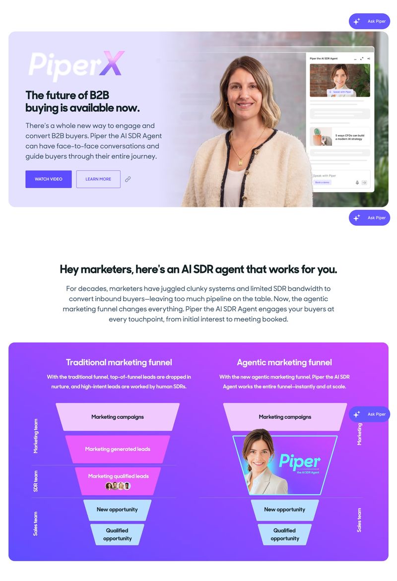
What's particularly interesting is their side-by-side comparison of the traditional marketing funnel versus the "agentic" funnel. In the traditional model, leads pass through marketing campaigns, get qualified by human SDRs, and eventually reach sales. In their AI model, "Piper" handles the entire process from first touch to booked meeting. Whether you adopt this level of AI or not, the comparison illustrates where B2B buyer engagement is heading.
But here's the honest assessment for most mid-market B2B companies: the fundamentals matter far more than AI features. A clear value proposition, fast load times, logical site structure, and compelling proof points will do more for your lead generation than an AI chatbot sitting on top of a confusing website. Get the basics right first. Layer in AI tools when you've earned the complexity.
The practical takeaway is straightforward. Write content that's clear, specific, and well-organized enough for both humans and machines to understand. Use proper headings, answer specific questions directly, and structure your pages so the key information is easy to extract. This serves your human visitors, your search engine optimization, and the AI tools that are increasingly mediating how B2B buyers find solutions.
Platform and Infrastructure Decisions
The platform question comes down to one thing most agencies won't tell you: who's going to maintain this site after launch? The best platform in the world is useless if your marketing team can't update it without calling a developer every time.
WordPress powers a huge share of B2B sites because of its flexibility and massive plugin ecosystem. But that flexibility comes with a maintenance burden. Regular security updates, plugin compatibility issues, and performance optimization require ongoing attention. Without a dedicated developer or agency relationship, WordPress sites tend to degrade over time.
Custom-built solutions offer complete control and can handle virtually any requirement. The trade-off is cost and timeline. Custom development takes longer, costs more upfront, and ties you to the developers who built it. For companies with truly unique requirements, it can be the right call. For most, it's overkill.
Modern platforms like Webflow bridge the gap. Visual development tools let designers build custom layouts without writing code. Hosted infrastructure handles security and performance. Marketing teams can make content updates without developer involvement. The trade-off is that you're working within the platform's boundaries, which occasionally means compromising on very specific functionality.
When Ecommerce Meets Lead Generation
For B2B companies that need ecommerce alongside lead generation, platform choice becomes more critical. Companies like Hilti, which sells construction tools and fastening technology, need their site to handle product catalogs and direct purchasing while also serving as a lead generation and brand-building tool.
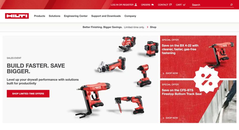
Hilti's navigation tells the story: Products, Solutions, Engineering Center, Support and Downloads, Company. They've built a site that handles transactional buyers (who know exactly what fastener they need and want to order it) alongside consultative buyers (who need engineering support for a complex project). That dual-purpose architecture requires a platform that can handle both ecommerce workflows and traditional B2B content.
Self-service capabilities like account portals, resource download centers, and online quote builders are increasingly expected by B2B buyers who want to accomplish routine tasks without waiting for business hours. The right answer depends on your team, your budget, and where your business will be in three to five years. A redesign is expensive. A platform migration is more expensive. Choose the infrastructure that your provider can actually support long-term and that scales with your growth, not the platform that looks best in the demo.
For more on planning a redesign:
Measuring What Actually Matters
Traffic numbers are satisfying but misleading for B2B websites. A thousand visitors from the wrong target audience are worth less than ten from the right one. The metrics that matter are the ones that connect to revenue: how many qualified leads did the site generate, which pages contributed to conversions, and which traffic sources produce prospects that actually close.
Set up goal tracking that reflects your real business objectives. A demo request from a qualified prospect is worth more than a whitepaper download from a graduate student. Assign values based on what actually converts to revenue, then measure whether your site is improving on the metrics that count. Bounce rate and time-on-page provide useful context, but they're diagnostic tools, not success metrics.
A/B testing helps you improve systematically instead of guessing. Test meaningful variations: headlines, value propositions, CTA placement and wording, form length. Avoid testing tiny details like button colors. Run tests long enough to reach statistical significance, especially on B2B sites where conversion volumes are lower than B2C.
Heat mapping and session recordings reveal the gap between how you think visitors use your site and how they actually do. Where do they click? How far do they scroll? Where do they hesitate? These insights often contradict assumptions and surface optimization opportunities you wouldn't find any other way.
For the full guide on optimizing conversions:
Where to Start
If you're staring at a B2B website that isn't performing, the sheer number of B2B website best practices that could be improved is paralyzing. Don't try to fix everything at once.
If you're planning a full redesign, start with strategy. Define who the site is for, what it needs to accomplish, and how it fits your sales process before anyone opens a design tool. If your current site exists but isn't generating leads, start with messaging and conversion paths. Can visitors understand what you do in five seconds? Are there clear next steps beyond "Contact Us"? These two changes alone can transform results without touching the design.
If you're not sure what's wrong, start with an honest audit. Pull your search console data, look at your traffic patterns, and compare your site to the competitors ranking above you. The data will tell you where the biggest gaps are.
For the next step: