
Your website visitors aren't shopping for shoes. They're evaluating a potential partnership that could impact their entire business. Yet many companies make the expensive mistake of applying consumer website design principles to their business-focused sites.
Here's the thing: B2B buyers think differently than consumers. They have different needs, different pressures, and different ways of making decisions. When your website doesn't reflect these differences, you're essentially speaking the wrong language to your most important audience.
Understanding these differences isn't just academic. It's practical. Companies that align their B2B web design with buying behaviors see dramatic improvements in lead quality and conversion rates.
We know it's confusing when most web design advice focuses on flashy consumer sites. This guide will help you understand exactly what makes B2B different and how to use those differences to your advantage.
The Fundamental Mindset Difference
When someone buys a pair of sneakers online, they might spend five minutes comparing prices and reading reviews. When they select an engineering firm for a major infrastructure project or choose a manufacturing partner for critical components, they're entering a months-long evaluation process that involves multiple people and careful consideration of business impact.
B2C: The Impulse Decision
Consumer purchases often happen in moments. Someone sees something they want, checks the price, maybe reads a few reviews, and clicks buy. The decision is emotional as much as logical. They're thinking about how the product will make them feel, whether it fits their lifestyle, and if the price seems fair. One person makes the call, and if they don't like it, they can usually return it without major consequences.
B2B: The Committee Decision
Business purchases are different beasts entirely. Multiple stakeholders need to agree. The person researching solutions might not be the person who signs the check.
You have to consider all types of decision-makers, including the:
- End user who cares about functionality
- IT manager who worries about integration
- CFO who needs to see ROI
- Executive who wants to know how this helps achieve strategic goals
These buyers are evaluating risk as much as reward. A bad consumer purchase means returning a product. A bad business purchase could mean project delays, safety concerns, production downtime, or failed compliance audits.
They need evidence, not just promises. They need to understand not just what you do, but your safety record, your project management approach, and your ability to meet specifications and deadlines.
What This Means for Your Website
Your B2B website design can't just look pretty and have a clear checkout process. It needs to serve as a comprehensive resource that addresses diverse concerns and supports a complex evaluation process. While consumer sites can focus on desire and simplicity, B2B sites need depth and credibility.
This doesn't mean your site should be boring or overwhelming. It means being strategic about how you present information and understanding that different visitors need different things from your site.
B2C vs. B2B Design in Action: Nike vs. Cisco
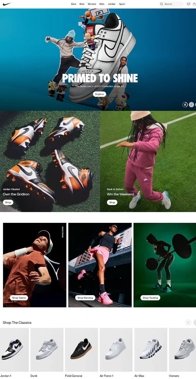
Nike’s B2C website is all about lifestyle and instant choice. You can shop by sport or gender, or you can scroll to explore classic shoe styles like the Air Max and Air Force 1. The navigation and homepage design are simple and streamlined because the goal is quick browsing and immediate purchase.
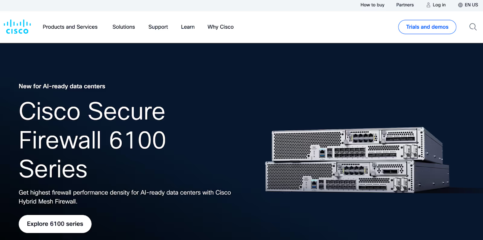
As a B2B company, Cisco takes an entirely different approach. Rather than showcasing bright, attention-grabbing lifestyle images, the digital communications technology corporation keeps their homepage professional and clean, featuring its newest product for AI-ready data centers.
While Cisco’s homepage design may be simple, its expanded navigation menu is built for complexity, organizing content into categories like “Products and Services,” “Solutions,” and “Support.” When visitors click into various navigation items, they can further segment themselves by industry (education, government, healthcare, and more) or technology type.
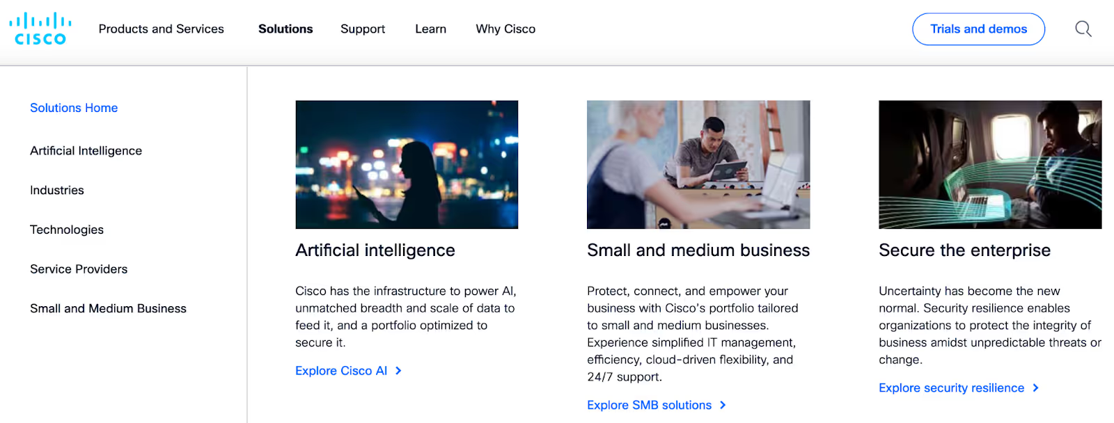
This structure reflects the B2B buyers’ world, where decisions involve technical considerations, multiple stakeholders, and high-stakes outcomes. Where Nike leans into emotional appeal and convenience, Cisco prioritizes context and depth so businesses can easily find the solutions that best align with their needs. This contrast highlights how B2B websites must guide buyers through a lengthy decision-making process, rather than just a quick shopping experience.
Learn more about calculating the impact of your B2B website:
Navigation and Information Architecture: Depth vs. Simplicity
Walk into a clothing store and you'll find sections for men's, women's, and kids' clothing. Simple categories for simple decisions.
But B2B buyers don't think in simple categories. They think in problems, industries, use cases, and integration requirements.
B2C Navigation: The Shopping Mall Approach
Consumer sites excel at helping people browse and discover. Categories are broad and visual. The path from homepage to purchase is intentionally short. Search functions help people find specific products quickly, with filters for:
- Size
- Color
- Price
Everything is optimized to reduce friction between desire and purchase.
B2B Navigation: The Research Library Approach
B2B navigation serves researchers, not shoppers. Visitors need to find information relevant to their industry, their specific challenges, and their technical requirements. They're not browsing for fun; they're on a mission to solve a business problem.
This means your navigation should offer multiple pathways. Someone might search by:
- Industry
- Project type
- Specific service they need
- Compliance requirements
A small manufacturer has different needs than a large hospital system, even if they're looking at the same engineering firm.
The "mega menu" has become standard in B2B because it allows sites to present complex information hierarchies without overwhelming visitors. These expanded menus can show solution categories, popular resources, and industry-specific pathways all at once.
How Fluor Makes Complex Navigation Simple
Fluor’s website is a great example of how B2B companies can handle complex navigation. For example, under the “Market Reach” tab in the main navigation menu, visitors will find a mega menu that lets them self-segment in two different ways: by industry (fuel, government, manufacturing, and more) or by business segment (energy solutions, urban solutions, or mission solutions). This approach makes it easy for diverse buyers with different goals to find what matters most without wasting time wading through irrelevant content.

For engineering firms and other B2B companies with a wide range of client types, strategically organizing information is essential for clarity and trust. It shows buyers that you understand their specific needs and that you offer tailored solutions for the unique challenges they face.
Practical Examples
Consider how an engineering consultancy might organize their site differently than an online retailer. The retailer focuses on product categories and seasonal collections. The engineering firm is organized by:
- Market Sectors: Healthcare, education, infrastructure
- Service Types: Structural, mechanical, electrical
- Project Phases: Planning, design, construction administration
Search functionality differs too. While consumer sites filter by price and features, B2B sites need filters for:
- Industry sector
- Project type
- Certifications
- Geographic coverage
Engineering and construction firms might offer filters for:
- Project size
- Delivery method
- Specific technical capabilities
Content Strategy: Education vs. Entertainment
Open any consumer product page and you'll find beautiful photos, short benefit statements, and customer reviews. Open a B2B service page and you'll find detailed explanations, case studies, white papers, and ROI calculators. The difference isn't just depth – it's purpose.
B2C Content: Quick and Consumable
Consumer content aims to create desire and remove purchase barriers through:
- Product descriptions that focus on benefits and lifestyle fit
- Reviews that provide social proof
- Beautiful imagery that shows the product in context
Everything is designed to be quickly scannable and emotionally engaging.
B2B Content: Comprehensive and Credible
B2B buyers need education before they can evaluate. They need to understand not just what you offer, but:
- Your capabilities
- Your safety record
- Your project management methodology
- What certifications you hold
- What kind of results you've delivered on similar projects
This educational burden means B2B sites need substantially more content than their B2C counterparts. Case studies can't just say "Company X loved working with us." They need to detail the:
- Project scope
- Challenges encountered
- Solutions implemented
- Timeline adherence
- Measurable outcomes
Technical capabilities matter. Safety records matter. Certifications and compliance details matter.
How Skanska Uses Case Studies to Build Trust With Visitors
Global construction and project development company Skanska features multiple case studies on its website, like its “360° Cameras” case study. The organization first outlines the problem – the potentially fatal outcome of limited visibility around large construction equipment – before presenting the solution: 360° all-round visibility cameras.
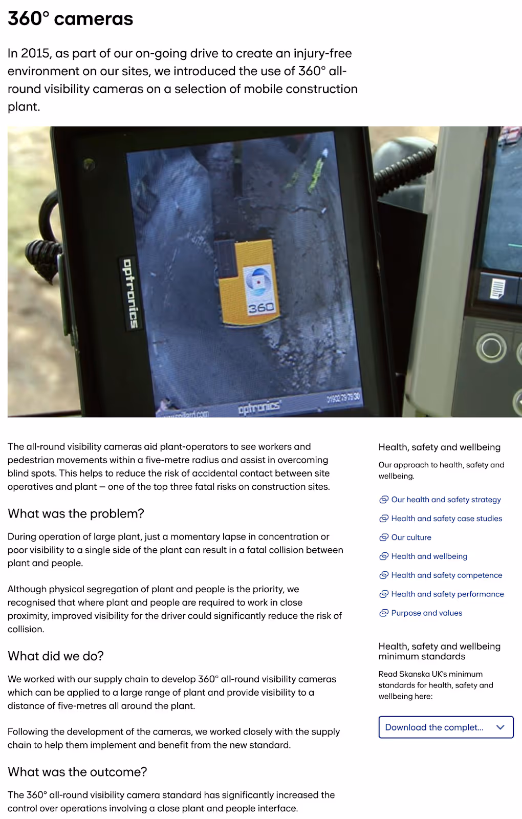
Next, they clearly present the outcome: a significant increase in operational control resulting in reduced risk of accidental contact between site operatives and the plant. By providing this structured approach, Skanska effectively demonstrates its commitment to safety and innovation, building trust with potential B2B clients.
The Content Depth Difference
B2B buyers expect to find answers to complex questions on your site. They want to understand your:
- Methodology
- Implementation process
- Support structure
They need content that speaks to technical evaluators and business stakeholders alike.
This creates a balancing act. Technical accuracy is crucial, but so is readability. The CFO needs to understand the business case without getting lost in technical specifications. The IT manager needs technical details without wading through marketing fluff. Smart B2B sites create distinct content paths for different audiences while maintaining a cohesive story.
The Role of Gated Content
Gated content plays a different role in B2B too. While consumers rarely trade contact information for content, B2B buyers routinely download white papers, attend webinars, and request detailed guides. They're willing to engage because the content has real business value.
Creating Content That Converts
Effective B2B content addresses the full buying committee.
- Finance stakeholders need ROI projections and total cost of ownership analysis
- Technical stakeholders need architecture diagrams and API documentation
- End users need to understand the day-to-day experience
The best B2B sites don't just dump all this information on visitors. They guide them to relevant content based on their role and stage in the buying process. For example, early-stage researchers might see educational content about industry challenges, while later-stage evaluators find detailed implementation guides and pricing information.
Design and Visual Hierarchy: Professional vs. Trendy
Flip through any consumer brand's Instagram and you'll see bold colors, playful animations, and design trends that change with the seasons. B2B design plays by different rules. While consumer brands chase attention, B2B brands build trust through consistency and professionalism.
B2C Design Principles
Consumer design embraces emotion and aspiration.
- Bold visuals grab attention
- Seasonal updates keep things fresh
- Mobile-first interfaces assume people are shopping from their phones
The overall aesthetic aims to be memorable, shareable, and aligned with current design trends.
B2B Design Principles
B2B website design prioritizes clarity and credibility over creativity.
- Clean layouts help visitors process complex information
- Consistent design patterns across pages reduce cognitive load
- Professional aesthetics signal stability and reliability
This doesn't mean B2B design should be boring. It means every design decision should support business objectives.
- Data visualizations help explain complex concepts
- Interactive tools engage visitors while providing value
- Professional photography shows real people and real work environments rather than stock photo perfection
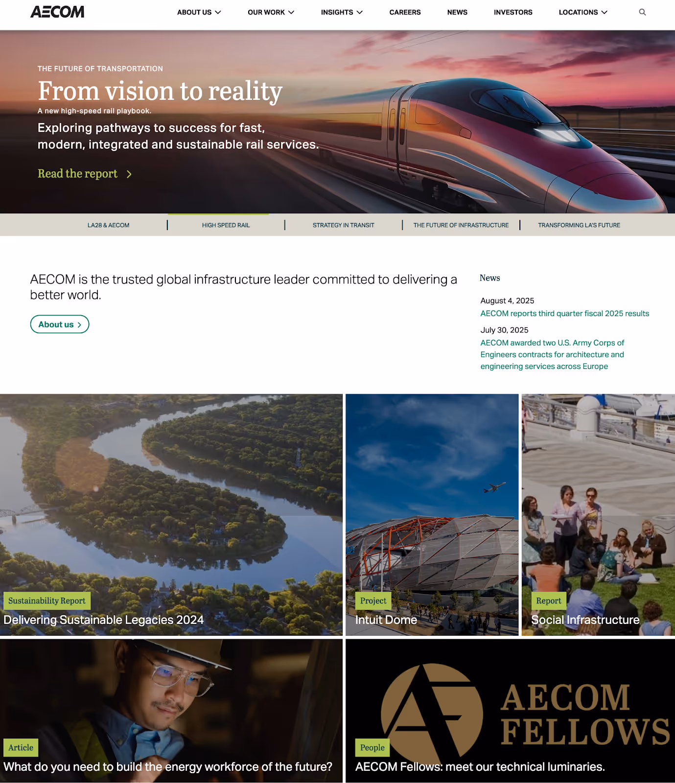
How AECOM Exemplifies Expertise Through Professional Design
AECOM’s website showcases how clean, professional design engages B2B buyers in the architecture, engineering, and construction sector. The site prioritizes clarity and expertise over decoration, using high-quality project imagery and professional typography to convey competence and trustworthiness. Content is strategically organized to guide visitors through their services and project highlights, making it easy for decision-makers to find relevant information quickly.
By balancing visual appeal with functional navigation, the site reinforces AECOM’s reputation as a reliable, expert partner for complex engineering and construction projects.
Service Pages vs. Product Pages
The structure of B2B service pages differs fundamentally from B2C product pages.
- Product Pages: Showcase features and benefits with the goal of immediate purchase
- Service Pages: Explain processes, demonstrate expertise, and build confidence in your ability to deliver results
B2B service pages often include methodology sections, team profiles, and detailed process explanations. They show the journey from problem to solution, not just the end result. While a consumer product page might have five sections, a B2B service page might have fifteen, each addressing different stakeholder concerns.
Color Psychology and Typography
B2B color palettes tend toward conservative choices for good reason. Navy, gray, and muted tones signal professionalism and stability. While accent colors add personality, they're used sparingly and strategically. The goal is to appear established and trustworthy, not trendy or playful.
Typography choices prioritize readability over style:
- Body text needs to be comfortable for extended reading sessions
- Headers need a clear hierarchy to help scanners find relevant sections
- Technical specifications require fonts that clearly distinguish between similar characters
The Mobile Question
Here's something interesting: while consumer sites obsess over mobile optimization, many B2B buyers still research and evaluate on desktop computers during work hours. This doesn't mean ignoring mobile, but it does mean considering the context of use.
B2B mobile users might be:
- Executives reviewing proposals on tablets
- Sales teams accessing resources in the field
- Technical staff checking documentation
Each use case has different needs. Responsive design isn't just about screen size; it's about understanding when and how different devices get used in the business context.
Explore comprehensive B2B design strategies:
Trust Signals and Social Proof: Different Types of Credibility
A five-star rating might convince someone to buy a phone case. But convincing a company to invest in a year-long partnership requires different proof points. B2B trust building goes deeper than reviews and ratings.
B2C Trust Builders
Consumer sites build trust through volume and recency.
- Hundreds of reviews create confidence
- User-generated content shows real people using products
- Celebrity endorsements add aspiration
- Security badges assure safe transactions
The focus is on popularity and social validation.
B2B Trust Builders
B2B credibility comes from different sources entirely. Client logos show you work with recognizable companies. But unlike consumer brands that might just display logos, B2B sites need to tell the story behind the logo.
You need to answer:
- What challenge did you solve?
- What results did you achieve?
- Who at the company would vouch for your work?
Industry certifications matter more in B2B because they represent compliance with standards and regulations. These aren't just trust badges; they're table stakes for certain industries.
- Construction firms need proper licensing and bonding
- Engineering firms need professional engineering licenses
- Manufacturers need ISO certifications
- Government contractors need specific security clearances
Team expertise becomes a trust signal too. B2B buyers want to know who they'll be working with. Team pages with real photos, genuine bios, and LinkedIn profiles help buyers evaluate expertise. Thought leadership through published articles, speaking engagements, and industry involvement demonstrates deep knowledge.
Visual Proof of Expertise: Client Logos in B2B Design
Kongskilde Industries’ U.S. homepage showcases the manufacturer’s capability in handling complex projects by featuring a slider of client logos. Not only do client logos serve as social proof to build trust with potential B2B buyers, but they highlight the company’s extensive experience working with clients in a variety of industries, including plastics, paper, and packaging.

Including client logos on your B2B website serves as a visual testament to your expertise, reassuring prospective clients of your competence and reliability.
Testimonials That Actually Convert
B2C testimonials can be anonymous and brief. "Love this product! - Sarah M." works fine for consumer goods.
B2B testimonials need:
- Full names
- Titles
- Companies
- Specific outcomes
"Reduced processing time by 47% - Jennifer Chen, VP of Operations, TechCorp" carries real weight.
Video testimonials work especially well in B2B because they're harder to fake and show real stakeholders discussing real results. The best ones don't just praise the vendor; they explain the:
- Problem
- Evaluation process
- Implementation experience
- Measurable impact
Building Authority
Authority in B2B comes from demonstrating deep expertise in specific areas:
- Publishing original research positions you as an industry leader
- Detailed methodology explanations show you have a proven process
- Case studies with named clients and specific metrics prove you deliver results
This authority building requires consistent effort over time. One blog post doesn't establish thought leadership. But regular publication of insightful content, participation in industry discussions, and contribution to professional communities builds recognition as a trusted expert.
Learn proven authority-building strategies:
Pricing Strategy: Transparency vs. Custom Quotes
Nothing frustrates B2B buyers more than hunting for pricing information that doesn't exist. Yet many B2B sites hide pricing behind "Contact Us" forms. The tension between transparency and customization creates one of the biggest differences between B2B and B2C sites.
B2C Pricing: Immediate and Clear
Consumer sites put prices front and center.
- Clear pricing, visible discounts, and simple comparison charts help buyers make quick decisions
- Shipping calculators remove surprises
- Promotional codes create urgency
Everything about consumer pricing aims to remove friction and encourage immediate purchase.
B2B Pricing: Strategic and Complex
B2B pricing is rarely simple because:
- Projects need customization
- Scale affects pricing
- Timeline impacts costs
- Complexity varies based on specifications and site conditions
What works for a small office renovation might not work for a major industrial facility. This complexity leads many B2B companies to hide pricing entirely.
But complete opacity frustrates buyers who need budget guidance. The best B2B sites find middle ground, providing pricing ranges, starting prices, or transparent pricing for standard packages while offering custom quotes for complex needs.
When to Show vs. Hide Pricing
Showing pricing works when:
- Your services are standardized
- Your market expects transparency
- You're targeting smaller projects with defined scopes
Some consulting firms succeed with transparent day rates or project minimums.
Custom pricing makes sense when:
- Every project is unique
- You're handling complex engineering or construction projects
- Pricing depends on site conditions, specifications, and timeline
But even then, providing budget ranges or example project costs helps qualified buyers self-select.
The psychology of price anchoring works differently in B2B too. While consumers anchor on the lowest price, B2B buyers often anchor on value and ROI. Showing how your higher price delivers better outcomes can actually improve conversion rates among quality prospects.
B2B Price Presentation: Customized Services vs. Standardized Products
Many major professional service firms, like Boston Consulting Group, intentionally avoid publishing service rates on their websites for all the reasons listed above: their work is highly customized, and pricing depends on client size, industry, and project complexity. But they show their value in other ways, like demonstrating capability through case studies and thought leadership pieces that reinforce their expertise and authority.

For B2B companies with more specific products, like software that requires a subscription, it makes sense to outline clear pricing tiers (while still leaving room for custom quotes). For example, 3M’s product page for their Visual Attention Software (VAS) gives visitors an overview of the product and its features, a “Support” section that addresses FAQs, and a dedicated pricing page showing the monthly rate, yearly rate, and an option to request a custom quote for groups.
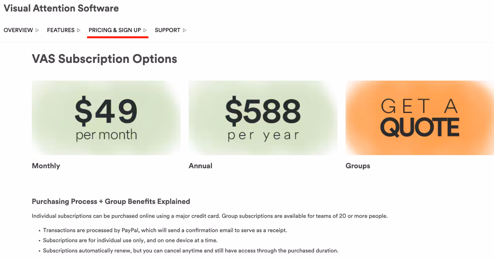
This type of pricing structure works much better for 3M than for a consulting firm, as the product is standardized, the costs are predictable, and buyers expect transparency when comparing software solutions. By pairing published rates with flexible custom options, 3M makes it easy for prospects to self-qualify while still accommodating larger enterprise needs.
The Conversion Path: Quick Purchase vs. Lead Nurturing
The "Add to Cart" button that dominates consumer sites barely exists in B2B. Instead, B2B conversion paths recognize that the first interaction is just the beginning of a longer lead nurturing process.
B2C Conversion Goals
Consumer sites optimize for immediate transactions by:
- Reducing cart abandonment
- Streamlining checkout
- Offering multiple payment methods
- Saving cart contents
- Sending abandonment emails
Everything focuses on completing the purchase quickly before the buyer changes their mind.
B2B Conversion Goals
B2B sites play a longer game. The goal isn't immediate purchase but qualified engagement.
- Consultation requests let prospects discuss their specific needs
- RFP submissions capture project requirements
- Capability statements and portfolio downloads identify interested parties
- Newsletter signups nurture early-stage interest
- Lunch-and-learn requests build relationships
Each conversion type serves different stages of the buying journey:
- Early-Stage Visitors: Download educational content
- Mid-Stage Evaluators: Request demos or case studies
- Late-stage Buyers: Engage with sales teams or start trials
The website needs to offer appropriate conversion opportunities for each stage.
Forms and CTAs That Work
B2B forms can ask for more information because the value exchange is clearer. While consumers balk at long forms, B2B buyers understand that providing company size, industry, and use case information leads to more relevant follow-up.
Progressive profiling makes this process smoother. Instead of asking for everything upfront, smart B2B sites collect information over time. The first download might ask for a name and email. The second adds company and role. By the third interaction, you have enough information for meaningful sales follow-up.
Call-to-action language differs too. While consumer sites use "Buy Now" and "Add to Cart," B2B sites use "Request a Consultation," "Get Your Project Quote," or "Schedule a Capabilities Presentation." These CTAs acknowledge the consultative nature of professional services and custom manufacturing.
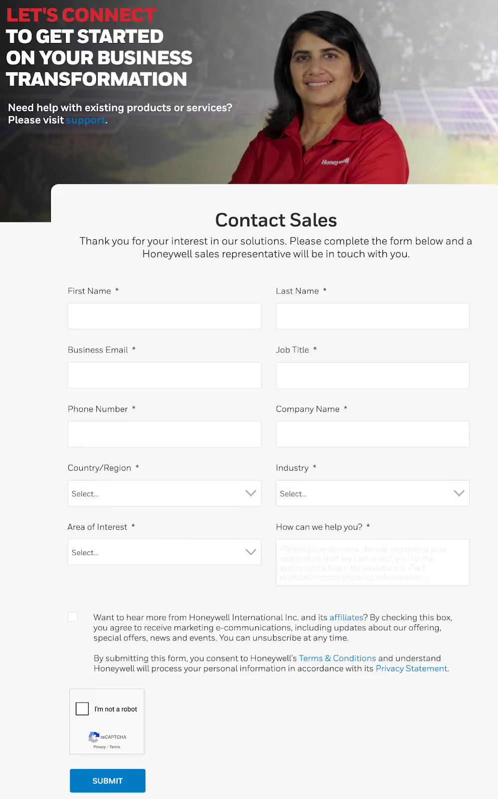
Using Forms to Gather Crucial Project Details That Increase Conversions
Honeywell’s “Contact Sales” business inquiry form shows how B2B companies can use forms to gather essential client and project details that will help them streamline the sales process and provide more accurate and tailored proposals. By prompting potential clients to provide their name, contact information, job title, company name, industry, and area of interest, Honeywell ensures their sales team can respond quickly with relevant solutions, improving both efficiency and the likelihood of conversion.
For B2B marketers, implementing similar forms can facilitate more effective lead qualification, enhance customer satisfaction, and ultimately drive more successful business outcomes.
The Lead Nurturing Difference
B2B websites are starting points, not finish lines. After initial conversion, the real work begins.
- Email nurturing sequences provide relevant content based on interests
- Sales teams follow up with personalized outreach
- Marketing automation tracks engagement and identifies sales-ready leads
This extended nurturing requires websites to support ongoing engagement.
- Resource centers provide self-service information
- Customer portals maintain relationships post-purchase
- Partner directories facilitate referrals
The website becomes a platform for relationship building, not just lead capture.
Master B2B lead generation strategies:
Common Mistakes When Designing B2B Websites
Sometimes in the effort to modernize B2B sites, companies swing too far toward consumer-style simplicity. Other times, they lean so heavily into complexity that they create confusion. Finding the right balance requires understanding common pitfalls.
Trying to Be Too B2C
- Oversimplifying Complex Solutions: This common mistake frustrates serious buyers. When you hide technical specifications to avoid overwhelming visitors, you force technical evaluators to contact sales for basic information. This creates friction for buyers who want to self-educate before engaging with sales teams.
- Hiding Pricing Without a Good Reason: If your competitors show pricing and you don't, buyers might assume you're expensive or difficult to work with. Unless your pricing truly requires customization, some level of transparency helps buyers qualify themselves.
- Neglecting Technical Buyers in Favor of Executive Messaging: This error leaves out crucial stakeholders. While the CEO might make the final decision, the technical team often has veto power. Your site needs to serve both audiences without forcing either to dig for relevant information.
Going Too Far the Other Way
- Overwhelming Visitors With Technical Jargon and Complex Navigation: Just because B2B buyers need depth doesn't mean they want to wade through dense technical documentation to understand basic value propositions.
- Not Prioritizing User Experience: Forgoing user experience in the name of information density creates problems too. Long pages without navigation aids, dense paragraphs without visual breaks, and complex forms without progress indicators frustrate even patient B2B buyers.
- Underestimating the Power of Good Design: This is equally problematic, as professional doesn't mean austere. Clean doesn't mean boring. B2B buyers are still humans who appreciate thoughtful design, clear information hierarchy, and visual elements that aid understanding.
The Balanced Approach
The best B2B sites know when to borrow from B2C.
- They use emotional appeals when appropriate, understanding that even business decisions have emotional components
- They simplify where possible while maintaining necessary depth
- They use visual design to enhance understanding, not just decoration
Testing and iteration help find the right balance. What works for one B2B audience might not work for another. A site selling to IT professionals needs different approaches than one selling to HR leaders. Regular testing, user feedback, and analytics help refine the approach over time.
Practical Implementation Tips
Understanding these differences is one thing. Applying them to your website is another. Here's how to start improving your B2B website design without overwhelming your team or budget.
Starting Points for B2B Redesign
- Begin by Auditing Your Current Conversion Paths: Map out how visitors move from first visit to conversion. Identify where they drop off and why. Survey existing customers about their buying journey to understand what information they needed and when they needed it.
- Look at Your Content Through the Lens of Different Stakeholders: Does your site serve technical evaluators, financial decision-makers, and end users equally well? Create simple personas for each stakeholder type and evaluate whether your site meets their needs.
- Review Your Frequently Asked Questions: Assessing your FAQs can provide insight into what's missing from your site. If sales constantly answers the same questions, that information should be on your website. If support fields similar queries from new customers, your onboarding content needs work.
Quick Wins
- Add Industry-Specific Case Studies: Including case studies on your site can immediately improve credibility and conversion rates. Even one detailed case study per major industry you serve helps prospects envision success. Focus on specific challenges, solutions, and measurable outcomes rather than generic success stories.
- Create Comparison Guides: Comparisons help late-stage buyers understand your unique value. Show how you stack up against alternatives, including the status quo of doing nothing. Be honest about where you excel and where others might be better fits.
- Improve Your About Us Page: Optimizing your About page builds trust quickly. Add real team photos, genuine bios that show expertise and personality, and specific information about your experience and approach. B2B buyers want to know who they're working with before they commit.
Fostering Confidence by Showing Real People With Real Expertise
Burns and McDonnell’s “Who We Are” page is a prime example of how professional service firms can build trust through transparency and authenticity. This page highlights the company’s history, values, reach, and commitment to employee ownership, establishing a strong foundation of credibility.
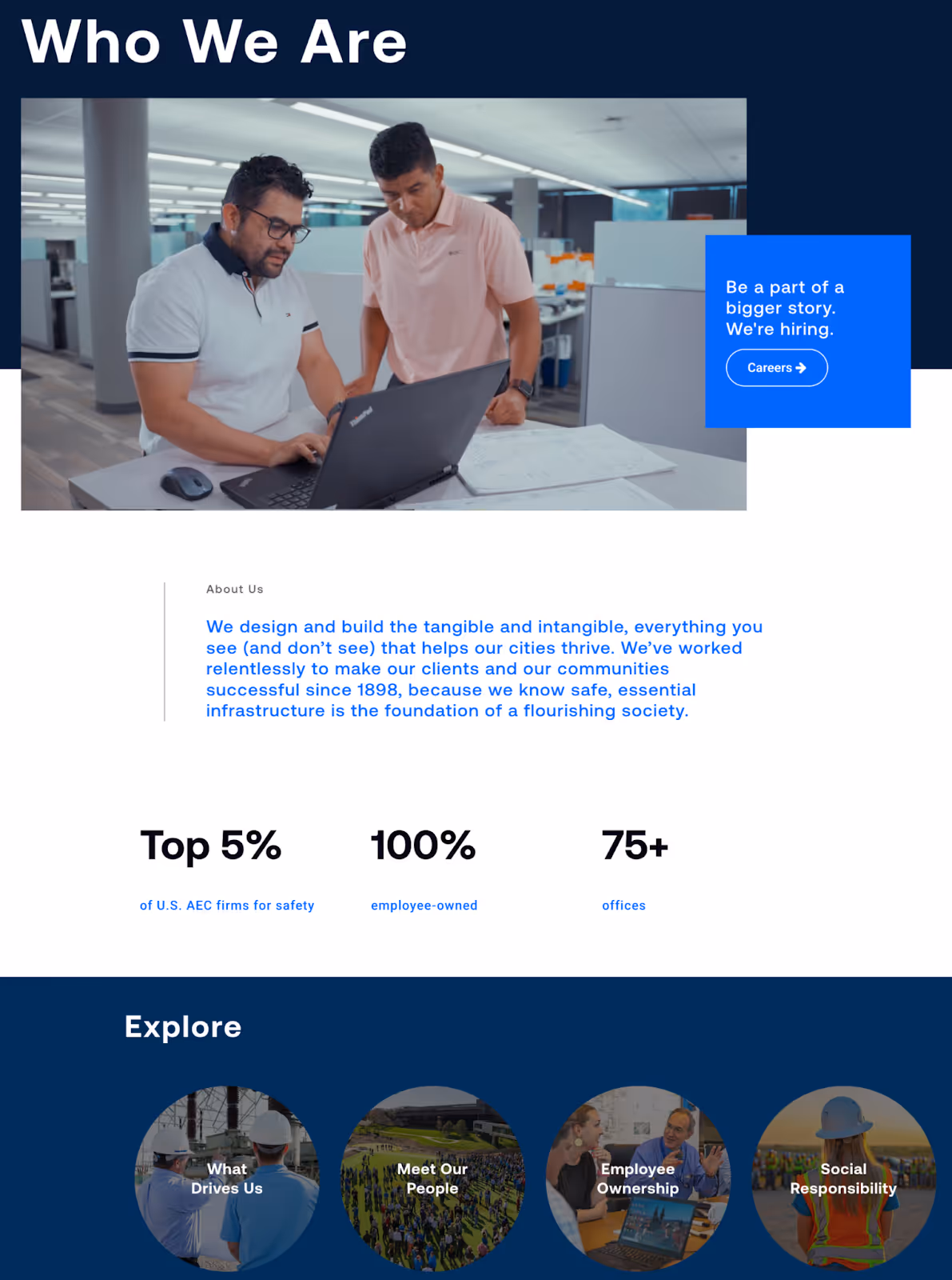
Visitors can delve even deeper into the company by clicking links like “What Drives Us” or “Meet Our People” – a dedicated page that showcases the leadership team alongside their names, roles, and photos. By showing the real people behind the scenes, Burns and McDonnell humanizes the brand and reinforces their dedication to fostering real relationships with clients.
For B2B marketers and web designers, implementing similar About page strategies can help you convey competence and expertise while fostering trust with visitors.
Long-Term Strategies
Building a comprehensive resource center takes time but pays long-term dividends. Here are our tips for developing a resource hub that establishes authority and drives lead generation:
- Organize Resources Strategically: Organize company resources by industry, role, and challenge. Include diverse content types from beginner guides to technical documentation. Make everything searchable and filterable to help visitors find what they need.
- Develop Industry-Specific Landing Pages: Industry-specific landing pages help with both SEO and conversion. Each industry page should speak directly to that sector's unique challenges and requirements. Use industry terminology, reference relevant regulations, and show applicable case studies.
- Provide Interactive Tools and Calculators: These kinds of tools provide value while capturing leads. ROI calculators, assessment tools, and planning templates help prospects understand potential value while positioning you as a helpful resource rather than just another vendor.
Next Steps: Optimizing Your B2B Site for Real Buyers
The differences between B2C and B2B website design run deeper than surface aesthetics. They reflect fundamental differences in how businesses buy versus how consumers shop. B2B buyers need more information, involve more people, and face higher stakes in their decisions.
Understanding these differences helps you make better design decisions. Remember:
- Your navigation can offer multiple pathways without overwhelming visitors
- Your content can provide necessary depth while remaining scannable and engaging
- Your design can appear professional without being boring
- Your conversion paths can nurture leads without being pushy
The key is remembering that B2B buyers are still people. They appreciate good design, clear communication, and helpful resources. They just need these things delivered in a way that acknowledges the complexity of their decisions and the reality of their evaluation process.
Small Tweaks = Big Wins for B2B Websites
Small changes like these can lead to significant improvements:
- Adding case studies with real metrics
- Creating content for different stakeholders
- Showing pricing ranges instead of hiding everything
- Improving form design to reduce abandonment.
Each optimization moves you closer to a site that truly serves B2B buyers.
Evaluate Your Website Through a B2B Lens
Start by evaluating your current website against these principles:
- Where are you treating B2B buyers like consumers?
- Where might you be making things unnecessarily complex?
- What information do buyers need that you're not providing?
The answers will guide your path toward a more effective B2B web presence.
