Picture this scenario: a qualified engineering manager lands on your manufacturing website. They're actively looking for industrial automation solutions. They know you have what they need because a colleague recommended you. But after clicking through three different menu items and still not finding pricing information, they leave frustrated and check out your competitor instead.
This happens more often than you might think. 42% of users will abandon your website as soon as they experience issues with functionality or usability. But the hidden cost of poor navigation isn't just bounced visitors. It's lost deals from buyers who were already interested in what you offer. When someone can't find basic information quickly, they don't just leave your website. They question your company's competence.
Research shows that sites with clear navigation can see conversion rates double compared to confusing ones. That's the difference between 50 leads a month and 100 leads a month from the same amount of traffic. For B2B companies, where each lead might represent tens of thousands in potential revenue, navigation becomes a critical business issue.
B2B website navigation faces unique challenges that consumer sites don't deal with. Research by Nielsen Norman Group reveals that B2B sites must serve multiple decision-makers with vastly different information needs. You're not just helping someone find a product and click "buy now." You're guiding multiple decision-makers through months of research, evaluation, and internal selling. Your navigation needs to serve everyone from the hands-on engineer checking specifications to the CFO looking for ROI data to the procurement manager verifying compliance certifications.
This guide breaks down exactly how to create navigation that serves these complex buyers. You'll learn why B2B navigation requires different thinking, how to organize information for multiple stakeholders, and specific patterns that drive conversions. Most importantly, you'll discover practical steps to transform your navigation from a barrier into a powerful tool that guides prospects toward becoming customers.
Why B2B Navigation Is Different
Your website isn't serving one person. It's serving an entire buying committee. The engineer researching your industrial sensors has completely different needs than the operations director who'll approve the purchase. This creates a fundamental challenge that consumer sites rarely face.
The “User” Versus the “Chooser” Dynamic
Think about the user versus chooser dynamic. The "user" is often someone technical who'll work with your product daily. They want:
- Detailed specifications
- Compatibility information
- Integration documentation
Meanwhile, the "chooser" is typically an executive who cares about:
- Business impact
- Total cost of ownership
- Risk mitigation
Your navigation needs to help both find what they need without overwhelming either.
Each persona navigates your site differently too. Technical users often know exactly what they're looking for and prefer to dive deep quickly. Executives typically scan for high-level value propositions and proof points. If your navigation only serves one group, you're essentially turning away half your potential buyers before they even explore your offerings.
Longer, More Complex Sales Cycles
B2B purchases aren't impulse buys. Your buyers might visit your site dozens of times over several months. The median length of the B2B sales cycle is 2.1 months, but it can last up to 6–8 months, depending on your industry and deal size.
The Three Phases of the B2B Sales Cycle
Buyers at each stage of the B2B sales cycle have different needs:
- Research Phase: Buyers in this phase need educational content to understand their problem and potential solutions.
- Evaluation Phase: These prospects need detailed comparisons and proof of capabilities.
- Decision Phase: Prospects at this stage are looking for pricing, implementation details, and support information.
Your navigation must support this entire journey. A visitor in early research mode shouldn't have to wade through technical documentation to find basic educational content. Similarly, someone ready to buy shouldn't have to hunt through blog posts to find contact information. The structure needs to accommodate both without forcing either down the wrong path.
Navigation for Repeat Users
Returning visitors add another layer of complexity. Someone who read your overview content last month doesn't want to start from scratch. They need to quickly resume their research, find that specification sheet they glimpsed before, or share specific pages with colleagues. Good navigation helps them pick up where they left off.
Higher Stakes Mean Higher Information Requirements
When someone's evaluating a solution that costs $50,000 and requires months of implementation, they need substantial proof before moving forward. Consumer sites might get away with minimal information, but B2B buyers expect comprehensive details.
They need to verify that your solution:
- Fits their specific requirements
- Integrates with existing system
- Meets compliance standards
The 10-20 Second Rule
This creates what we call the "10-20 second rule."If a qualified buyer can't find the information category they need within 10-20 seconds, they often assume it doesn't exist and leave. That's not much time to prove you have answers to their complex questions. Your navigation must immediately signal that you understand their needs and have the depth of information they require.
The stakes extend beyond just the purchase price. A wrong decision could disrupt operations, require extensive retraining, or create security vulnerabilities. Buyers need confidence that they're making the right choice, and confused navigation immediately undermines that confidence.
For more information about B2B buyer behavior and website design:
- B2B Website Design Best Practices: The Complete 2025 Guide
- B2C vs B2B Website Design: Key Differences That Impact Conversion
- B2B Buyer Journey Mapping: Building Websites That Convert
The True Cost of Poor B2B Navigation
Immediate Impacts
Poor navigation creates immediate, measurable problems. High bounce rates from frustrated visitors are just the beginning. When qualified prospects can't find what they need, you're not just losing traffic. You're losing opportunities with buyers who were already interested in your solution.
- Reduced Form Submission Rates: Conversion metrics tell the real story. Sites with confusing navigation often see form submission rates below 1%, while well-organized sites achieve 2-3% or higher. On a site with 10,000 monthly visitors, that's the difference between 100 leads and 300 leads. For many B2B companies, that could mean millions in lost pipeline.
- Increased Support Requests: Support requests increase when navigation fails. Your sales and customer service teams end up fielding basic questions that visitors should have found on their own. "Where's your pricing?" or "Do you integrate with our ERP?" become frequent emails, wasting everyone's time and suggesting your website isn't doing its job.
Long-Term Consequences
The damage extends far beyond immediate metrics. When prospects struggle with your website, they question your company's competence. If you can't organize a website clearly, how can they trust you to handle their complex industrial processes or professional services needs?
Here are two long-term consequences of poor B2B navigation:
- Negative Brand Perception: Brand perception suffers in ways that are hard to measure but very real. That engineering manager who couldn't find specifications doesn't just leave. They tell colleagues about their frustrating experience. In close-knit professional communities, word spreads quickly about which vendors are easy to work with and which aren't.
- Lost Competitive Advantage: You lose competitive advantage when navigation creates friction. While you're losing visitors to confusion, competitors with clearer sites are capturing those same prospects. In competitive markets where products are similar, the company with the better digital experience often wins.
The worst part? You'll never know about most of these lost opportunities. Unlike a store where you can see customers leave empty-handed, website visitors disappear silently. You might lose hundreds of qualified prospects monthly without realizing your navigation is the culprit. These invisible losses compound over time, creating a hidden drag on growth that many companies never identify.
For more information about measuring website performance:
Building Trust Through Navigation Design
Navigation as a Credibility Signal
Your navigation menu might seem like a minor detail, but it's actually one of the first credibility tests prospects apply to your site. Within seconds of arriving, visitors are making judgments about your professionalism based on how your menu looks and functions. More than 90% of first impressions are design-related, and confusing or unprofessional B2B sites often lose the visitor’s trust almost immediately.
Web credibility research confirms that clean, logical navigation suggests a company that has its act together. Confused, cluttered menus suggest the opposite.
Think about what your menu says about your company:
- Clear labels demonstrate that you understand your customers' language and needs
- Well-organized categories show that you've thought carefully about how to serve visitors
- Easy access to important information signals transparency and confidence in what you offer
Professional services firms understand this intuitively. When an architecture firm presents a portfolio, they don't dump all their projects in one massive gallery. They organize by project type, industry, or challenge solved. The same principle applies to your navigation. The structure itself communicates professionalism before visitors read a single word of content.
Trust-Building Navigation Elements
Certain navigation elements directly build or erode trust, including:
- Transparent Information Architecture: This navigation element ranks at the top. When visitors can easily understand how your site is organized and predict where to find information, they feel confident exploring further. Hidden or mysteriously labeled sections create doubt.
- Clear, Jargon-Free Labels: These matter more than you might think. Using internal terminology or clever names might seem unique, but it usually backfires. When a manufacturing company labels their products section "Solutions Suite" instead of simply "Products," they're creating unnecessary confusion. Visitors want clarity, not creativity, in navigation.
- Consistent Navigation: Consistent navigation across all pages provides another trust signal. When menus change unexpectedly or disappear on certain pages, visitors feel lost. They wonder if they've left your site or entered some unfinished section. Maintaining consistent navigation reassures visitors that they're always in the right place.
- Easy Access to Trust Markers: Easily accessible trust markers reinforce credibility. Certifications, security badges, client logos, and support options should be readily accessible—not buried three clicks deep. Ensure trust markers are visible in your site’s utility navigation or clearly linked from main menus.
How Holland Manufacturing Builds Trust With Clear Navigation
Holland Manufacturing is a strong example of a manufacturing company website with clear, simple navigation labels. Buyers arriving on the site can quickly find what they need, whether that’s purchasing a product, learning more about the company, browsing resources, reading the blog, or contacting the team.
A built-in search function lets prospects type in a keyword and go directly to the right page, while the prominently placed phone number and email address in the top left-hand corner make it easy for visitors to reach out in their preferred way.
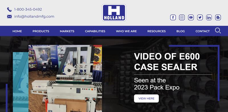
By combining straightforward navigation with easily accessible contact information, Holland builds trust and helps potential buyers move through the site with confidence.
The Psychology of Navigation Trust
B2B buyers approach websites with healthy skepticism. They're risk-averse by nature because their decisions affect entire organizations. Confusing navigation triggers their caution instincts immediately. If finding basic information is difficult, what else might be problematic?
Here are three navigation elements that build trust and increase buyer confidence:
- Clear Navigation: Clear navigation reduces perceived risk by demonstrating competence. It shows that you understand how to organize complex information, a skill that translates directly to managing challenging projects or services. For engineering firms or industrial manufacturers, this organizational competence is especially important.
- Consistent Information Placement: Meeting expectations builds confidence incrementally. When visitors find information where they expect it, each successful interaction increases trust. The About page contains company information. The Products section shows your offerings. The Contact page provides ways to reach you. These might seem obvious, but violating these conventions erodes confidence quickly.
- Smooth, Predictable Navigation Patterns: Navigation patterns become even more critical for risk-averse buyers evaluating expensive solutions. They're looking for any red flag that might indicate problems ahead. Smooth, predictable navigation suggests a vendor who'll be similarly organized and reliable in their business dealings. It's not just about finding information. It's about what the experience of finding that information says about working with your company.
The Anatomy of Effective B2B Navigation
Your main navigation menu carries enormous weight. Within a handful of menu items, it needs to communicate:
- What you offer
- Who you serve
- How visitors can engage with you
The Sweet Spot
Research shows that 5-7 main menu items hit the sweet spot between comprehensive coverage and cognitive overload. More than seven items overwhelm visitors with choice. Fewer than five might oversimplify your offerings. The key is grouping related content logically so that each menu item represents a clear category of information.
A manufacturing company might use:
- Products
- Industries
- Services
- Resources
- About
- Contact
Simple, clear, comprehensive.
The Importance of Visual Hierarchy
Visual hierarchy in your menu design guides attention to what matters most. Factors that help visitors process options quickly include:
- Slightly larger text for primary items
- Subtle color differences for CTAs
- Strategic use of space
But avoid getting too creative. B2B buyers want clarity over artistic expression.
Mega Menus for Complex Sites
When you have extensive content, mega menus become invaluable. These expanded dropdown panels can display dozens of options in an organized, scannable format. The key word here is "organized." A mega menu without clear structure is just a wall of confusing links.
88% of top e-commerce sites use mega menus to handle extensive content. For B2B sites with complex offerings, mega menus prevent users from having to click through multiple layers of navigation, letting them see broad options at a glance.
How to Organize a Mega Menu
Here are three crucial factors for building an organized mega menu that doesn’t overwhelm buyers:
- Group Related Items Under Descriptive Subheadings: If you manufacture industrial equipment, don't just list 50 products alphabetically. Organize them by application, industry, or product category. Add brief descriptions where helpful to guide selection.
- Prioritize the Most Common Needs: Avoid the temptation to include everything in your mega menu. Just because you can display 100 links doesn't mean you should. Focus on the options visitors most commonly need. Less common pages can live in footer navigation or be discoverable through search.
- Simplify Your Visual Design: Visual design makes mega menus usable or overwhelming. Use columns to create clear sections. Add subtle borders or background colors to define areas. Include whitespace to prevent the claustrophobic feeling that comes from densely packed links. Consider adding icons for major categories, but only if they genuinely aid recognition.
How Asana Uses a Structured Mega Menu to Guide Users
Asana’s navigation menu highlights four key categories: Product, Solutions, Resources, and Pricing. Each category features a well-structured mega menu, broken into clear sections with simple, accessible headers.
For example, the “Solutions” menu expands to show company type (enterprise, small business, nonprofit), teams (operations, marketing, IT, leaders), industries (healthcare, retail, financial services, education, manufacturing), and use cases that provide additional social proof for hesitant buyers.
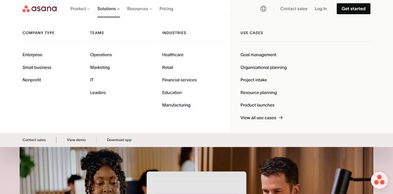
Well-organized mega menus like this make it possible to present extensive options without overwhelming visitors, helping users find relevant content quickly and confidently.
Secondary Navigation Elements
Beyond your main menu, secondary navigation elements play crucial supporting roles. These include utility navigation, footer navigation, breadcrumbs, and search functionality.
Utility Navigation
Utility navigation, typically placed above the main menu, handles important but secondary functions like:
- Login links
- Support access
- Phone numbers
- Language selection
These don't merit main menu space but need to be easily accessible.
Footer Navigation
Footer navigation serves as a comprehensive backup. While visitors shouldn't have to scroll to the footer to find critical information, it provides a safety net for everything else. Include links to:
- Legal pages
- Detailed product categories
- Company information
- Resources
Think of it as an expanded sitemap that's always available. For example, Resend’s footer provides comprehensive access to all site content without cluttering the site’s main menu. Links are clearly broken down into simple categories like documentation, resources, company, help, handbook, and legal. On the left-hand side, visitors will find Resend’s address and links to their social profiles for ease of access.

By combining clear organization with consistent availability, this footer helps users navigate the site efficiently and reinforces trust in the brand.
Breadcrumbs
Breadcrumbs become essential on complex sites with deep information architecture. That’s because they:
- Show visitors where they are and how they got there
- Provide an easy path back to broader categories for visitors deep in technical specifications
- Reinforce your site's organization, helping visitors build a mental model of your content structure
Search Functionality
Search functionality deserves special attention. 43% of visitors go immediately to the search bar to find the information they’re seeking. Make your search bar prominent, not hidden behind an icon. Include it in your header where it's always accessible. A hidden search function might as well not exist for many users.
Sticky Navigation and Headers
Sticky navigation keeps important menu options visible as visitors scroll. For long pages common on B2B sites, this prevents the frustrating scroll back to the top just to navigate elsewhere. But sticky headers need careful implementation to avoid eating up precious screen space.
Best Practices
Implement sticky navigation following these best practices:
- Include Only Essential Elements: The main navigation menu, search bar, and primary CTA usually suffice. Secondary elements can disappear on scroll to maximize content space.
- Prioritize Mobile Usability: Mobile considerations become even more critical here, where screen real estate is limited. Test how the sticky header affects readability, scrolling, and tap targets to avoid frustrating mobile users.
- Monitor Your Analytics Carefully: Some sites see significant conversion improvements from sticky navigation. When contact or demo request buttons remain visible, visitors can act on interest immediately rather than hunting for conversion points. But monitor your analytics carefully. If sticky headers increase navigation usage but decrease time on page, you might be making it too easy for visitors to leave before consuming content.
How Berlin Packaging Uses Sticky Navigation to Keep Key Options Front and Center
Berlin Packaging’s sticky navigation header stays fixed while scrolling, keeping important options accessible without requiring prospects to scroll all the way back to the top. This approach ensures that no matter where a visitor is on the page, critical navigation items like product categories, search, and contact options are always visible, reducing frustration and helping buyers move efficiently through the site without interrupting the browsing experience.
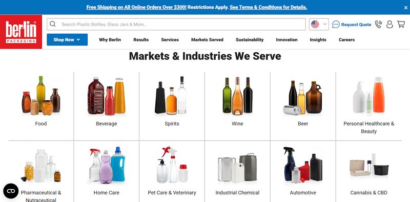
For B2B marketers, implementing a similar approach can improve user experience by reducing friction and helping buyers quickly reach product pages, resources, or contact points. Consistently visible navigation also reinforces key messages and ensures calls-to-action are always within reach, supporting higher engagement and conversion rates.
Mobile Navigation Considerations
Mobile navigation for B2B sites requires special thought. Follow these best practices to ensure your navigation remains clear and functional on smaller screens:
- Explore Mobile Menu Options Beyond the Hamburger: While hamburger menus are standard on mobile, they hide options that B2B buyers need to evaluate your company. Consider alternatives like priority navigation that shows key items and hides others under a "more" option.
- Implement Progressive Disclosure: Progressive disclosure helps manage complexity on small screens. Start with main categories, then reveal subcategories as needed. This prevents overwhelming mobile users while still providing access to detailed information.
- Ensure Buttons and Links Are Easy to Tap: Making touch targets large enough for easy tapping is especially important for users in industrial settings who might be wearing gloves.
- Accommodate Varying Use Cases (Without Sacrificing Functionality): Screen size optimization goes beyond just making menus fit. Consider the mobile context of your B2B buyers. An engineer on a factory floor needs different quick access than an executive reviewing options during a commute. Your mobile menu should flex to meet these use cases while maintaining clarity and efficiency.
For more information about B2B website structure and best practices:
- B2B Website Design Best Practices: The Complete 2025 Guide
- B2C vs B2B Website Design: Key Differences That Impact Conversion
Organizing Your Navigation by Buyer Needs
How you organize your navigation fundamentally shapes how visitors experience your site.
Solution-Based vs. Industry-Based vs. Problem-Based vs. Hybrid
Solution-based navigation organizes content around what you provide. Industry-based navigation organizes around who you serve. Problem-based navigation organizes around challenges you solve. Each approach has merit, and the best choice depends on how your buyers think about their needs.
Solution-Based Navigation
- When It Works: Solution-based navigation works well when buyers know what type of solution they need. An engineering firm seeking automation software has a clear solution in mind. They'll look for "Software" or "Automation Solutions" in your menu. This approach provides a direct path for buyers with defined requirements.
- Potential Downside: The downside is that this approach assumes visitors already know which solution fits their needs.
Industry-Based Navigation
- When It Works: Industry-based navigation excels when your offerings vary significantly by sector. A construction company has different needs than a pharmaceutical manufacturer, even when buying similar equipment. Organizing by industry lets you immediately speak their language and address sector-specific requirements.
- Potential Downside: This approach can frustrate visitors who don't fit neatly into your defined industries or who serve multiple sectors themselves.
Problem-Based Navigation
- When It Works: Problem-based navigation connects with buyers still defining their needs. Instead of "Inventory Management Software," you might have "Reduce Stock-outs" or "Optimize Warehouse Operations." This approach resonates with buyers focused on outcomes rather than specific solutions.
- Potential Downside: The challenge is accurately identifying and articulating the problems your audience faces.
The Hybrid Approach
Many successful B2B sites use hybrid approaches. Your main navigation might be solution-based, with a secondary "Industries" menu that provides tailored content. Or you might lead with industries but include a "Solutions" dropdown for those with specific needs. The key is testing with your actual audience to discover what resonates.
Managing Complex Information Architecture
Deep, extensive content creates organizational challenges. The ideal navigation depth is 2-3 levels maximum. Beyond that, visitors lose track of where they are and how to get back. But what if you manufacture hundreds of products across dozens of categories?
Start With Logical, Broad Categories
Consider which categories make sense to your buyers. An industrial equipment manufacturer might start with equipment type:
- Pumps
- Valves
- Sensors
- Controllers
Within each category, you can then organize by:
- Application
- Size
- Technical specifications
The goal is creating a path that feels intuitive at each step.
Create Logical Subcategories
This approach requires you to understand how your buyers think about your products. Do they search by:
- Technical specifications?
- Application?
- Industry?
Your categorization should match their mental models, not your internal product codes or organizational structure.
Cross-Link Related Content
This strategy prevents dead ends. If someone's reading about a specific pump, they should easily find:
- Compatible valves
- Installation guides
- Case studies
These contextual links help buyers build complete understanding without backing out to main navigation repeatedly.
How NXP Makes Extensive Product Navigation Simple for B2B Buyers
Semiconductor manufacturing company NXP features a well-organized product page that helps buyers navigate their extensive catalog. Accessible directly from the main navigation menu, the page provides multiple ways for visitors to find what they need. Users can select links at the top of the page, browse all product categories via the left-hand menu, or scroll through sections like “Newest Products,” “Processors and Microcontrollers,” and “Analog and Mixed Signal.”
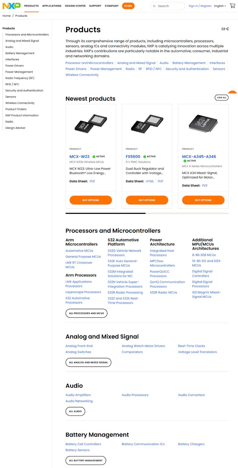
Additionally, the sticky navigation menu keeps search functionality and other key navigation items—such as “Applications,” “Support,” and “Store”—always within reach, making it easier for prospects to explore products efficiently.
Navigation for Different Visitor Types
Effective website navigation adapts to the needs of different types of visitors, guiding each group toward the content that matters most.
- First-Time Visitors: First-time visitors need orientation. They don't know your company, your offerings, or your site structure. Your navigation must quickly communicate what you do and guide them toward relevant content. Clear, descriptive labels and logical organization help newcomers understand their options.
- Returning Visitors: Returning visitors have different needs entirely. They've already explored your overview content. Now they want to dive deeper into specific areas or find that document they glimpsed last week. Supporting these return visits means making detailed content accessible without forcing them through introductory material again.
- Users Versus Choosers: The user versus chooser dynamic requires special consideration. Create clear paths for both technical users seeking specifications and decision-makers seeking business value. This might mean having both "Technical Specs" and "Business Benefits" as navigation options, or providing role-based entry points that guide each audience appropriately.
- Anonymous Visitors: Anonymous visitors browse differently than logged-in users. While you can't customize navigation for every anonymous visitor, you can provide clear paths for common user types. Once visitors log in, you might provide additional navigation options based on their role or past behavior. But be careful not to hide critical information behind login walls, as this frustrates researchers in early evaluation stages.
Essential Pages Every B2B Site Needs
Certain pages appear so consistently across successful B2B sites that their absence becomes conspicuous. Below, we cover the essential pages every B2B website needs, along with examples of what type of content to include on each page.
About or Company Page
Your About or Company page builds trust by sharing your:
- Story
- Leadership
- Values
Visitors expect to find this easily, usually in main navigation. This page proves you're a real company with real people, not just a website.
Resources or Insights Sections
Resources or Insights sections support the research-heavy B2B buying process. Include content that helps buyers educate themselves, such as:
- White papers
- Guides
- Webinars
- Blog posts
This content demonstrates expertise while nurturing prospects through long sales cycles. Make this section prominent in navigation rather than buried in footers.
Case Studies or Success Stories
Case Studies or Success Stories provide the social proof B2B buyers require. They want to see companies like theirs succeeding with your solution. These pages deserve prominent navigation placement, not hiding under vague labels like "Customer Stories" that visitors might miss.
Pricing or Plans Pages
Pricing or Plans pages address the elephant in the room. Even if you can't provide exact pricing, you can build trust by offering:
- Ranges
- Starting points
- Factors that affect cost
Hiding pricing entirely frustrates buyers and suggests you might be unaffordable. Make pricing information accessible through clear navigation, even if it's just a "Pricing Guide" or "Investment Levels" page.
Contact or Get Started Pages
Contact or Get Started pages provide clear next steps. Every visitor should be able to find how to reach you within seconds. Include multiple contact methods and make it clear what happens next.
These pages often deserve multiple access points:
- Main navigation
- Utility navigation
- Prominent CTAs throughout your site
For more information about B2B website content and messaging:
Navigation Patterns That Convert
The Hub-and-Spoke Model
The hub-and-spoke model creates a central landing page for each major topic, with related pages branching off from that hub. This works exceptionally well for complex B2B offerings that need extensive explanation. Your "Solutions" page becomes a hub, with individual solution pages as spokes providing detailed information.
This pattern helps visitors understand relationships between your offerings. A professional services firm might have a "Services" hub that overview their capabilities, with spokes leading to detailed pages about consulting, implementation, training, and support. Visitors can start broad and drill down as their interest develops.
Navigation Cues
Implementation requires careful attention to navigation cues, such as:
- Clear Links: Each spoke page should clearly link back to the hub and to related spokes.
- Breadcrumbs: Breadcrumbs become essential for maintaining orientation.
- Strong Visual Design: The hub page itself needs strong visual design to make the various options clear without overwhelming visitors with choices.
How Heffernan Financial Guides Buyers Through Its Services
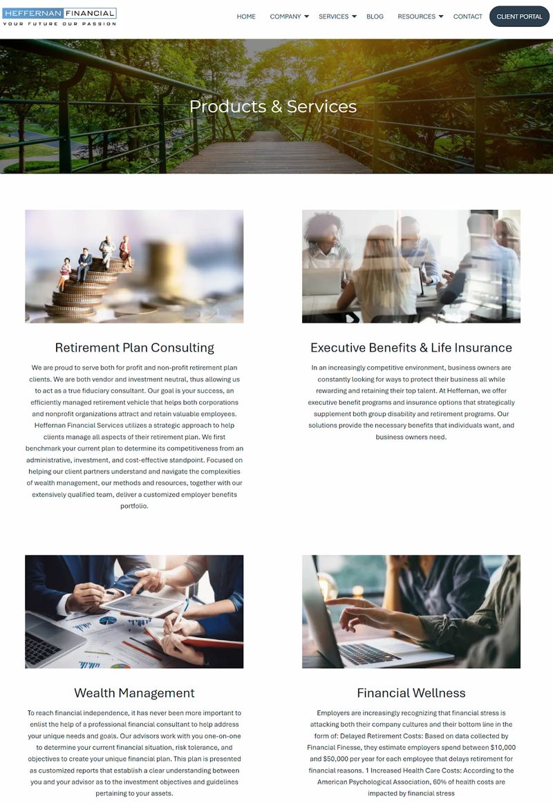
Heffernan Financial’s “Products & Services” page serves as a hub page, providing an overview of the different categories of financial solutions they offer: retirement plan consulting, executive benefits and life insurance, wealth management, and financial wellness. This page provides a brief, 3-5-sentence overview of each product or service offering, with a link to a detailed page that covers each topic in depth.
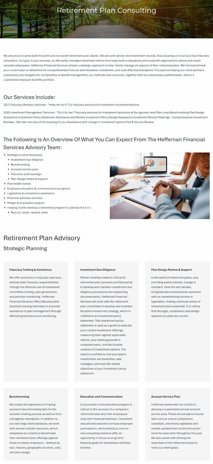
For example, visitors who click the “Retirement Plan Consulting” link will be taken to this page, where Heffernan Financial dives into a summary of their strategic retirement plan consulting approach, a list of their services, and an overview of each element of their retirement planning strategy.
This hub-and-spoke content model works so well for professional service firms and other B2B companies because it organizes complex information into digestible sections, allowing prospects to explore topics at their own pace while maintaining a clear site structure.
Progressive Disclosure
Progressive disclosure reveals complexity gradually rather than overwhelming visitors immediately. Start with high-level categories that anyone can understand. As visitors show interest by clicking deeper, provide more detailed options. This approach respects both newcomers who need orientation and experts who need specifics.
For a construction equipment manufacturer, the first level might show major equipment categories. Clicking "Excavators" reveals size classes. Selecting a size class shows specific models. Each level provides enough information to make an informed choice about whether to continue deeper.
Maintaining Clarity
Maintaining clarity through progressive layers requires you to:
- Ensure Each Level Feels Complete: You don’t want prospects to feel like you're hiding information.
- Provide Sufficient Context: Offer enough context at each stage so visitors understand what they'll find by going deeper.
- Use Consistent Patterns: Consistent patterns will help ensure the progression feels natural rather than maze-like.
Action-Oriented Navigation
Effective navigation not only helps visitors find information but also guides them toward taking meaningful actions that advance their buyer journey.
- Use Verbs and Outcome-Focused Language: Instead of passive labels like "Services," you might use "Explore Solutions" or "Get Started." This subtle shift from noun-based to verb-based navigation drives engagement by encouraging visitors to take action rather than just browse.
- Place CTAs Strategically Within Navigation: This strategy multiplies opportunities for conversion. Your main menu might include a highlighted "Request Quote" or "Schedule Demo" option. These aren't traditional navigation elements, but they provide clear next steps for interested visitors at any point in their journey.
- Create Clear Pathways to Conversion: This means thinking about navigation as a funnel, not just an organizing system. Each menu item should lead somewhere specific, whether that's deeper education, proof of capability, or direct contact. Remove navigation options that don't ultimately support your conversion goals.
- Provide Clear Action Options: The balance between information and action requires careful calibration. Too many CTAs in navigation feels pushy. Too few CTAs in navigation misses opportunities with interested visitors. The key is providing clear action options without obscuring the informational content visitors need to make informed decisions.
For more information about driving conversions:
- B2C vs B2B Website Design: Key Differences That Impact Conversion
- B2B Buyer Journey Mapping: Building Websites That Convert
Common B2B Navigation Mistakes
Mistake #1: Organizing by Internal Structure
One of the most damaging navigation mistakes is organizing your site based on how your company is structured rather than how customers think. Your prospects don't care that Product Development and Professional Services are different departments. They care about solving their problems.
Visitors arrive with questions like "Can you help me reduce manufacturing downtime?" not "Which department handles predictive maintenance sensors?" When navigation mirrors org charts, visitors must translate their needs into your internal language. Most won't bother. They'll find a competitor whose site speaks their language instead.
Use Customer Research to Guide Your Site Structure
Better organization starts with customer research.
- How do your buyers describe their needs?
- What language do they use?
- What mental models do they have about solutions in your space?
A manufacturing company might discover their buyers think in terms of production stages rather than equipment types. Navigation should reflect that reality.
Mistake #2: Hiding Critical Information
Transparency builds trust, yet many B2B sites hide essential information behind forms, vague labels, or deep navigation paths. Pricing is the most common hidden element, but technical specifications, implementation requirements, and support options often suffer the same fate.
The fear behind hiding information is understandable. Maybe pricing varies significantly. Maybe you want to qualify leads before sharing details. But consider the buyer's perspective. They're comparing multiple vendors. The one that makes evaluation easier usually wins.
Creative Solutions for Complex Pricing
These solutions build trust while respecting pricing complexity:
- Provide ranges, starting points, or a pricing calculator
- Share case studies with investment levels
- Explain factors that affect cost
The cost of making buyers hunt for information compounds over time. Each frustrated visitor who can't find basics like integration requirements or support levels represents a lost opportunity. Worse, they often share their frustration with colleagues, multiplying the negative impact.
Mistake #3: Neglecting Search Functionality
Many B2B sites treat search as an afterthought, hiding it behind a tiny magnifying glass icon or omitting it entirely. This ignores the reality that 43% of visitors turn to search when they can't immediately find what they need through navigation. For visitors who know exactly what they want, search provides the fastest path.
Implementing Effective Search
You’ll need to do more than just add a search box to implement effective site search.
- Ensure results are relevant, filterable, and clearly presented
- Include filters for content type, product category, or document format
- Show preview text so visitors can evaluate results without clicking through to each one
Search bar design affects usage rates significantly. Hiding key navigation options, including the search bar, reduces discoverability and task completion rates by more than 20% compared to when navigation remains visible. On desktop specifically, users complete tasks 39% more slowly when navigation options like search bars are hidden and report a 21% higher level of perceived difficulty.
A persistent search bar in your header makes it clear that searching is an option. For content-heavy B2B sites, search isn't optional. It's essential navigation infrastructure.
How Amazon Filters Enhances Navigation with Search
Amazon Filters features a prominent search bar at the top of its industrial website, which serves as a navigation safety net for visitors who prefer to search rather than browse. The site’s entire navigation menu—including the search bar—is sticky, so buyers who scroll and can’t find what they’re looking for can begin a search without having to scroll all the way back to the top of the page or return to the website’s homepage.
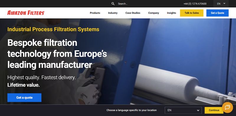
Prominent, sticky search functionality ensures visitors can quickly find products or information, reducing frustration and keeping them engaged. For B2B marketers, providing an always-accessible search option can complement traditional navigation and support faster, more efficient buyer journeys.
Mistake #4: Overcomplicating the Journey
Analysis paralysis is real. When faced with too many navigation options, visitors freeze. They can't determine the best path forward, so they choose the easiest option: leaving. B2B sites often create this paralysis by trying to surface every possible page in navigation.
Over-categorization creates similar problems. When you divide products into dozens of micro-categories, finding anything becomes an exercise in frustration. A valve manufacturer doesn't need separate navigation categories for every valve size. Broader categories with good filtering serve visitors better than hyper-specific navigation that requires encyclopedic knowledge to navigate.
Simplifying Navigation Options
Simplification doesn't mean hiding content. It means organizing it logically and progressively.
- Start with clear, broad categories that anyone can understand
- Provide filtering and search for those who need specifics
- Use landing pages to guide visitors toward relevant content rather than expecting navigation alone to do all the work
Mistake #5: Ignoring Accessibility
B2B sites often overlook accessibility, assuming their professional audience doesn't include users with disabilities. This assumption is both wrong and potentially illegal. Accessibility isn't just about compliance. It's about ensuring all potential buyers can evaluate your offerings.
Keyboard navigation support matters for users who can't or prefer not to use a mouse. Can someone tab through your menu options? Can they activate dropdowns with the enter key? Many B2B buyers work in environments where mouse use is impractical, making keyboard support essential.
Making Your B2B Website Accessible
Here are four key components of B2B website accessibility to implement on your site:
- Screen Reader Compatibility: This ensures visually impaired users can navigate your site.
- Proper Structure and Labels: Proper heading structure, descriptive link text, and ARIA labels make navigation usable for screen reader users.
- Color Contrast: Meeting color contrast requirements ensures that text remains readable for users with vision impairments.
- Click Target Sizes: Proper click target sizes matter for users with motor impairments or those using touch screens.
For more information about website transparency:
- Web Accessibility: Practical Compliance for B2B Sites
- B2B Website Costs: A Complete Pricing Guide for 2025
Testing and Optimizing Your Navigation
User Testing
Real user feedback reveals navigation problems that seem invisible from the inside. Use these user testing methods to learn how users actually interact with your navigation—and where your navigation falls short of meeting their expectations.
Card Sorting
Card sorting exercises help you understand how your audience mentally organizes information. Give users cards with your content topics and ask them to group and label them. Their organization often differs dramatically from your assumptions.
Tree Testing
Tree testing evaluates your proposed navigation structure without visual design influence. Users receive tasks like "Find information about equipment maintenance contracts" and navigate through your menu structure. This reveals whether your labels and organization make sense to actual users. If people consistently choose wrong paths or give up, your structure needs work.
First-Click Testing
First-click testing measures whether users choose the correct navigation option for specific tasks. Research shows that when users get their first click right, they complete tasks successfully 87% of the time. When the first click is wrong, success drops to 46%. This dramatic difference highlights why clear navigation labels and organization matter so much.
Session Recording and Heatmap Analysis
Session recordings and heatmap analysis show how real visitors interact with your navigation.
- Where do they hover?
- What do they click?
- Where do they get confused?
Heatmap tools like Hotjar and Crazy Egg reveal patterns you'd never discover through guesswork, like which navigation elements get the most attention and which get ignored. Maybe visitors consistently hover over a menu item expecting a dropdown that doesn't exist. Maybe they're clicking non-navigational elements expecting them to be links.
In this heatmap overlay tool result for Quick Sprout, you can see that “Websites” and “Blogging” are the most-clicked items in the main navigation menu, followed by “Marketing” and “Other.” Meanwhile, “Ecommerce,” “HR,” “Tech,” “Startup,” and “Finance” are clicked far less.
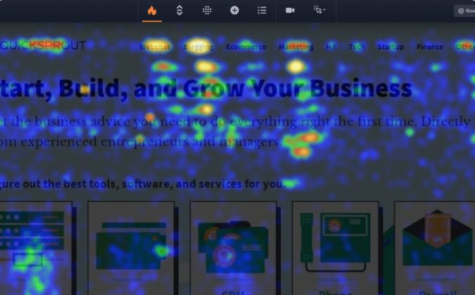
This result reveals valuable insights into visitor behavior, showing which navigation items attract engagement and which may need rethinking or better visibility.
Key Metrics to Track
Tracking the right metrics ensures you identify both strengths and weaknesses in your navigation.
Click-Through Rates
Navigation performance measurement starts with click-through rates on menu items.
- Which options get used most?
- Which options get ignored?
- Are users clicking items in the order you expect, or are they bypassing key options entirely?
Low click rates might indicate unclear labels or unnecessary options. High rates on unexpected items might reveal important content buried too deep.
Time to Find Information
Time to find information provides a crucial benchmark. Test how long it takes users to locate key pages like:
- Pricing
- Contact information
- Specific products
The 10-20 second rule applies here. If finding essential information takes longer, you're losing prospects.
Task Completion Rates
Task completion rates measure navigation effectiveness for specific goals. Can visitors successfully:
- Request a quote?
- Find technical specifications?
- Download a white paper?
Track completion rates for critical tasks and investigate when they fall below expectations.
Search Usage Patterns
Search usage patterns indicate navigation failures. High search usage might mean visitors can't find what they need through menus. Common search terms reveal navigation gaps. If everyone searches for "pricing" but you've labeled it "Investment Levels," you've identified an easy fix.
Conversion Impact by Navigation Path
Conversion impact by navigation path shows which routes through your site lead to desired actions. Maybe visitors who use your Industries menu convert at twice the rate of those using Products. This insight helps you optimize navigation to guide more visitors down successful paths.
Iterative Improvements
Navigation is never truly finished. Continuous testing and refinement ensure it evolves to meet your user needs while supporting your business goals.
Implement A/B Testing
A/B testing navigation changes prevents costly mistakes. Test one change at a time to understand its impact. Maybe you're considering renaming "Solutions" to "Products & Services." Test it with a portion of traffic before committing. Sometimes changes that seem logical actually confuse visitors.
Test Mega Menus Versus Dropdowns
Testing mega menus versus traditional dropdowns can significantly impact engagement. Research on navigation patterns shows that mega menus often increase navigation usage by exposing more options, but they might overwhelm certain audiences. Test both approaches with your specific visitors to see what works best for your situation.
Refine Gradually
Gradual refinement beats dramatic overhauls. Major navigation changes disorient returning visitors who've learned your current structure. Instead:
- Make incremental improvements based on data
- Rename confusing labels
- Reorganize problematic sections
- Add missing options
Each small improvement compounds over time.
Approach Major Restructuring Methodically
Here’s how to take a methodical approach when major navigation restructuring becomes necessary:
- Start with extensive user research to understand current problems
- Design multiple potential solutions and test them thoroughly
- Prepare clear communication about changes for existing users
- Consider running old and new navigation in parallel briefly to ease the transition
- Monitor metrics closely after launch to catch unexpected issues
For more information about website updates and redesigns:
- B2B Website Redesign: When to Update and How to Plan
- B2C vs B2B Website Design: Key Differences That Impact Conversion
- B2B Website Design Best Practices: The Complete 2025 Guide
Industry-Specific Navigation Examples
Professional Services Navigation
Professional services firms face unique navigation challenges. Potential clients often arrive unclear about which service they need. They know they have a business challenge but might not know whether they need consulting, implementation, or training. Navigation must guide them from problem to appropriate solution.
Structure by Service Lines
Organizing by service lines makes sense when clients know what they want. Management consulting, technology implementation, and change management deserve distinct sections. But also consider problem-based navigation that helps uncertain visitors. "Improve Operations," "Digital Transformation," or "Organizational Change" speak to outcomes rather than services.
Reinforce Credibility Through Navigation
Highlighting expertise and credentials through navigation builds essential trust. Professional services buyers heavily weigh expertise when selecting providers. Trust-building elements like these should be easily accessible:
- Credentials
- Certifications
- Team profiles
- Thought leadership
These trust-builders shouldn't hide in footer links but deserve prominence in main navigation.
SaaS/Technology Navigation
Engineers want technical details while executives want business impact. Successful SaaS navigation provides paths for both without forcing either through irrelevant content.
Feature-Based vs. Benefit-Based Organization
Feature-based organization works for technically sophisticated buyers who know what capabilities they need. You need clear navigation paths for feature-based content like:
- API documentation
- Integration guides
- Technical specifications
But benefit-based organization serves business buyers better. "Reduce Costs," "Improve Efficiency," or "Ensure Compliance" resonate with executives focused on outcomes.
Strategically Offer Free Trials and Demos
Supporting free trials and demos requires special navigation consideration. These conversion points need prominence without overwhelming the evaluation experience.
- Include clear CTAs in utility navigation and strategic points throughout the site
- Place links to free trials, demos, or upgrade options near product details, case studies, or feature explanations so users can take the next step without leaving the page
- Ensure trial users can easily access support, documentation, and upgrade paths through dedicated navigation
Manufacturing/Industrial Navigation
Manufacturing and industrial companies typically manage extensive product catalogs that challenge traditional navigation approaches. Hundreds or thousands of SKUs can't all appear in dropdown menus. Smart categorization and filtering become essential.
Match Your Structure to Buyer Mental Models
Depending on how buyers search, product navigation might be organized by:
- Application
- Industry
- Technical specifications
A pump manufacturer might organize by:
- Fluid type
- Flow rate
- Industry application
The key is matching your organization to buyer mental models, discovered through customer research.
How Thomasnet Guides Buyers Through a Complex Catalog
Industrial sites need sophisticated product navigation to help buyers find specific items among thousands of options. Product sourcing and supplier platform Thomasnet clearly segments their navigation to meet the needs of two key target audiences: buyers and suppliers.

For example, B2B prospects who click the “For Buyers” link in search of suppliers and products will arrive on this page, where they can:
- Click the “Suppliers” dropdown to select “All,” “Suppliers,” “Products,” “CAD Models,” “Diverse Suppliers,” or “Insights”
- Search by category, company, or brand
- Choose the “All Regions” dropdown to find suppliers and products in a specific region
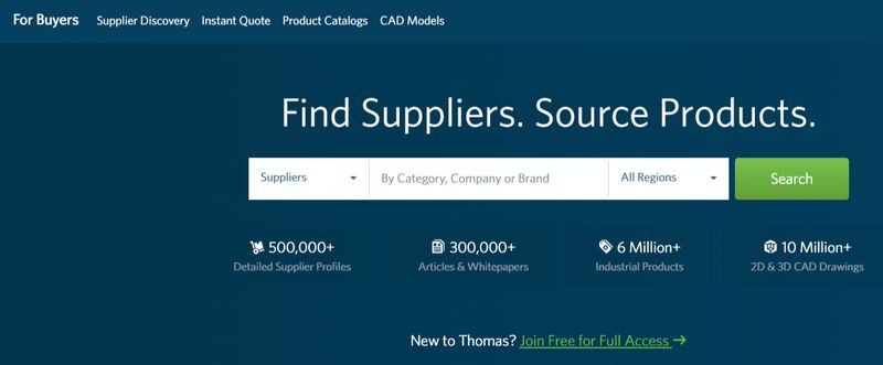
This segmented and flexible search functionality ensures buyers can quickly locate the exact products or suppliers they need, improving efficiency and overall user satisfaction while reducing friction in the sourcing process.
Support Research and Ordering
Supporting both research and ordering adds complexity. Researchers need:
- Specifications
- CAD files
- Application guides
Purchasers need:
- Pricing
- Availability
- Order history
Navigation must serve both without forcing all visitors through purchase-oriented paths. Consider separate "Learn" and "Buy" paths that converge when appropriate.
Conclusion: Your Navigation Roadmap
Clear, thoughtful navigation isn't just a nice-to-have for B2B website design. It's the foundation that determines whether your site generates leads or frustrates prospects into choosing competitors. The difference between confusing navigation and clear guidance can mean doubling your conversion rates. For B2B companies where each lead represents significant revenue potential, navigation optimization offers one of the highest ROI improvements you can make.
Key Principles of Navigation Optimization
The key principles remain consistent across industries:
- Organize based on how buyers think, not how your company is structured
- Support multiple stakeholders with different information needs
- Provide clear paths through complex information
- Build trust through transparency and logical organization
- Test with real users rather than assuming what works
Your Next Steps
Follow these steps to ensure your site effectively guides visitors while supporting your business goals.
Step #1: Audit Your Current Navigation With Fresh Eyes
Better yet, ask someone unfamiliar with your company to find specific information.
- Can they locate pricing information within 20 seconds?
- Can they understand what you offer and who you serve from your main menu?
- Do they get lost in complex sections or confused by unclear labels?
Step #2: Map Your Navigation to Buyer Journey Stages
Early-stage researchers need different navigation paths than ready-to-buy decision-makers. Ensure your structure serves visitors throughout their journey, from initial problem recognition through vendor selection. Each stage should have clear, findable content that moves visitors toward the next phase.
Step #3: Test Against the 10-20 Second Rule
This testing provides a concrete benchmark. Pick five critical pieces of information buyers need:
- Pricing
- Contact information
- Product specifications
- Case studies
- Service descriptions
Time how long finding each takes. If any exceed 20 seconds, you've identified priority improvements.
Step #4: Simplify and Clarify Labels
This step offers quick wins with minimal risk. Replace internal jargon with language your customers actually use. "Solutions Suite" becomes "Products." "Success Stories" becomes "Case Studies." These small changes can significantly improve navigation success rates without structural overhaul.
What to Keep in Mind as You Begin Your Navigation Optimization Journey
Implementation should be incremental rather than revolutionary. Start with your biggest pain points identified through testing. Make one improvement at a time and measure the impact. This approach minimizes risk while building momentum through successive wins.
Remember: navigation is an investment in conversion optimization that pays dividends over time. Every qualified prospect who successfully finds the information they need represents protected revenue. Every confused visitor who finds clarity becomes a potential advocate.
In the competitive B2B landscape, the companies that make evaluation easiest often win. Make your navigation a competitive advantage rather than a barrier, and watch your conversion metrics improve accordingly.