18 Great-Sounding Web Design Ideas that are Actually Bad
Bad web design advice is everywhere. We hear it practically every day in our line of work from clients who just want the best for their business.
Unfortunately, just because something sounds like a good idea doesn’t mean it’s in keeping with web design best practices. And for many of the businesses we work with, that great-sounding idea is the very thing holding them back by driving away potential customers.
So we’ve taken it upon ourselves to refute some of the web design “bright ideas” we hear most often and offer our own recommendations instead. Which of these practices are currently in place on your website?
Bad idea 1: Visuals without a strategy
Too often, people think of web design as simply how a website looks, but there’s more to it than pretty fonts and soothing colors. Good design takes user experience into account and creates elements that function flawlessly, are easy to interact with, and are helpful to your users.
Make no mistake, the visuals are important — in fact, 48% of people cited design as the No. 1 factor in deciding the credibility of a business.
But the best websites are attractive AND functional. Remember, the primary function of your website is to get visitors to buy your products or services, and if they can’t even find the purchase button, there’s a big problem.
Curious about what makes for good site design? Our Beginner’s Field Guide to Web Design Best Practices goes into more detail.
Bad idea 2: Desktop-only design
Gone are the days when you could throw together a website that looked “good enough” on your desktop and be done with it. Now that roughly half of all website traffic comes from users on mobile devices, having a responsive website — i.e., one that scales to fit any screen size while offering the same ease of use on any device — is an absolute must.
Take a look at your website on a smartphone or tablet. Does it automatically resize to fit your smaller screen? Is the text easily legible? Are the buttons a convenient size to tap? Can you see the full images without interference from any of the other elements on the page?
If you answered no to any of the above questions, then your site has room for improvement.
Here at Trajectory, every website we build is fully responsive so that you can hit the ground running with everything you need for a thriving online presence, no matter what devices your visitors use.
Bad idea 3: Homepage-focused design
Here’s a myth that really grinds our gears: Your website’s homepage is the only one that matters.
The truth is that while your homepage often gets the most visits, it’s far from the only one that matters, either to your visitors or to Google.
Think about how you typically stumble onto a new website. Chances are you find it by googling a term or phrase, then clicking the search result that promises to be most helpful, like a blog post or an About page. From there you probably click over to the homepage, but it’s not likely to be the first one you encounter on that website.
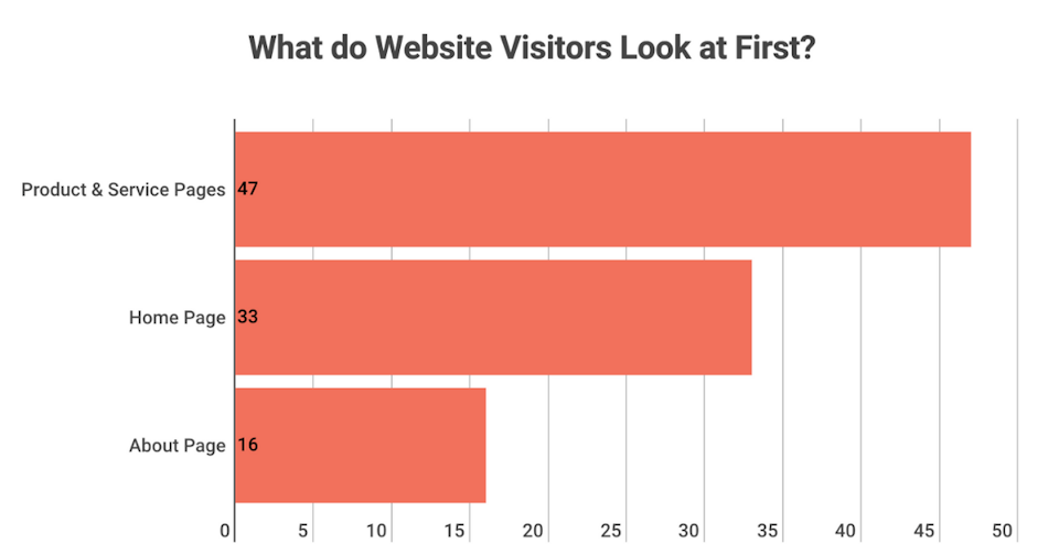
Studies support this behavior pattern. According to a 2015 Web Usability Report, 47% of first-time website visitors look at a company’s products and services first, compared to only 38% who look at the homepage first.
If your homepage is the only one with great design, strategy, copy, and imagery, your visitors may never even find their way there. So to avoid losing users before they can convert into customers, the same amount of planning and strategy has to go into every single page on your website, and not just the homepage.
Bad idea 4: Placing calls to action only above the fold
One misconception we hear a lot from new clients is that the call to action on a web page has to be above the fold — i.e., high enough that you don’t need to scroll to see it. The problem with this is that every page on your website has a different purpose, and where your call to action works best on one page won’t necessarily yield optimal results on another.
For example, the goal of your homepage is to briefly introduce your company and encourage visitors to learn more. A call to action above the fold works well here to grab users’ attention and lure them deeper into your site.
Conversely, the goal of your Services page is to show visitors how you can help them and encourage them to make a purchase. But most people want to learn about your offer or service before purchasing, so asking them to give you money before they’ve even learned what they’re buying is simply premature.
On average, people need to consume 3-5 pieces of content before deciding to buy from you, so placing your call to action lower on the page below that content increases the chance that they’ll click through.
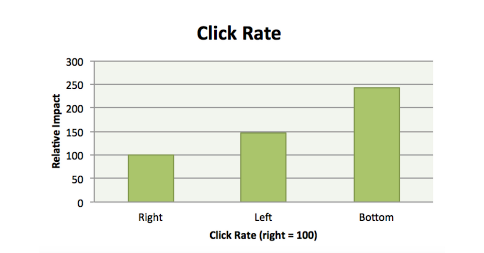
Still not convinced? A case study by Content Verve found that pages with calls to action lower on the page perform 304% better than pages with a call to action above the fold. Another study, this one from marketing expert and thought leader Neil Patel, suggests that calls to action at the bottom of a page (and on the left side) may be more effective than the same prompt placed higher:
Want to know more about using calls to action effectively? Check out our previous blog, “Everything You Need to Know About Compelling Calls to Action.”
Bad idea 5: Cluttering forms with too many fields
Forms are a fantastic way to get users to convert to leads. You can offer forms that allow people to schedule an appointment, make a reservation, send over their questions, or simply provide their contact information so that you can reach out to them.
When someone decides to fill out your form, it’s an exciting moment for your business. They’re showing that something on your website worked, you’ve piqued their interest, and they think you might be worth working with.
Unfortunately, some businesses halt this exciting process in its steps by demanding way too much information.
You have to remember that filling out a form is a big commitment for someone who’s never worked with you, and may never have even heard of you. They’re likely giving you their personal contact information, which requires increasingly more trust as consumers scrutinize how companies use their data.
Want a better website? A form is a great conversion opportunity for users on your website. Make it simple by asking for only the minimum information you need to follow up.
According to the web usability report we mentioned earlier, 69% of people said “excessive form field requirements” would deter them from completing a form, while 65% said they wouldn’t complete a form if “too much personal information” was required.
So instead of overwhelming your users with long forms asking for several pieces of their background, history, and contact information, stick to the key info that you need to get in touch. We’re talking first name, phone or email, and maybe some details about what their specific concerns may be — no more than 5 fields at the very most. You can then use your follow-up to get all that background information.
Bad idea 6: Overcrowding your site structure
Creating your site structure is tricky. The best websites have a shallow structure, succinct main navigation, and at least 300-500+ words of content per page.
Many small business owners aren’t really sure how to strike that perfect balance. The result is an ultra-cluttered website with multiple, complicated dropdown menus in the main navigation. Some pages may be missing from that main navigation. Some may have less than 200 words each. Some may bombard users with 1,000+ words of content.
Your site should only have as many pages as necessary to show visitors how you can solve their problems. Usually, this includes at least:
- Home
- About
- Services (or Products)
- Contact
Depending on your company’s needs, a strategically planned website may also include one page per service, a page to showcase past work, or a page to book appointments.
Remember, if it doesn’t help solve a customer problem, then it shouldn’t be on your website. Be choosy about which pages to include in your main navigation and keep things as simple for your visitors as possible.
Want a better website? Crafting the right site structure is about finding a balance. Users should be able to navigate to just about any page on your website within 1-2 clicks.
Bad idea 7: Allowing broken links to slip through
A broken link is a link that doesn’t lead anywhere. When you click on a broken link, you’ll be directed to an error page, where you can either close out the page or hit the “back” button.
If you have broken links on your website, it’s likely that the URL was typed incorrectly or the target page was deleted. It’s very easy for broken links to slip through the cracks and sit there for weeks, months, or years before you notice they’re broken.
Removing broken links from your site is an extremely easy and effective way to improve user experience, keep users on your site, and even improve your search engine rankings. This is a topic that we’ve written about in the past, but to reiterate: Use a free tool like Screaming Frog (or even look through your links manually) to find any broken links on your site.
All you have to do is swap out the broken URL for an updated one, or you can remove the hyperlink altogether if there’s no suitable alternative. Make sure that every single link on your website leads somewhere — and that it leads to its intended destination.
Bad idea 8: Link dumps
Link dumps are a common feature we see among low-performing websites. Some businesses offer link dumps via “Links” or “Resources” pages. A common method is to link to nearby businesses or points of interest in the town where their business is located.
But these pages do nothing good for your website. In fact, they do many bad things.
First, think about what happens when the user clicks on one of those links. They leave your site! They may have been interested in learning more about your business, but your link to a random website sent them away, especially if it opened in the same browser tab where they were viewing your site.
Next, they really aren’t good for your search engine rankings. A big factor of SEO is links — who links to your site, where they link to, and how often these links appear. Google uses links to determine which sites should appear higher in search rankings.
So links to your site can help improve your rankings, but linking away from your site sends some of your “link juice” to other websites.
This isn’t to say that you should never link to other websites. It can be a good thing to link to your social media accounts, a source that you used in a blog post, or a website that offers more information on a topic your users want to better understand. The key here is to be mindful of when and how you use these links and, if you have a page that’s dedicated to linking to other websites, just go ahead and remove it.
Bad idea 9: Pared-down mobile websites
One misconception about web design we often hear is that mobile websites need fewer features than desktop sites.
In reality, if a feature is important to the user experience for your desktop visitors, it’s just as important for your mobile audience. And if your visitors are used to features on your desktop site, it can be frustrating not to have access to them on a smartphone — after all, 57% of users say they won’t recommend a business with a poorly designed mobile site.
Instead of eliminating important features, prioritize which ones your mobile users need most and place those higher on your mobile page. The mobile version of your site may have an entirely different order of elements than your desktop site, and that’s OK, as long as the restructure is based on mobile users’ behavior.
But there’s a fine line between not enough important features on your website and too many elements that simply get in the way. Some elements may sound like a fun idea or make your page look pretty, but they simply don’t help your visitors become customers. These fun but useless features include:
- QR codes
- Intrusive pop-ups
- Animated titles and headings
- Carousel banners
- Preloaders
When it comes to good web design, sometimes less is more. If the only reason to include an element on your website is that it’s fun, cool, or pretty, chances are your visitors won’t appreciate it. Better to spend your time and money on something more useful, like marketing your new website.
Bad idea 10: Pop-ups and other interrupting elements
Years ago, someone had the idea of using pop-ups to keep customers on their site. Since then, pop-ups have spiked in popularity and then plummeted, but there are plenty of websites that still use them to inform users about a special deal, welcome visitors to their site, or even pop up to discourage people from leaving.
Pop-ups aren’t the only offender, though. Have you ever tried reading an article on Forbes’ website only to be greeted with a 5-second, page-wide ad? Forbes’ blog posts consistently rank well for a number of search terms, yet they add a massive obstacle that discourages users from viewing them.
Elements like these have two key things in common:
1. They interrupt user experience.
2. Because of that, users hate them.
Many of the business owners who still use these would rather keep people on their site than encourage them to have positive feelings about their business/website. These elements turn out to be ineffective, though, since the user will often just back out of the site as soon as they get the chance — with the intention of never returning.
Want a better website? Pop-ups, autoplay content, and other interrupting elements frustrate and annoy your website visitors. Instead, entice your users to opt into your content.
Another feature that has this effect is autoplay content, the most common of which is videos. Maybe you added a great video to your homepage after reading about the effectiveness of video marketing. But if that video plays as soon as a user loads your homepage, you’re facing the same problem as you do with pop-ups.
Autoplaying media like music or videos often happens with the best intentions. After all, you’ve heard that it’s best to share content in various media to keep your users engaged. But if your users don’t opt into that content, there’s a good chance they’ll be annoyed when it starts playing.
You also have to consider that someone may not be in a good situation for your content to autoplay. Maybe they’re browsing without headphones on, so your autoplay content disrupts the entire room. This is even worse when the user is browsing multiple tabs at once and can’t figure out the source of the noise, so they have to frantically search until they find your web page and simply close that tab.
Oftentimes, users who are greeted with autoplay content just find a way to turn it off. They pause the video, they mute their sound, or they simply back out of your site. In these cases, autoplay content forces the user to opt out rather than opting into content they find interesting. Can you guess which scenario would lead to happier, more curious users?
Bad idea 11: Thinking like your competitors
This might be the most important thing to stop doing in order to improve your website. When you want to add new design elements, begin new marketing campaigns, or write the content for your website, where do you turn for inspiration?
If you’re looking to your competitors, you may be making a big mistake.
It’s natural to want to see what the competition is up to. In fact, having a thorough knowledge of your competitors is a great way to close a sale with an interested customer. But there’s a fine line between knowing information about your competitors and looking to them for inspiration.
When you mimic designs and content that you see on your competitors’ websites, you don’t set yourself above the competition. A user who visits all of these sites may actually be confused why they’re seeing similar websites over and over, making it harder for them to see a distinct difference between you and your competitors.
Instead, look beyond your industry for inspiration. Don’t limit yourself to just your competition when you’re improving your website.
If you must look at your competition for inspo, consider what could be better about their approach. Decide where they could have included more helpful information or explained their services more clearly … and then do so on your own website.
Bad idea 12: Trying to convince customers you’re the best
One common mistake that businesses make in their content is trying to convince people that their product is worth trying, that their business has the right level of experience, that they’re the most valuable solution, and so on.
While your content will naturally highlight key points of your business with a confident tone, some business owners fall into the mindset that their content is a salesperson. But, unlike a charismatic salesperson who doesn’t take no for an answer, your site copy — your entire sales pitch — can disappear with a quick click of the “back” button.
If your visitors don’t feel like you truly understand their specific situation, they’re not going to stay on your site long enough to buy anything.
So while content can definitely help sell your business, that shouldn’t be its main purpose.
A better approach is to use it to connect with your target audience on a deeper, more emotional level. Remember that the content on your website is the voice of your brand, so consider not only what you want that voice to say, but also how you want your users to feel when they hear it.
That feeling they get will be the determining factor in whether or not they convert into loyal, paying customers.
Want a better website? Your content’s main purpose is not to sell or convince — it’s to connect.
We dove into this topic in more detail in our blog post about writing compelling website copy.
Bad idea 13: Overloading customers with too much copy
Truth be told, this isn’t as common as business owners including too little copy on their website, but that doesn’t mean it doesn’t happen.
Sometimes, business owners get really excited about their content or about a certain idea. That excitement is a great thing! But it’s not great when that excitement translates into thousands of words of copy that isn’t examined with a critical eye.
Just imagine if you were in the beginning stages of researching a company and you were greeted with a page full of 2,000 words of content. No images, long paragraphs, and no headers to break it up. No one would blame you if you didn’t want to read through all that content.
This is how your customers feel when they run into a huge wall of text.
Want a better website? Break up large streams of copy across separate pages and by using white space, images, headings, and bulleted or numbered lists.
If you find that some pages on your website have 1,000+ words of content (and they aren’t pages like blog posts or case studies where that amount of content is expected), consider whether this copy can be broken up across a few pages. As we mentioned above, it’s good to have a balance of focused pages and pages with ~500 words of content.
So, for example, if you have 1,500 words of content talking about one of your products, consider breaking that up into 3 effective pages that each have a specific focus.
Overall, it’s best not to include long streams of copy anywhere on your website. Use things like headings, images, and bulleted/numbered lists to break up that content, and use shorter paragraphs to embrace white space.
Content is a phenomenal tool on your website, but streams of it with no breaks will only overwhelm your users.
Bad idea 14: Using copy you can’t stand behind
Part of the purpose of your website’s content is to encourage users to trust in your business’ abilities and to want to buy from you. That’s why so much of the website content we see veers sharply into promotional territory.
Anytime that content becomes promotional, you have to look at it from an objective standpoint to evaluate if it’s trustworthy and accurate. For example, it can be all too easy to use phrases like “We’re the best at…” or “We provide the best solution around.”
Terms like this have a problem. Your intent behind them is to establish authority and credibility, but they can actually lead users to trust you less.
So instead of making wild claims that any business can, our copywriters here at Trajectory focus on concrete terms that can be proven. For example, if your business has certifications, awards, reviews, and/or Better Business Bureau ratings, these are all great examples of truly trustworthy content that we include.
When in doubt, remember that it’s best to steer clear of any claims that you can’t actually prove. Together, we’ll read through your content with the perspective of someone who’s skeptical about your claims, and stick to the stuff that’s either educational or can be proven through a third party.
Bad idea 15: Using jargon
Jargon is a super common crutch that businesses use when writing their content. This is especially true in more complex industries like healthcare and in industries where your product is more abstract, like coaching or consulting.
The thing with jargon is that many businesses think it establishes their credibility. They’re using terms that they understand and, after all, those terms exist because there is no other word that encompasses the same idea.
But in reality, jargon does nothing to boost your credibility, and may even diminish it.
When a person comes to your website, they will, at some point, want to know that you’re qualified for the job. But first, they want to find an answer to their questions or a solution to their problems. They don’t want to go out of their way to understand you — they want you to understand them.
Making any sort of purchasing decision is a lot more emotional than some business owners think, so your first step is to make a personal connection.
Jargon hinders you from making this connection. If anything, it can actually show that you’re out of touch with what your users are experiencing, or it can show that you don’t care whether they understand your terms or not. Sprinkling jargon throughout your website often achieves the complete opposite of what you were trying to accomplish.
In cases where you must use jargon, ask yourself if it really is necessary or if there are other words you can use. If you really must use it, make sure that you explain it, and try to use it sparingly.
Want a better website? The intent behind using jargon is to establish credibility, but it can actually alienate your users and hinder you from making a real connection.
Bad idea 16: Keyword stuffing
This isn’t a new concept on the Trajectory blog. In fact, we’ve written about it so many times because it’s an incredibly common mistake among business owners — they’ve heard that keywords can help improve their search engine rankings, so they choose a list of keywords to target and jam-pack their content with them.
As with a lot of topics discussed in this post, cramming keywords into your site content isn’t a good move for user experience. But that’s not the only detriment. The reason that business owners keyword stuff is to improve their search engine rankings, but Google has made it clear over the past several years that doing so can actually harm your performance.
Let’s be perfectly clear about one thing: This does not mean that your website shouldn’t use keywords at all. Relevant keywords are still a crucial piece of the SEO puzzle, and without them, you can kiss search rankings goodbye. But you need to be choosy about which ones you use and how often you include them.
That’s because part of what Google looks at when ranking search results is how relevant the content on a given page is to the search in question. So if your law firm handles both divorce and trademark cases, for example, each page should have a separate set of keywords that’s specific to that service. Keywords about trademarks shouldn’t appear on the page about divorce, and vice versa.
Sites with a ton of keywords crammed in together don’t really show that they are the most relevant — they just show that they know how to add keywords to their content. That’s why Google has shifted further and further away from keywords as a ranking factor and instead puts more weight on factors like inbound links and types of content.
Want a better website? Rather than cramming keywords onto your site, consider why a user would search for that term and create content that appeals to their situation.
Fortunately for you, our clients never have to worry about which keywords to include or how often. Our developers and copywriters work hand-in-hand to determine the best keywords to position you for success and include them throughout your site content for optimal performance.
Bad idea 17: Writing press releases instead of blog posts
If your marketing team has been busy writing press releases to publish on your company’s blog, then you’ll want to pay special attention to this section.
Press releases are meant to be sent to the news media for release and are about timely news pieces. If you’ve made connections with local news outlets and your business is doing things that they might want to cover, a press release is a perfect way to tell your story and share it.
Blog posts, on the other hand, are meant to be read by your website’s visitors and are generally for educational purposes. They come in all different forms and lengths, and the great thing about them is that they allow you to speak directly and causally with your target audience.
Want a better website? Use your blog to write casual, educational content for your target market. Save press releases for the news outlets.
If your blog is filled with press releases, there’s a good chance that users won’t want to read them and that they wouldn’t know what to do with the information if they did. If there’s a certain point that you want to get across to your leads and customers, a blog post is usually a more strategic choice than a press release.
Bad idea 18: Stock photography cliches
Stock photography can be a great thing. It allows you to make a more visual website without the added expense of hiring a professional photographer.
But the problem with using stock photography is that you’re using photos that most likely already exist on other websites, which makes yours much less personalized.
Because of this, there are a few photos that have become the running joke of stock photography. In fact, they’re so infamous that a few years ago, Adobe released a clothing line featuring the worst, most overused stock photos. They include:
- “Man at desk frustrated with technology”
- “Smiling seniors using laptop”
- “International business team working around laptop”
- “Firm handshake between business associates”
- “Happy office workers pointing to blank sign”
- “Call center woman wearing headset”

Two pieces from Adobe's line of clothing featuring stock photo clichés.
The bottom line is that sometimes, there’s simply no way around using stock photography in your web design. Our solution is to choose photos with a more natural, organic feel rather than the stiff, sterile imagery like you see above. These should feel less posed and more candid, which helps you distinguish yourself from the competition while maintaining a feeling of personal connection.
Conclusion
By removing these elements from your website, looking at your site with a critical eye, and following your own intuition and our expert guidance rather than your competitors’ strategies, you’ll greatly improve the functionality and appeal of your website.
Ready for a stellar new website?
We’re ready for takeoff! Tell us a little about your business and we’ll reach out to get your project underway.