By any metric, the internet is enormous. Most of us spend the majority of our days navigating its pages, and over time, we have come to rely on computers to satisfy our most basic informational needs. For better or worse, the internet and its contents have become a part of our psyches—an intrinsic element of our ability to seek out, interpret, and understand information.
No wonder, then, that psychology plays an important role in web design. In fact, the psychology of a website’s design is directly tied to certain areas of cognitive and environmental study—and the best web designers know how to use these principles to design pages that draw users in and convert them to customers.
Think about it: Designing an effective website is very similar to designing a physical landscape. Interacting with our computers is a highly intellectual act, involving our perceptions and preferences of the pages we encounter. That activity implies not just perceiving a website, but entering it and experiencing the space.
In other words, if we want to study how psychology directly affects the core principles of good web design, we must understand how humans assess, learn from, and—importantly—like or dislike their surroundings.
What is cognitive landscaping?
In the early 2000s, many psychologists were curious about the human mind’s relationship to the internet—how we use it, how we understand it, and what it does to our brains. Two researchers, Rachel and Stephen Kaplan, made the biggest breakthrough when they applied certain concepts of environmental psychology to these questions.
They found that cognitive landscaping—or the mental process people use to understand their environments—was related to users’ preferences over the pages they interact with. In other words, studying how people make sense of and explore a new environment revealed the best principles by which designers could encourage understanding and involvement in their websites.
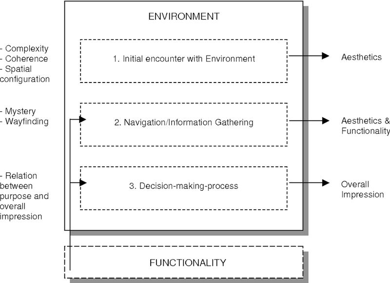
The relationship between an environment's purpose and overall impression help to determine whether it's functional and desirable for users.
Generally, the researchers saw that cognitive landscaping involved a few immediate mental calculations, which could occur all at the same time. Environments which were orderly—or coherent—increased a person’s ability to understand the space, and environments that contained a balance and richness of elements—or complexity—encouraged further exploration. Questions like, ‘Can I comprehend this situation?’ and ‘Is there enough going on to maintain my interest?’ were crucial to understanding.
Both of these assessments were followed by deeper questions, the researchers found, like ‘Does this environment have a memorable component that will aid me in the future?’ and ‘Is there a chance to learn?’
In other words, having a memorable component that assists in the understanding of a new environment—or legibility—reduces confusion in navigating toward what we want to achieve. And a promise of future satisfaction—or mystery—compels us onward and motivates us to explore.
In all, researchers demonstrated that people favor environments which recognize a preference for coherence and legibility, while at the same time accommodating a desire for some complexity and mystery.
How does cognitive landscaping relate to web design?
So, what does all of that mean—and what do big ideas about environmental psychology have to do with web design?
It’s easier than it seems: A website must strike the right balance between achieving its technical purpose and striking an overall positive and enticing impression. In other words, a company’s website must be pleasing and interesting to visit, but it also must be effective in driving its sales goals and converting users to customers.
Effective web design is simple: A website must strike the right balance between achieving its technical purpose and striking an enticing impression.
In this way, the basic principles of cognitive landscaping—coherence and complexity, legibility and mystery—directly relate to web design’s most basic tenants.
Effective, intuitive page layout helps users navigate through and understand the environment of a website—coherence. And striking, but not overwhelming design lends richness to a page’s layout—complexity. Clear, concise and compelling content assists in users’ understanding, clarifies a website’s message and is a distinctive imprint of a company’s voice—legibility. And calls to action and effective conversion techniques promise future satisfaction and action—mystery.
So, how can designers apply these principles to web design?
Layout
As described, an environment’s coherence is most closely associated with a website’s layout—or the order and structure of a site’s content. Because coherence refers to how a landscape hangs together, good web designers can prevent stress, disinterest or haplessness among users by using layout to aid wayfinding throughout their site.
For example, when first encountering an environment, research has shown that users quickly engage in two basic strategies of visual search, directly impacting how a page is laid out. At first, a user processes screen locations in parallel, but only extracts a limited amount of information. Then, a second stage of visual search restricts itself to areas of interest, where more complex tasks and information gathering can be carried out.
Great web designers can prevent stress, disinterest or haplessness among users by using layout to aid wayfinding throughout their site.
Translated to web design, important information must be located in the part of the visual field the eye looks to first—which research has shown is the top left corner of a website—and, because only so much information can be consumed in the second stage of visual search, a website’s layout cannot be overwhelming.
For example, in this homepage we designed for a trade exhibition company, all the relevant information is located in the left and top-left side of the page, drawing the user’s eye directly to the most important content. A simplified interface that suggests the kind of exhibits the company is known for, but doesn’t over-complicate the visual field with additional information or obtrusive imagery, keeps the design coherent and functional.

Even in this rudimentary first step of assessing a website’s coherence and orderliness, the human brain is involved in complex systems of information gathering—and the best designers can implement these processes in fine-tuning key areas of page layout, like:
Hero Messages
The hero message is the initial copy your visitor sees when he or she arrives at your site’s homepage—usually a large header and clarifying sentence at the top of your page, like in the BTWN Exhibits example. They’re often the first opportunity to establish a relationship with a viewer, and they’re key to establishing the message and structure of your website.
In short, hero messages should explain who you are as a company, what you do and why the visitor should care about what you offer. Additionally, hero messages should help your visitor determine if your product or service is useful to them. It should establish trust, and it should entice your visitor to perform your desired call to action.
Research shows that most website visitors don’t have much patience for vague or unclear homepages, and 55% of people will leave a website in less than 15 seconds if it doesn’t capture their attention. In addition to its location in the first area of visual search, hero messages are key for establishing order and coherence.
Research shows that most website visitors don’t have much patience for vague or unclear homepages, and 55% of people will leave a website in less than 15 seconds if it doesn’t capture their attention
In other words, the hero message should work as a transition between both stages of visual search. It’s the first thing on the page that the viewer sees, and it’s also the first area of interest the user will encounter. So, an effective hero message must contain all of the relevant information to establish a basic sense of coherence on your site and, in turn, move your user easily toward preference for your product.
Scanning and Spacing
As users make their way through your site—establishing an initial sense of order—the spacing of your page’s contents, as well as their optimization for users’ tendencies to scan, becomes increasingly important.
Users tend to view websites in a F-shaped pattern, with significant attention given to the top left corner of the page. This is easily visible in a heatmap, which measures where visitors’ eyes land on a page. As site visitors' eyes move down the page and to the right, they consume less information.
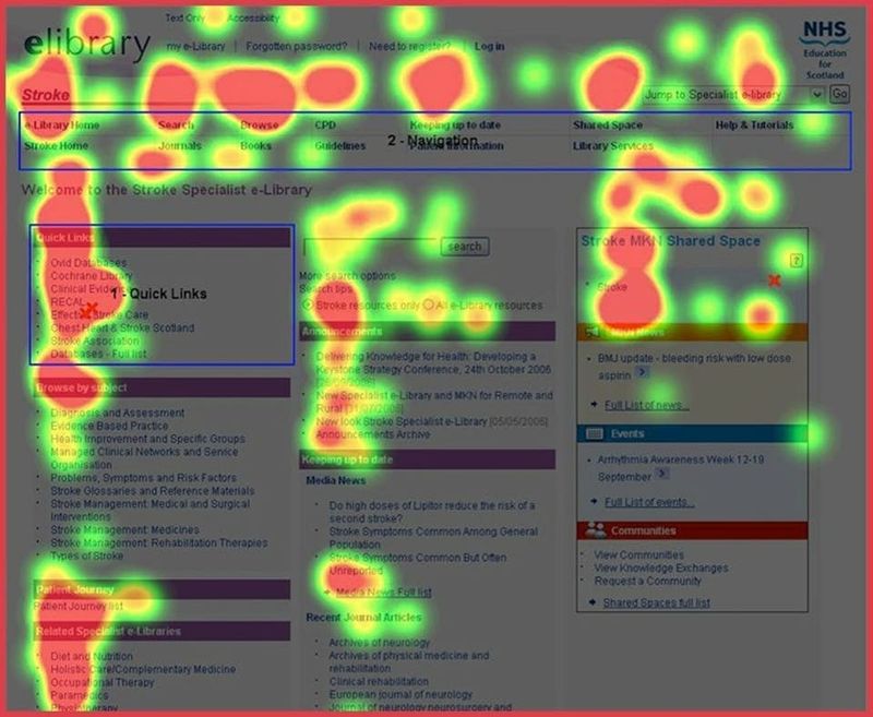
Understanding this, web designers make sure to place the most important and helpful information toward the top left-hand corner of the visual field. Additionally, leaving plenty of whitespace between elements allows your visitors to more easily perceive the order and coherence of your site’s structure.
Navigation Structure and Hierarchy
The navigation menu is another crucial element of your website. Proper navigation structure prevents users from feeling overwhelmed by the number of options your site presents. Clean, concise and responsive navigation keeps your layout from looking too cluttered, and it ensures that no pages are overlooked.
In short, the navigation structure of your website is key for encouraging exploration and understanding. As this relates to coherence, the Serial Position Effect is most important. Generally, this principle refers to a user’s tendency to recall the first and last items in a series, rather than the middle ones. Structuring a page to account for this effect allows designers to control user behavior by placing information in a specific order, encouraging coherency.
As a web design agency, it's most important that potential customers get a sense of the work we're able to do for our clients. This is why, for example, our navigation menu is bookended by our "Work" and "Contact" pages—the two most important pages on our site for conversion.
The visual design of a website is most closely associated with the cognitive principle of complexity. Because complexity refers to the richness of elements in a setting, compelling design—in addition to aiding coherence through consistent visual language—is necessary for adding complexity to a page.
Of course, too much complexity is a bad thing, and good web designers strive for adding enough interest without bogging down a user’s ability to extract information and identify a company’s clear message and brand positioning. In this sense, the ability for effective design to lend complexity to a site doesn’t refer to complicated, hard-to-decipher pages, but to an enticing balance of elements.
The ability for effective design to lend complexity to a site doesn’t refer to complicated, hard-to-decipher pages, but to an enticing balance of elements.
This is important, because a user’s first feeling of a website is mostly dependent on the site’s actual design aesthetics, since interaction with the site in the form of browsing has generally yet to occur.
In all, web designers employ several key aspects of visual design to entice users and create a coherent visual experience, like:
Color
A consistent deployment of a complementary color scheme is important for encouraging coherence, but colors are also important when it comes to imparting richness to your layout and communicating certain ideas about your company and industry.
To a certain degree, we have an understanding of certain properties of colors: Blue is calming. Red is warming, and yellow is stimulating. But web designers know that color can play one of the most important roles in defining a brand, creating a visual language for a website and lending interest to a user's experience of a new page. In fact, some studies show that color can account for up to 85% of the reason why someone might decide to buy from a company and could form up to 90% of a customer’s opinion of a brand.
Often, designers will settle on certain colors based on industry, and many color schemes have specific ties to certain services, products and company functions. Blue, for example, resonates particularly in medicine, healthcare and government services. Green feels more at home in human resources and finance, and black is more closely associated with construction, manufacturing and cosmetics.
Ultimately, color involves more than picking one hue for your brand, and web designers employ color schemes, white space and the strategic placement of certain colors—like highlighted pops of color for calls to action—to lend functionality and complexity to a website's design.
Balance
Encouraging richness and complexity in a website is also about emphasis—and in web design, establishing a proper balance of the items on your page is how effective emphasis is achieved. In short, balance creates harmony and order, and it keeps each page element in the right proportion so what’s most important is noticed first.
Often, designers impart balance, richness and complexity to a website through symmetry, which can be used to create strong points of interest on a page and aid visual stability.
Generally, designers consider there to be three types of symmetry:
- Reflection or bilateral symmetry, the “mirror” effect when an object is reflected to create another instance of itself.
- Rotational or radial symmetry, when an object is rotated in a certain direction around a point.
- Translational symmetry, when an object is relocated to another position in repeating intervals.
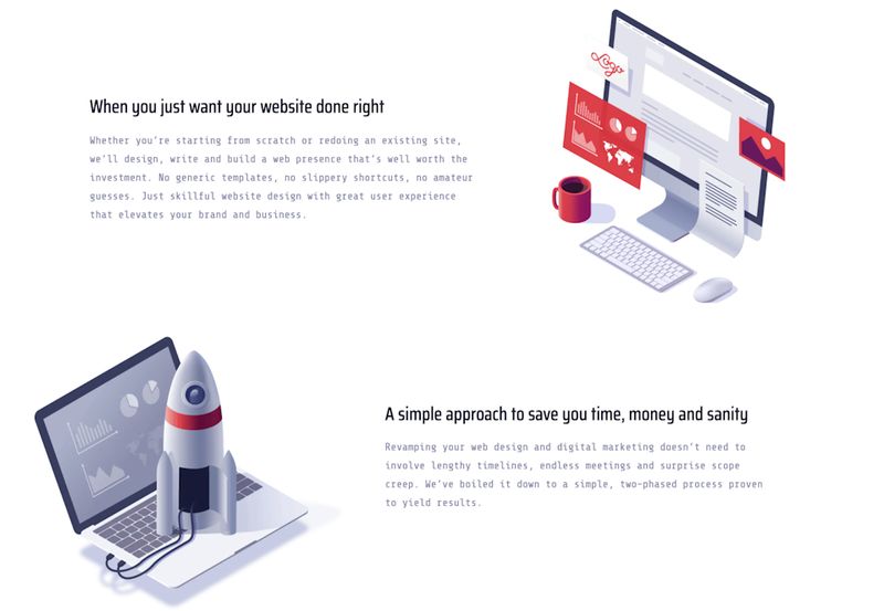
Most web pages employ some or all of these symmetries to achieve a sense of visual balance and complexity, like this page from our website, which uses varying degrees of bilateral and translational symmetry to describe our services:
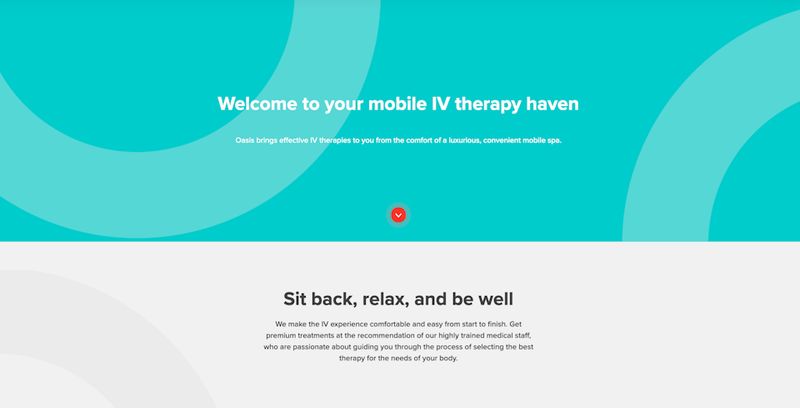
Or this page from a client’s website, which centers text on a middle alignment and reflects mirror images of circular figures on a slightly diagonal axis, creating a balanced, even effect.
Logo Design
Logos can be tricky, and effective logo placement on a page is often an important measure of how good design can add complexity and intrigue to your website. It can also be a glaring example of how ineffective graphic elements on a page can overwhelm, fail to properly communicate the right messages to your audience and, ultimately, alienate your site visitors.
We see the latter happening most often as it relates to the size of logos on a page. Commonly, ineffective web designers make the mistake of placing a company’s logo too prominently on a page—or simply making the logo too large. Bigger is almost never better, and a large company logo has little to do with a company’s brand strength or identity. More often than not, making a logo too big on a website can negatively affect how well your site performs with customers and clients.
Logos can be an important part of adding visual complexity to your website. They keep your visitor grounded in the visual style of your brand, and they communicate your company’s ideals and message in a graphic way. However, obtrusive logos are a perfect example of how an attempt at visual complexity actually impedes coherency. The larger the logo, the more it steals attention away from what matters—the solutions your company provides for your customers.
And if people can’t immediately see what your company does, you stand to lose about 46% of them right off the bat.
Content
After users establish an immediate or direct perception of your website through layout and design, they must transition that first impression to a deeper understanding of the landscape.
In other words, after your user gains a basic understanding of the visual character of your company, they must move to a greater understanding of your business’ offerings and message. This is like walking from a two-dimensional space to a three dimensional space—standing at the garden gate or walking through it.
Written content allows a user to synthesize the impressions they’ve already made with the information they’re meant to consume.
Here’s where copy and the written content of your website starts to do its work. Written content—correlating with the cognitive principle of legibility—allows a user to bring together the impressions they’ve already made with the information that they are meant to consume. If done right, effective copy and written content should bring users to a deeper, more memorable and distinctive understanding of what is being experienced.
Of course, this is easier said than done, and from a psychological and content perspective, getting this right can be tricky.
Content should present an identifiable message.
As near-constant internet users, we are continually inundated with information from a wide variety of sources. Some of this information is important, and some of it is trivial. For better or worse, even great content marketers are accused of trying to make us think it’s all important.
But good content should be able to cut through this barrage of information to present a valuable, legible and usable message. According to a 2015 web usability study, the lack of a clear brand message or the inability to tell what a company does is the biggest factor that causes users to leave a website—so crafting copy that makes your company legible is crucially important.
Content should present usable information.
Ultimately, people appreciate and are motivated to use information that helps them expand previous knowledge. So, content marketing that plays on users’ desires to access new information is key.
Often, this takes the form of a company blog. Many businesses choose to equip their websites with a consistent stream of content related to their business and industry—like ours. In addition to providing educational deliverables to your customers, blogs serve the purpose of further clarifying service offerings and making a company’s distinct voice and persona more immediately legible to users.
Content should overcome gaps in previous knowledge.
It’s also true that most people have trouble understanding new information, and many users are not motivated to use information that is not connected to previous knowledge.
Effective web copy and good content marketing must overcome this hurdle. Content that is customer-facing and intent on speaking directly to consumers—rather than about your company—is an important way to get customers to internalize the information being provided.
Using words like you and your, for example, is one way to help draw focus to a customer’s needs. Used too frequently throughout a company’s site, we and our can come across as self-centered and boastful.
And content shouldn’t impede comprehension.
Providing too much information creates a barrier to engagement. Overloading your customers or new site visitors with boatloads of information isn’t going to help anyone. More often than not, too much content will cause visitors to become confused and disengaged.
Done right, content must be clean, concise and coherent. You’ve got to get to the point.
In the end, users can always tell the difference between strategic copy that pinpoints their concerns and guides them to a solution with text that’s only there to fill out a page. Achieving legibility—and providing site visitors with a distinct, memorable and usable impression of your company—hinges on making that difference.
Mystery—the final component of cognitive landscaping—works to transition a person’s impression of a new landscape to a deeper understanding of what an environment has to offer. Ultimately, this key principle relates to conversion—the all important factor of converting visitors into leads, leads into customers, and customers into loyal patrons of your company and brand.
This might be the most important mental consideration a person makes when interacting with your website. Unlike coherence, complexity, and legibility, mystery is a time-oriented consideration: Effective lead conversion allows a visitor to calculate the future possibilities of their present choices in the current environment.
Effective lead conversion allows a visitor to calculate the future possibilities of the present choices your website offers.
This is key. To motivate someone to explore a landscape, there must be some promise of future satisfaction, and lead conversion techniques enhance a user’s desire to explore your website by conveying the feeling that much more can be found if one keeps going.
Calls to Action
Calls to action, commonly used in all forms of marketing and web design, are significant factors leading to user conversion. They prompt a user to do something, and as such, they play an integral role in sales pipelines.
The fact of the matter is that most web visitors won’t take action unless you ask them to. And effective websites use calls to action to provide a clear path for their users, including at least one per page and ensuring that visitors go where you want them to no matter which page they found first.
For example, this call to action at the bottom of one client's homepage uses a pop of color and persuasive copy to drive users down the company's sales funnel.
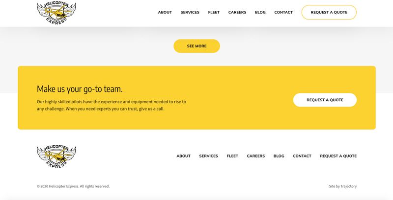
In short, calls to action promise future action and, done correctly, promise future satisfaction, allowing users to positively calculate the future possibilities of their relationship to your company.
A recent study found that, when done right, calls to action on landing pages can increase conversion rates by up to 80%, though 70% of small businesses don’t implement these strategies clearly.
In our blog post, “Everything You Need to Know About Compelling Calls to Action,” we talk about best practices for these important features of web design, like their purpose, placement and impact on click-through rates.
Paradox of Choice
Basically, consistent calls to action and effective lead conversion techniques are doing one thing: They’re demanding clear action for your user. In short, they’re reducing choice.
Successful conversion—and a successful use of the cognitive principle of mystery—involves reducing the number of choices or future possibilities for your customers, narrowing in on distinct future satisfaction.
While a sense of mystery—or the future promise of services delivered—is key in leading to conversion, users will fall away from future involvement with your website or commitment to your company if there are too many obstacles or things to choose from. In other words, offering too much choice can paralyze a user into inaction.
Successful conversion—and a successful use of the cognitive principle of mystery—involves reducing the number of choices or future possibilities for your customers, narrowing in on distinct future satisfaction. The paradox of choice dilemma describes this concept—that too many choices can be constricting, leading to haplessness, stress and indecision on the part of your site users.
As this relates to web design, there are plenty of examples where reducing choice is key to optimizing conversion. Beyond providing a clear and authoritative call to action, succinct, easy-to-use product or service pages and personable customer outreach strategies are also effective.
Key Takeaways
In the end, layout, design, content and conversion—or, as they relate to cognitive psychology: coherence, complexity, legibility and mystery—work toward establishing preference for your website. In other words, after making an initial assessment, your customer is going to ask one way or the other: ‘Does this website interest me and meet my needs for the future?’
The psychology of web design tells us that the answer to that question hinges on the purpose of your customer’s visit, and that purpose will act as a determining factor for whether your website was effective. Simply put: If a customer found your website because they were looking for a service your company provides, their rapid assessment of your pages will determine for them whether your business can adequately provide that service.
To say again: Whether your website successfully solves your customers’ problems is one of the most important considerations for accessing new clients. And effective web design can make or break your ability to do so.
If a customer found your website because they were looking for a service your company provides, their rapid assessment of your pages will determine for them whether your business can adequately provide that service.
Just as important, these impressions and preferences happen in rapid succession, and they can occur in seconds. Encouraging a sense of understanding and involvement in your brand is not a process that happens over time. It’s almost immediate, and the window for achieving this conversion is small.
Pages on a website are environments, and a good web designer knows how to use fast and intuitive human judgements—unavoidable processes of decision making and preference built into our psyches—to make the best websites.