There's no shortage of web design advice online. The problem is that most of it is either too vague to act on ("make it user-friendly") or too technical to matter if you're a business owner trying to figure out why your site isn't generating leads. Whether you're a beginner building your first site or redesigning an existing one, what you actually need is a clear set of design principles that affect whether your website design works.
And by "works," we don't mean "looks nice." A website that looks great but doesn't convert visitors into customers is an expensive brochure. A site that's optimized for conversions but looks like a template from 2015 is a different kind of failure. The best web design balances both, and it does so by getting a handful of foundational decisions right.
This article covers the web design best practices that actually move the needle. These are the web design principles that affect how visitors perceive your business, how easily they find what they need, and whether they take the action you want them to take.
Start With a Clear Goal for Every Page
Every page on your website exists to move someone in your target audience toward a specific action. That action should be defined early in the design process, because when you skip this step, you end up with pages that look fine but don't accomplish anything.
The mistake most businesses make is thinking about goals only at the site level. "We want more leads" is a fine business objective, but it doesn't tell you what your Services page should do versus your About page versus your blog. Each page needs its own purpose.
A services page should drive consultation requests. A case study should build confidence and push readers toward a contact form. A blog post might drive email signups or click-throughs to deeper content.
How Page Goals Drive Design Decisions
Once you've defined a page's goal, every design decision flows from it. What headline do you write? Where does the CTA sit? What supporting content do you include, and what do you leave out?
These aren't aesthetic choices. They're strategic ones.
The clearest sign of a page without a defined goal is competing calls to action. When a page asks visitors to request a quote, sign up for a newsletter, download a whitepaper, and follow on social media, it's not guiding anyone. It's creating confusion. One primary CTA per page, aligned with that page's goal, gives visitors a clear path forward.
Shopify's homepage is a strong example of this principle in action. The hero leads with a bold headline and a single primary CTA ("Start for free") that's impossible to miss. A secondary video link exists, but it's visually subordinate, so the primary action path is unmistakable. Below the fold, the messaging reinforces that same singular focus: one platform, one purpose, one next step.

For more on aligning your website with business goals:
- B2B Website Strategy: Building a Site That Supports Your Sales Process
- B2B Website Conversion Optimization: A Data-Driven Approach
Build a Navigation Structure That Guides, Not Overwhelms
Your navigation menu is the single most important UX element on your site. It determines how easily website visitors find what they're looking for, and if they can't find it quickly, they leave. It's that simple.
The best navigation structures share a few traits. They keep the main menu to 5-7 items. They use short, descriptive labels (one or two words when possible). And they follow the placement conventions visitors already expect: logo in the top left, main navigation in the header beside or below it, contact info or a CTA in the top right.
Straying from these conventions doesn't make your site creative. It hurts usability and degrades the user experience.
Your navigation should mirror the visitor's journey. Someone evaluating your services has different needs than someone researching your company's background. Your primary menu should prioritize the pages that matter most to conversion: Services, About, Case Studies or Work, and Contact. Secondary pages like privacy policies, careers, and terms belong in the footer menu, where they're accessible without cluttering the main navigation.
Supporting Navigation Elements
For content-heavy sites, a search bar gives visitors a direct route to what they need without clicking through menus. Breadcrumbs help users orient themselves in deeper page structures, showing exactly where they are and how to get back. Both are especially useful for companies with large product catalogs or extensive resource libraries.
The general rule of thumb is that any page on your site should be reachable within three clicks from the homepage. If visitors have to dig deeper than that, either your navigation hierarchy needs flattening or the page isn't important enough to exist.
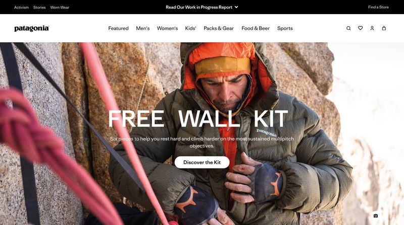
Patagonia's navigation is a strong example of these principles at work. Despite selling hundreds of products across multiple categories, the main menu stays clean: seven items (Featured, Men's, Women's, Kids', Packs & Gear, Food & Beer, Sports) organized by how people actually shop, not by internal product taxonomy. Utility icons for search, favorites, account, and cart sit in the expected top-right position. Secondary links like Activism and Stories live in a separate bar above the main nav, keeping the primary menu focused and scannable.
For a deeper dive into navigation design:
- B2B Website Navigation: Structure That Guides Complex Buyers
- Website Navigation Design: Everything You Need to Know
Use Visual Hierarchy to Control What People See First
Visual hierarchy is the arrangement of visual elements on a page in order of importance. It's what makes visitors look at your headline before your body text, your CTA before your footer, and your main offer before your secondary links. Without it, every element on the page competes equally for users' attention, and nothing stands out.
The tools are straightforward: size, color, contrast, and spacing. Larger design elements draw the eye first. Bright or high-contrast elements stand out against muted backgrounds. And white space (also called negative space) isolates important elements so they can breathe.
When your CTA button is surrounded by generous whitespace and uses a contrasting color, it naturally draws attention. When it's buried in a dense block of text, it disappears.
Most visitors scan web pages rather than reading them top to bottom. Eye-tracking research from Nielsen Norman Group consistently shows that users follow predictable scanning patterns. For content-heavy pages, visitors tend to read in an F-shaped pattern, focusing on the first few lines, then scanning down the left side. For landing pages with fewer elements, the eye moves in a Z-pattern from the top left to the top right, then diagonally down to the bottom left and across to the bottom right.
Understanding these patterns means you can place your most important elements where visitors' eyes naturally go. Put your strongest headline and value proposition at the top. Place your primary CTA in the path the eye naturally follows. Use whitespace to create separation between sections so the page layout feels organized, not chaotic.
Purposeful animation can reinforce visual hierarchy too. Subtle motion, like a button that gently pulses or content that fades in as you scroll, draws attention to key elements without distracting from the content itself. The key word is "purposeful."
Animation that exists just to be flashy creates clutter. Animation that guides the eye toward your CTA or highlights a key data point serves the design.
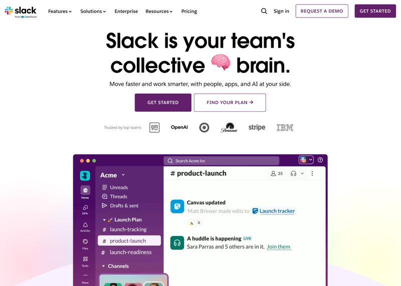
Slack's homepage shows visual hierarchy working exactly as it should. The reading order is unmistakable: a large, bold headline dominates the page, followed by smaller supporting text below it, then two CTA buttons with clear visual weight (the primary button uses a dark fill, the secondary uses an outline). Below the CTAs, a row of client logos provides social proof without competing for attention, and a product screenshot grounds the messaging in something concrete.
Notice how size, weight, and contrast create a natural flow from top to bottom. You don't have to think about where to look next because the hierarchy does that work for you.
For more on creating strong first impressions:
- How to Write a Website Hero Message (With Examples and Formulas)
- A Complete Guide to Website Homepage Design and Content
Make Typography and Readability a Priority
Typography is one of the most overlooked aspects of web design, and one of the easiest to get wrong. Poor font choices, tiny text, and walls of unbroken copy are some of the fastest ways to lose a visitor. If your content is hard to read, people won't read it.
Start with the basics. Your body text should be at least 16 pixels. Anything smaller and you're forcing visitors, especially those on mobile devices, to squint or zoom.
Line height should sit between 1.5 and 1.7 for body copy, and line length should stay between 50 and 75 characters per line. Lines that are too long exhaust the eye. Lines that are too short create a choppy, fragmented reading experience.
Font pairing matters more than most people realize. A clean approach is to choose one font family for headings and another for body text, or use a single versatile family with enough weight variation to create contrast between the two. The goal is visual distinction between headings and paragraphs without the page feeling like a ransom note.
Headings as Structure, Not Decoration
Your heading hierarchy does double duty. Visually, it breaks up the page and gives scanners anchor points so they can jump to the section that interests them. Behind the scenes, it helps search engines understand how your content is organized.
Use an H1 for the page title, H2s for major sections, H3s for subsections. These HTML header tags aren't just an SEO best practice. They also help screen readers navigate the page, which makes your site more accessible.
Subheadings should be descriptive. A reader scanning your page should be able to read only the headings and understand what the page is about. "Our Approach" tells a visitor nothing. "How We Reduce Project Timelines by 30%" tells them everything.
Keep your paragraphs short: two to four sentences maximum. Shorter paragraphs improve readability on screens, especially on mobile where a four-sentence paragraph can fill the entire viewport. When you're presenting three or more parallel ideas, use a bulleted list instead of burying them in a paragraph.
For more on B2B design standards:
Design for Mobile First, Then Scale Up
Mobile-first design isn't a trend. It's the default, and has been since Google switched to mobile-first indexing in 2020. More than 60% of web traffic now comes from mobile devices, and Google evaluates your site based on its mobile experience, not its desktop version. If your site doesn't work well on a phone, it's already hurting you in search rankings.
Mobile-first means designing for the smallest screen first, then adding complexity and layout refinements as the screen gets larger. It's not the same as "responsive design," which often starts with a desktop layout and squeezes it down for smaller screen sizes. The distinction matters because when you design desktop-first, you end up cramming elements into a small screen. When you design mobile-first, you prioritize what actually matters and then expand.
In practice, this means paying attention to touch targets (buttons and links need to be large enough to tap accurately with a thumb), content prioritization (what's important enough to show on a 375-pixel-wide screen?), and performance. Mobile users often browse on slower connections, so every kilobyte matters. A page that loads in 2 seconds on your office WiFi might take 8 seconds on a 4G connection, and more than half of mobile visitors will abandon a page that takes longer than 3 seconds.
Don't rely on resizing your browser window to test responsiveness. Use your actual phone. Better yet, test on a few different devices and screen sizes. What looks fine on a new iPhone might break on an older Android device with a different screen ratio.
For the technical side of mobile performance:
Get Your Calls to Action Right
Your CTA is where design meets revenue. It's the moment a visitor decides whether to take the next step with your business or keep scrolling. And yet, most websites treat CTAs as an afterthought: a generic "Submit" button at the bottom of a form, or a "Learn More" link that doesn't tell the reader what they'll learn.
Effective CTAs start with copy that states the value, not just the action. "Get Your Free Site Audit" is better than "Submit." "See Our Work" is better than "Click Here." The copy should answer the visitor's implicit question: "What do I get if I click this?"
Visually, your CTA should be the most prominent element in its immediate area. That means a contrasting color that stands out from the page background, enough size to be noticeable without being obnoxious, and enough surrounding whitespace so it isn't competing with nearby text or images. If your visitor has to hunt for the button, your CTA isn't doing its job.
Placement Patterns That Work
Where your CTA sits depends on the page's purpose:
- High-intent pages (pricing, contact, service pages): Place the primary CTA above the fold. Visitors landing on these pages are often ready to act, and the CTA should be visible without scrolling.
- Educational pages (blog posts, guides, resource pages): Place the CTA at the bottom of the content. Readers need to absorb the information before they're ready to take action. Asking too early feels pushy.
- Long-form pages (pillar content, detailed service breakdowns): Use a sticky or floating CTA that stays visible as the visitor scrolls, or repeat the CTA after key proof points throughout the page.
One CTA per page should be your default. Landing pages especially should have a single, clear action. When you give visitors multiple competing options, you're not being helpful. You're creating decision fatigue, and the most common response to decision fatigue is to do nothing.
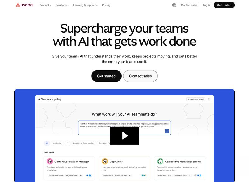
Asana's homepage demonstrates strong CTA design. The primary "Get started" button uses a solid dark fill that immediately draws the eye, while the secondary "Contact sales" button uses a lighter outline style that's visible but clearly subordinate. Both sit directly in the natural reading path below the headline and supporting text. A product preview below the CTAs reinforces what you're signing up for, adding context without creating competition.
The contrast between the two button styles is key. Visitors instantly know which action is primary and which is secondary, reducing decision fatigue without hiding the alternative path.
For the complete guide to CTAs and lead capture:
- Everything You Need to Know About Compelling Calls to Action
- B2B Website Lead Generation: Turning Visitors Into Pipeline
Build Trust Before You Ask for Anything
Nobody fills out a contact form on a website they don't trust. And trust isn't built by saying "we're trustworthy." It's built by showing proof, specifically and strategically, at the moments when visitors are deciding whether to take the next step.
The most effective trust signals include client logos, testimonials with real names and companies, case study snippets with measurable outcomes, industry certifications, and third-party recognition (awards, media mentions, review site ratings). But having these elements isn't enough. Where you place them matters just as much.
Trust signals placed near your CTAs convert better than trust signals isolated on a separate testimonials page. When a visitor is considering whether to request a consultation and they see a testimonial directly above the form, that's a nudge at exactly the right moment. When that same testimonial is buried on a page they'll never visit, it's wasted.
Specificity beats volume. "We increased qualified leads by 340% for a mid-market manufacturer" is more persuasive than "Our clients love us." Numbers, timelines, and industry context give potential buyers something concrete to evaluate.
For higher-stakes purchases, the bar is even higher. Decisions that involve multiple stakeholders, longer consideration cycles, or significant financial risk demand stronger proof. Your trust signals need to address that level of scrutiny.
Zendesk's homepage demonstrates this placement strategy well. Directly below the headline, a customer count ("Powering over 20,000 AI customers and counting") sits just above the email signup form and "Try for free" button. That's a credibility nudge at the exact moment a visitor is deciding whether to enter their email.
Further down the page, a "Trusted by 100,000+ companies" bar with recognizable logos (Squarespace, Uber, Stanley Black & Decker, and others) reinforces the proof. The trust signals aren't isolated on a separate page. They're woven into the conversion flow.

For the complete trust-building playbook:
Optimize for Speed Like Your Revenue Depends on It
Page speed isn't just a technical concern. It's a business one. Google uses site speed as a ranking factor, and visitors are ruthless about it.
Research from Google and Deloitte has found that even a 0.1-second improvement in mobile load time can increase conversion rates by 8%. On the other hand, more than half of mobile visitors will leave a page that takes longer than 3 seconds to load, driving up bounce rates and costing you conversions that search engine optimization alone can't recover.
Google measures speed through three Core Web Vitals, and understanding them helps you prioritize what to fix:
- Largest Contentful Paint (LCP): How long until the biggest visible element (usually a hero image or headline) loads. Google considers under 2.5 seconds "good."
- Interaction to Next Paint (INP): How quickly the page responds when someone clicks, taps, or types. Under 200 milliseconds is the target.
- Cumulative Layout Shift (CLS): How much the page content shifts around as it loads. Below 0.1 is "good." If you've ever tried to click a button and had it jump away because an image loaded above it, that's a CLS problem.
The most common speed killers on small business websites are unoptimized images (serving full-resolution photos when the browser only needs a fraction of that size), render-blocking scripts (JavaScript and CSS that prevent the page from displaying until they've fully loaded), and cheap shared hosting that simply can't serve pages fast enough. Even popular website builders can introduce speed issues if you're not careful about the themes and plugins you add.
Quick Wins vs. Structural Fixes
If your site scores below 90 on Google PageSpeed Insights, start with the quick wins:
- Compress and convert images to WebP format. This alone can cut page weight by 30-50%.
- Lazy-load images below the fold so they only load as visitors scroll down to them.
- Enable a CDN (content delivery network) to serve assets from servers geographically closer to your visitors.
- Defer non-critical JavaScript so it loads after the visible content.
If quick wins aren't enough, you may need structural changes: migrating to a faster hosting provider, switching to a performance-oriented platform, or auditing and removing bloated third-party scripts.
For the full technical deep dive:
- B2B Website Speed Optimization: Performance That Impacts Revenue
- B2B Website Maintenance Checklist: Monthly Tasks That Matter
Make Your Site Accessible to Everyone
Web accessibility means designing your site so its functionality works for people with a wide range of abilities. That includes visitors who use screen readers, navigate by keyboard instead of mouse, have low vision or color blindness, or experience motor impairments that make precise clicking difficult. It's not a niche concern. Roughly one in four American adults has some form of disability, and even temporary conditions (a broken wrist, an eye infection, using a phone in bright sunlight) create accessibility needs.
The most impactful accessibility improvements are also the simplest:
- Color contrast: Ensure text is readable against its background. WCAG 2.1 Level AA requires a contrast ratio of at least 4.5:1 for body text.
- Keyboard navigation: Every interactive element (links, buttons, forms) should be reachable and usable without a mouse.
- Alt text on images: Describe what the image shows and why it matters. "Team of engineers reviewing blueprints in a manufacturing facility" is useful. "Image1.jpg" is not.
- Form labels: Every input field needs a visible, descriptive label. Placeholder text that disappears when you start typing doesn't count.
- Proper heading structure: Use heading levels (H1, H2, H3) in order. Screen readers use these to navigate the page, and skipping levels creates confusion.
Here's what makes accessibility a smart web design practice rather than just a compliance exercise: the improvements you make for accessibility benefit everyone. Proper heading structure helps SEO. Alt text helps search engines understand your images. Good color contrast helps anyone reading on a phone in sunlight.
Clear form labels reduce errors for all users, not just those using assistive technology. This is sometimes called the curb-cut effect: features designed for people with disabilities end up making things better for everyone.
ADA-related web accessibility lawsuits have increased significantly year over year. Proactive compliance isn't just the right thing to do. It's the pragmatic thing to do.
For the legal and compliance details:
- Web Accessibility in Georgia: Practical Compliance for B2B Sites
- Website Accessibility for Nonprofits: A Practical Guide
Use Imagery That Builds Connection, Not Clutter
The images on your website shape how visitors perceive your business before they read a single word. And yet, too many business websites rely on the same generic stock photography that every competitor uses: the staged boardroom handshake, the perfectly diverse team high-fiving around a conference table, the suspiciously photogenic warehouse worker.
When possible, use high-quality photos of your actual team, office, facility, or work. Showing your real workspace, your real projects, and your real people builds a level of credibility that no stock photo can replicate. Visitors get a sense of your operation, your culture, and your attention to quality before they ever pick up the phone.
When stock photography is necessary (and sometimes it is), look for images with a natural, unstaged feel. Candid moments over posed shots. Natural lighting over studio setups. Images that could plausibly be real photos from a real workplace, not obvious stock photography that signals "we didn't care enough to take our own pictures."
Image optimization matters as much as image selection. Serve images in modern formats like WebP, use responsive image sizes so mobile visitors aren't downloading desktop-resolution files, and lazy-load anything below the fold. Every image that isn't optimized is slowing your page speed, which hurts both the user experience and your search engine rankings. And every image needs descriptive alt text, both for screen reader accessibility and as an SEO signal that helps search engines understand what your images show.
Keep Branding Consistent Across Every Page
Consistent branding might sound like a "nice to have," but it's actually a trust mechanism. When your website uses the same colors, fonts, button styles, and spacing patterns on every page, it signals that your business pays attention to details. When those elements shift from page to page, it signals the opposite, even if visitors can't articulate why the site feels off.
You don't need a 40-page brand guide to achieve consistency. You need a defined color scheme with a color palette of primary, secondary, and accent colors, one or two fonts used consistently, a standard button style, and uniform spacing between sections. These four decisions, applied consistently, create a cohesive design system that makes your entire website feel intentional.
The most common branding consistency mistakes on small business websites are also the most visible: button styles that change between pages, heading sizes that drift, color usage that shifts depending on which page you're on, and spacing that feels generous on the homepage but cramped on interior pages. It often happens when teams build from different templates without a shared style guide. These inconsistencies erode trust because they make the site feel assembled by different people who never coordinated.
Branding best practices extend beyond visual design to voice and messaging. The way you describe your services on your homepage should sound like the same company on your About page, your blog, and your contact page. Inconsistent messaging is just as jarring as inconsistent colors.
For more on homepage branding:
Where to Start With These Web Design Best Practices
If you're reading this and seeing gaps in five or six of these areas, don't try to fix everything at once. Start with three high-impact moves: define a clear goal and CTA for your most important pages, make sure your site is fast and mobile-friendly, and fix your visual hierarchy so visitors see the right things in the right order.
Those three changes touch the web design fundamentals with the biggest impact on whether visitors stay and convert. The rest (typography refinements, accessibility improvements, imagery upgrades, branding consistency) are important, but they compound on a foundation that's already working.
If your site needs more than incremental improvements, it might be time to step back and plan a full redesign.
For the next steps: