When someone visits your nonprofit's website, you have mere seconds to capture their attention and inspire them to take action. This is where landing pages shine. Unlike your regular website pages, landing pages are laser-focused on a single goal—whether that's collecting donations, recruiting volunteers, or gathering petition signatures.
For nonprofits, effective landing pages aren't just nice to have—they're essential tools that can dramatically increase your conversion rates and help you fulfill your mission. A well-designed landing page speaks directly to your supporters' hearts and minds, making it crystal clear how they can help and why their support matters.
While nonprofits’ key donation pages see average conversion rates of 12%, organizations that incorporate optimization strategies into their donation forms can achieve conversion rates closer to 20%.
In this comprehensive guide, we'll walk through everything you need to know about creating landing pages that inspire action and convert. From essential elements to common mistakes, you'll discover practical strategies to boost donations, increase event registrations, and grow your supporter base.
Let's explore how nonprofit website design can transform your digital fundraising and outreach efforts through effective landing pages.
What Are Nonprofit Landing Pages and Why Do They Matter?
A landing page is a standalone web page designed with a single focus—to capture visitor information and convert visitors into supporters. Unlike your homepage or general website pages that offer multiple navigation options, landing pages eliminate distractions and guide visitors toward completing one specific action.
For nonprofits, landing pages serve as powerful tools for various campaigns. Whether you're launching a year-end fundraising drive, recruiting volunteers for an upcoming event, or gathering signatures for advocacy work, a dedicated landing page helps you communicate your message clearly and drive meaningful action.
Landing pages matter because they create a direct pathway to conversion. When someone clicks on your email link, social media post, or Google ad, they should arrive at a page that directly addresses what prompted their click. This alignment between your promotional message and landing page content is crucial for maintaining momentum and turning interest into action.
The focused nature of landing pages makes them significantly more effective than general website pages for specific campaigns. By eliminating navigation menus, multiple calls-to-action, and other distractions, you keep visitors focused on the single action you want them to take.
For more insights on building an effective nonprofit website foundation:
- 21 Nonprofit Website Best Practices [With Real-life Examples]
- How to Structure Your Nonprofit Website for Maximum Impact: A Complete Guide
Distraction-Free Design That Builds Trust and Compels Donations
Let’s take a look at this donation landing page from Sightsavers, a nonprofit that works to prevent sight loss.
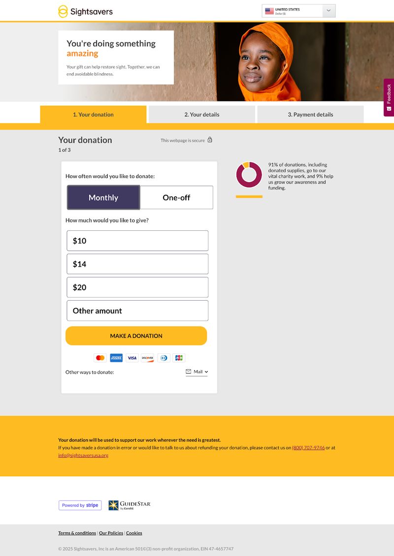
Here’s why this landing page works so well:
- Focused Layout: The page eliminates the navigation menu to reduce distractions and keep the visitor focused on the key goal–making a donation.
- Compelling Text: The headline immediately draws attention, with clarifying text that conveys the importance of the cause.
- Prominent Donation Form: The form is placed front and center, making it easy for visitors to begin completing it without scrolling.
- Transparent Usage of Funds: The page builds trust by including the exact percentage of donations that go directly toward the nonprofit’s work, as well as the percentage applied to funding and awareness. This helps assure donors that the majority of their donations will have a direct, meaningful impact.
- Trust Signals: The organization reinforces donor confidence by displaying recognizable trust signals, like the secure payment icon and Stripe and GuideStar logos. It provides clear contact information, including an email address and phone number, so donors can easily reach out with questions or concerns. At the bottom of the page, supporters can see that Sightsavers is officially recognized by the IRS as a tax-exempt charity under section 501(c)(3). The foundation provides its Employer Identification Number (EIN) as well so donors can verify its legitimacy.
Common Types of Nonprofit Landing Pages
Nonprofit organizations typically use several types of landing pages to support their various goals and campaigns:
- Donation Pages: These should focus solely on collecting contributions. Be sure to include clear donation amounts, impact statements, and streamlined payment processes.
- Event Registration Pages: Registration pages should provide event details and make signing up simple, whether for fundraising galas, volunteer opportunities, or educational webinars.
- Petition and Advocacy Pages: The goal of these pages is to gather signatures and support for your cause. Include compelling statistics and stories that emphasize urgency.
- Email Signup Pages: Signup pages build your supporter list by offering valuable content, updates, or other incentives in exchange for contact information.
- Thank You Pages: Be sure to acknowledge supporter actions and provide next steps. Doing so will help you turn a one-time interaction into an ongoing relationship.
Each of these page types serves a distinct purpose in your nonprofit's digital ecosystem. By optimizing each for its specific goal, you create clear pathways for supporters to engage with your organization in meaningful ways.
To dive deeper into specific page types and their optimization:
The Key Elements of Effective Nonprofit Landing Pages
Creating landing pages that convert requires thoughtful attention to several key elements. When these components work together harmoniously, they create a seamless experience that guides visitors naturally toward your desired action.
Compelling Headlines and Subheadings
Your headline forms the first impression and determines whether visitors will continue reading. Effective nonprofit headlines connect emotionally while clearly communicating your value proposition.
Strong headlines speak directly to your audience's motivations—whether that's making an impact, solving a problem, or being part of a community. They should:
- Be specific rather than generic
- Create urgency when appropriate
- Instantly communicate the purpose of your page
Subheadings break up your content into scannable sections, guiding readers through your message while reinforcing key points. They maintain interest for those who skim rather than read every word (which is most visitors).
Emotional and Authentic Imagery
Images can communicate emotion and impact faster than words. Authentic nonprofit photography showing real people, places, and situations affected by your work creates an immediate emotional connection.
Avoid generic stock photos that feel corporate or inauthentic. Instead, invest in quality images that tell your story visually. Whether it's the face of someone your organization has helped, volunteers in action, or visual evidence of your impact, compelling imagery brings your mission to life.
Remember that images should support–not distract from–your call-to-action. Choose visuals that evoke the emotions that inspire your desired action, whether that's compassion, hope, urgency, or determination.
Visual Storytelling That Sparks Compassion
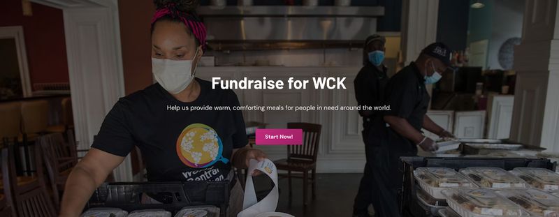
World Central Kitchen’s website features vivid, authentic imagery of volunteers preparing and distributing food and communities receiving much needed meals. This visual storytelling fosters an emotional connection between visitors and the organization’s mission by showing both real people affected by the hunger crisis and real volunteers who make a difference. These images humanize its mission and make the impact of its work feel both crucial and real.
Donor-Centric Copy That Focuses on Impact
The copy on your landing page should be concise, compelling, and focused on the supporter rather than your organization. Use "you" language that helps visitors see themselves as part of the solution.
Focus on concrete impact rather than organizational processes. Instead of explaining how your programs work, show what difference a donation makes. Specific impact statements ("Your $50 donation provides clean water for a family for a month") create a clear connection between action and outcome.
Keep paragraphs short and use simple language. Aim for an 8th-grade reading level to ensure your message is accessible to the broadest possible audience. This isn't about "dumbing down" your content—it's about communicating clearly and directly.
For comprehensive guidance on writing compelling nonprofit content:
- How to Write Effective Nonprofit Website Content: A Strategic Guide
- Nonprofit Blog Ideas: How to Create Content Your Community Will Love
Clear, Compelling Calls-to-Action
Your call-to-action (CTA) is the most critical element of your landing page. It should stand out visually, communicate exactly what will happen when clicked, and create a sense of urgency or importance.
Use action-oriented language that begins with verbs like:
- Donate now
- Join our team
- Sign the petition
Be specific about the action you're requesting, and ensure your CTA button contrasts with the rest of your page design so it's impossible to miss.
For donation pages, consider including multiple CTAs with suggested giving amounts. This makes the decision process easier for donors and can encourage larger gifts than open-ended options.
Trust Signals and Credibility Markers
Supporters need to trust your organization before they'll take action. Include elements that build credibility, such as:
- Third-party endorsements or charity ratings from watchdog organizations like Charity Navigator or GuideStar
- Testimonials from beneficiaries, donors, or respected community members
- Statistics demonstrating your track record and impact
- Security badges and privacy assurances for donation pages
- Transparency indicators like your 990 forms or annual reports
These trust signals are particularly important when asking for financial contributions or personal information. They reassure visitors that your organization is legitimate, effective, and responsible with resources.
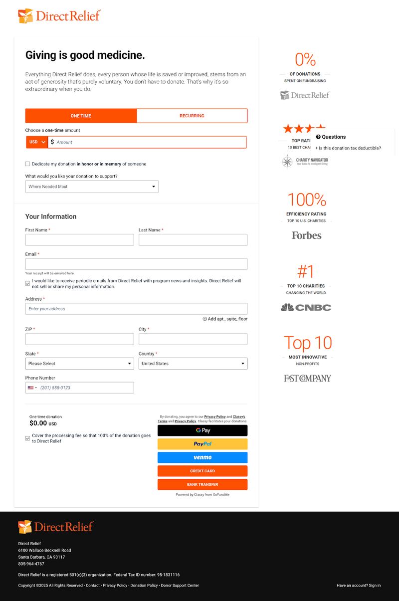
For example, on the right hand side of nonprofit Direct Relief’s donation page, you can see several trust signals and credibility markers.
Statistics to Keep in Mind About Donor Trust & Nonprofit Credibility
- 75% of donors will seek out concrete information about your nonprofit’s achievements before making a decision to donate. That’s why testimonials and statistics about your impact are so important for proving your credibility.
- 72% of potential donors are more likely to give if your nonprofit features a charity rating badge. These badges allow individuals to quickly assess your credibility and efficiency before making a donation.
- 68% of online donors believe that nonprofit websites and email addresses that use the “.org” domain are the most trustworthy.
Mobile-Friendly Design
More than half (57%) of nonprofit web traffic now comes from mobile devices, making mobile optimization essential for any landing page. Your pages should look great and function flawlessly on screens of all sizes.
Mobile optimization goes beyond responsive design. It means considering the mobile user experience throughout your page development. This includes:
- Using larger touch targets for buttons
- Minimizing form fields
- Ensuring text is readable without zooming
- Keeping page load times fast
For donation pages especially, a streamlined mobile checkout process is crucial. Complex forms or payment processes that work fine on desktop can cause significant abandonment rates on mobile devices.
To ensure your entire website performs well on all devices:
Creating Landing Pages That Convert: A Step-by-Step Process
Developing effective landing pages doesn't happen by accident. Following a structured approach ensures you address all key elements while keeping your focus on conversion optimization.
Define Your Campaign Goal and Target Audience
Every great landing page starts with clarity about exactly what you want to accomplish and who you're trying to reach. Are you targeting first-time donors or major supporters? New volunteers or experienced advocates?
Begin by defining your primary conversion goal in specific, measurable terms. Instead of "increase donations," your goal might be "secure 200 new monthly donors at an average of $30 per month."
Next, develop clear audience personas and nonprofit user journeys for your landing page. Be sure to consider:
- Demographics
- Motivations
- Potential objections
- What messages will resonate most strongly
This focused approach allows you to craft content that speaks directly to your intended audience.
Remember that different segments of your audience may require different landing pages. A page targeting potential major donors should look and feel different from one aiming to convert first-time supporters.
For deeper understanding of your website visitors' paths:
Craft Your Core Message and Value Proposition
Your value proposition answers the fundamental question in your visitor's mind: "Why should I take this action?" It combines the emotional appeal of your cause with clear statements about the impact of their support.
Effective value propositions for nonprofits typically include:
- A clear explanation of the problem your organization addresses
- How their specific action helps solve this problem
- What makes your approach unique or especially effective
- The emotional reward or satisfaction they'll receive by participating
This value proposition should be immediately apparent when someone lands on your page. It forms the foundation for your headline, imagery, and supporting copy.
Clear Value + Tangible Impact = More Donor Engagement
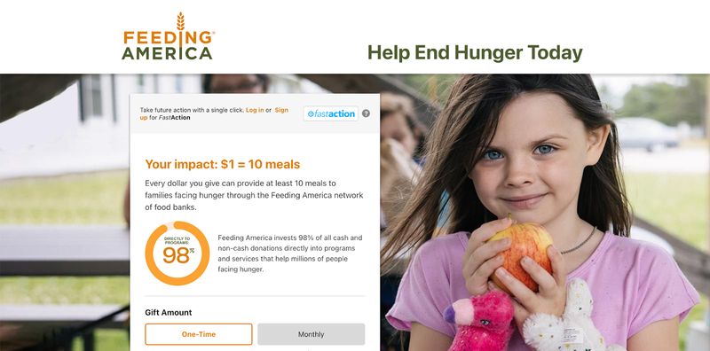
Feeding America’s donation landing page is a great example of a value proposition done right. The organization immediately communicates the problem it’s hoping to solve–hunger–before providing a clear and quick solution: a one-time or monthly monetary donation to support programs and services that help the millions of people facing hunger.
The page also emphasizes the impact of the donation. It quantifies that just $1 can provide “at least 10 meals to families facing hunger through the Feeding America network of food banks.” This tangible impact makes the donation feel both personal and powerful, and the statistic that 98% of all donations are poured directly into these programs reassures donors that their money is well spent.
Design a User-Friendly Form
Forms are where conversion happens—or doesn't. Each field you add to your form creates another potential point of abandonment, so include only the information you absolutely need.
For donation forms, start with the minimum required fields and consider whether additional information (like phone numbers or addresses) is truly necessary at this stage. You can always collect more detailed information after the initial conversion.
Make form completion as painless as possible by:
- Using clear labels for each field
- Providing helpful error messages when information is entered incorrectly
- Enabling autofill for common fields like name and email
- Including progress indicators for multi-step forms
- Offering alternatives like social login when appropriate
Remember that forms should never feel like an obstacle between your supporter and the action they want to take. They should be intuitive, efficient, and as frictionless as possible.
Add Trust Elements and Social Proof
We've discussed the importance of trust signals, but their placement matters too. Include credibility markers near points of highest friction—typically around your call-to-action or form.
Social proof can be particularly powerful when placed strategically as well. Social proof is a psychological phenomenon in which people feel increased trust and reduced hesitation to take a specific action when they see others taking the same action.
Social proof for nonprofits might take the form of:
- Real-time donation feeds showing recent contributions
- Testimonials from supporters explaining why they give
- Impact counters showing total people helped or projects completed
- Donation matches or challenges that create a sense of collective action
These elements tap into our natural desire to follow others' positive examples and can significantly boost conversion rates by reducing hesitation.
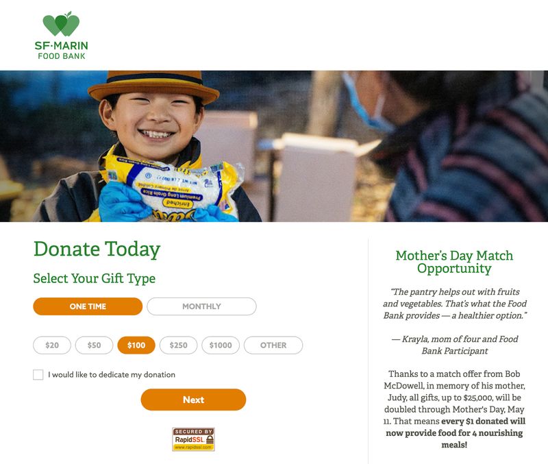
Building Trust: Testimonials and Donation Doubling
One example of social proof comes from the donation landing page of the San Francisco-Marin Food Bank. This page includes a heartfelt testimonial from a grateful food bank recipient, helping visitors connect emotionally to the cause and see the direct result of their support.
It also includes a message about the organization doubling all donations through Mother’s Day. Not only does this copy establish a sense of collective action, but it acts as powerful social proof by signaling that others–like the donor–believe in the mission strongly enough to double contributions. This creates a sense of shared commitment and an urgency to give prior to the deadline.
Remove Distractions and Simplify Navigation
One of the most common landing page mistakes is including too many options or distractions. For maximum effectiveness, eliminate standard website navigation, multiple calls-to-action, and anything else that might draw attention away from your primary conversion goal.
This doesn't mean your page should feel incomplete or isolated from your brand. Include your logo and maintain consistent design elements, but remove links to other sections of your website that could lead visitors away before converting.
If you absolutely must include additional links, consider placing them below your main call-to-action or on your thank-you page instead.
Test Your Page Before Launch
Before making your landing page public, conduct thorough testing to ensure everything works flawlessly. This includes:
- Testing your form submission process end-to-end
- Checking page load speed on various devices and connection speeds
- Reviewing all nonprofit website content for clarity, consistency, and accuracy
- Ensuring proper tracking is in place to measure conversions
- Testing payment processing with real transactions (for donation pages)
Invite colleagues, board members, or trusted supporters to provide feedback. Fresh eyes often catch issues you might miss after working closely with the page.
Nonprofit website development professionals recommend conducting A/B testing whenever possible to optimize key elements like headlines, images, and call-to-action buttons. Remember to test no more than 1-2 elements at a time. Ensure your sample size is large enough to produce reliable results.
Best Practices for Donation-Specific Landing Pages
Donation page design deserves special attention, as it directly impacts your organization's financial sustainability. These specialized landing pages have unique requirements beyond general best practices.
Suggested Giving Amounts
The donation amounts you display can significantly influence giving behavior. Rather than leaving it entirely open-ended, provide suggested amounts that guide donors toward your desired gift level.
Include 3-5 preset amounts that make sense for your typical donor profile, plus an "Other" option for those who want to give a different amount. Research shows that including at least one higher-than-average option can increase average donation size by anchoring expectations.
For each suggested amount, include a specific impact statement. Instead of generic descriptions, help donors visualize exactly what their contribution will accomplish: "$50 provides school supplies for 10 children" is much more powerful than "$50 helps our education program."
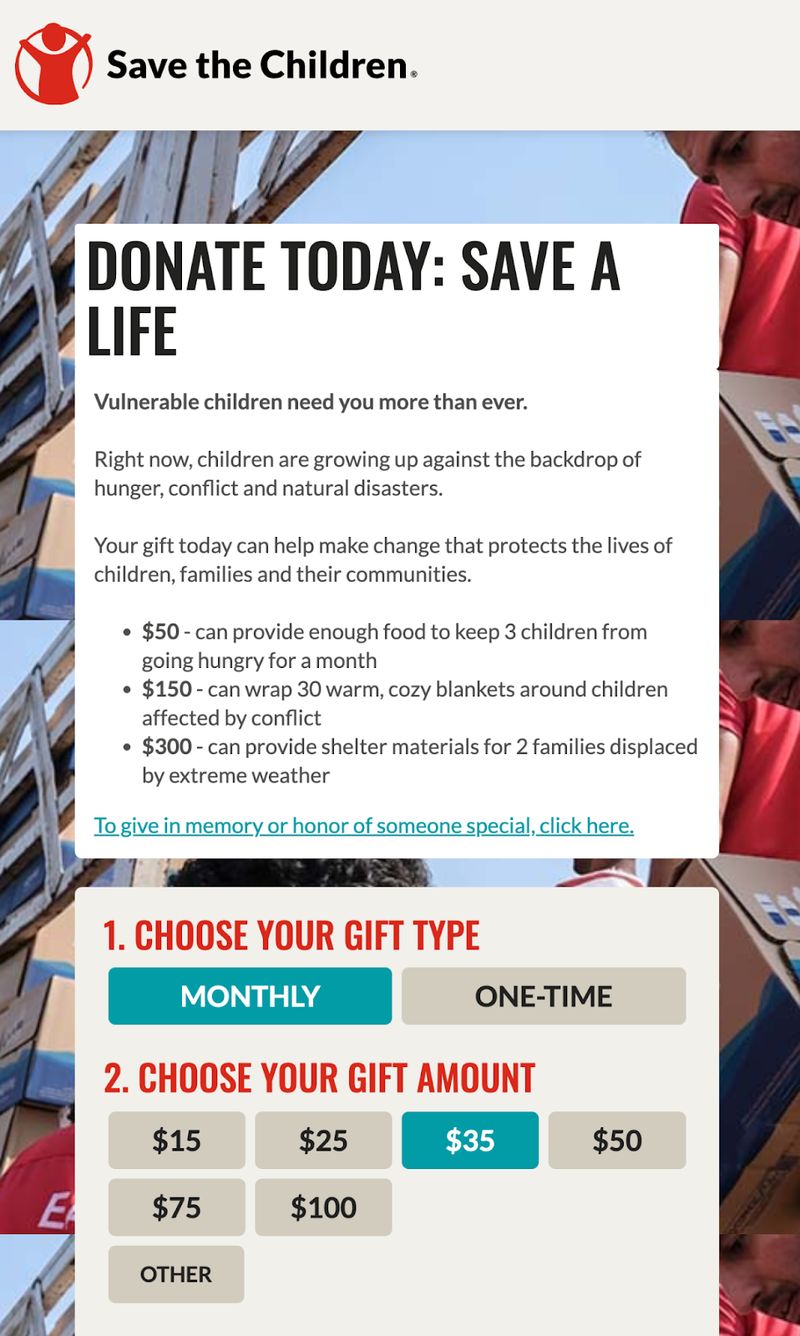
For example, this donation landing page from Save the Children uses compelling language and specific impact statements to show potential donors how $50, $150, and $300 donations can help protect children and families:
Monthly Giving Options
Monthly recurring donations provide sustainable funding that allows better planning and reduces fundraising costs. Make recurring giving prominent and attractive on your donation pages.
Highlight the benefits of monthly giving, such as spreading out a larger annual contribution into manageable monthly amounts. Some organizations effectively frame this as "joining" a special group of sustaining supporters, creating a sense of community and ongoing commitment.
Consider offering special incentives for recurring donors, such as exclusive content, recognition opportunities, or annual impact reports. These benefits acknowledge their special status while encouraging ongoing participation.
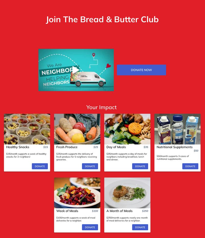
Making the Case for Monthly Giving
Let’s take a look at the “Bread & Butter Club” campaign from nonprofit Food & Friends. This organization provides free meals, groceries, and nutrition counseling to individuals living with life-challenging illnesses, their dependents, and their caregivers. They encourage donors to pledge their support by joining the Bread & Butter Monthly Giving Club, where monthly donations provide recipients with access to long-term services.
The monthly giving club’s donation page clearly spells out the real-world impact of recurring gifts, with statements like: “$15/month supports a week of healthy snacks for 3 neighbors” and “$100/month supports a week of meal deliveries for a neighbor.”
This specific, outcome-focused messaging turns the idea of a donation into something tangible, making the donor feel confident that their contribution is both measurable and meaningful. By showing how a monthly gift can lead to consistent nourishment for those in need, the nonprofit gains long-term supporters and shifts the narrative from “charity” to “ongoing support.”
Transparent Fund Usage
Donors increasingly expect transparency about how their contributions will be used. Include clear information about fund allocation, administrative costs, and program efficiency.
Rather than hiding this information, embrace transparency as a trust-building opportunity. Organizations that proactively address how donations are used often see increased giving and donor loyalty.
Consider including a brief breakdown of fund allocation or linking to more detailed financial information for those who want deeper insight. This transparency demonstrates confidence in your stewardship and respect for donors' desire to give wisely.
To build trust through proper data handling and policies:
- Do Nonprofit Websites Need a Privacy Policy? A Complete Guide
- The Complete Guide to Nonprofit Website Security
Streamlined Payment Processing
The moment of payment is critical—any friction or uncertainty here can lead to abandoned donations. In fact, around 60% of potential donors abandon nonprofit website donation pages before completing their transaction.
Here are a few steps you can take to establish trust and streamline payments in order to reduce your donation form bounce rate:
- Inspire Confidence: You can do this by ensuring your payment process is straightforward and secure.
- Offer Multiple Payment Options: Include credit cards, PayPal, and newer methods like Apple Pay or Google Pay that simplify mobile giving. Each additional payment option can increase conversion rates by accommodating different preferences.
- Display Security Badges and Reassuring Language: Statements like "Your information is secure" and "This is a protected connection" help reduce anxiety about online financial transactions.
Thoughtful Thank You Pages and Follow-Up
The moment after someone donates is a missed opportunity for many nonprofits. Your thank you page and immediate follow-up communications are crucial for building the donor relationship.
Create a dedicated thank you page that:
- Confirms their contribution was received successfully
- Expresses genuine appreciation for their support
- Provides information about what happens next
- Suggests additional ways to engage (volunteering, social sharing, etc.)
Follow up promptly with a personalized email receipt that reinforces the impact of their donation. This communication sets the tone for your ongoing relationship and can significantly influence whether donors will give again in the future.
Storytelling Techniques for Nonprofit Landing Pages
Did you know nonprofit websites that incorporate effective nonprofit storytelling see donor retention rates that are 18% higher than those of nonprofits that do not focus on storytelling?
That’s because stories create emotional connections that inspire action. On landing pages, strategic storytelling can dramatically increase conversion rates by helping visitors understand the human impact of their support.
To further develop your nonprofit's narrative strategy:
- How to Tell Your Nonprofit's Story Through Web Design
- Nonprofit Testimonials: The Complete Guide to Collecting and Displaying Impact Stories
- Photography for Nonprofits: Ethics, Sourcing, and Impact
Beneficiary Stories That Show Real Impact
Personal stories about individuals affected by your work are powerful conversion tools. These narratives transform abstract problems into concrete situations that donors can understand and connect with emotionally.
When featuring beneficiary stories, focus on:
- Specific individuals rather than anonymous groups
- Before/after narratives that show transformation
- Direct connections between donor actions and positive outcomes
- Authentic details that bring the story to life
Ethical storytelling requires balancing emotional impact with dignity and respect for those featured. Always obtain appropriate permissions and present stories in ways that empower rather than exploit the individuals involved.
Real People, Real Impact: The Power of Kiva’s Storytelling
Kiva, a nonprofit whose mission is to connect individuals in underserved communities with community-funded loans, features numerous beneficiary stories throughout its website. It highlights entrepreneurs from around the world, complete with photos, names, personal goals, and the amount left to fund.
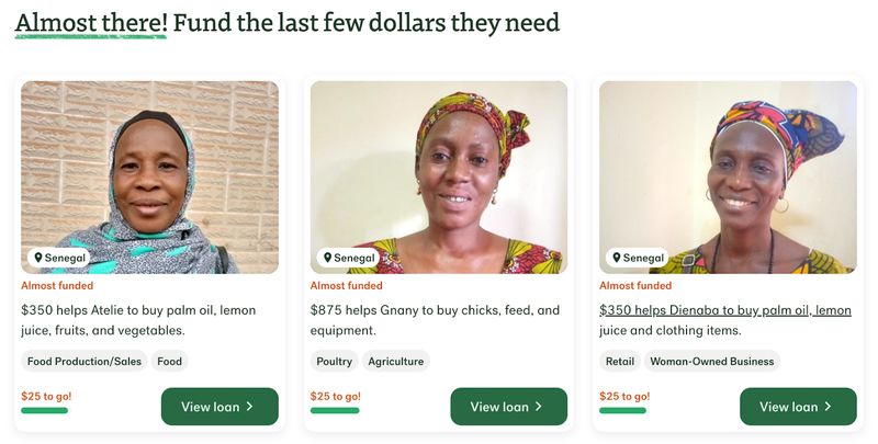
For example, Manal shares how she used the funds she received to buy sewing machines and begin her tailoring business, increasing her income and employing her daughter.
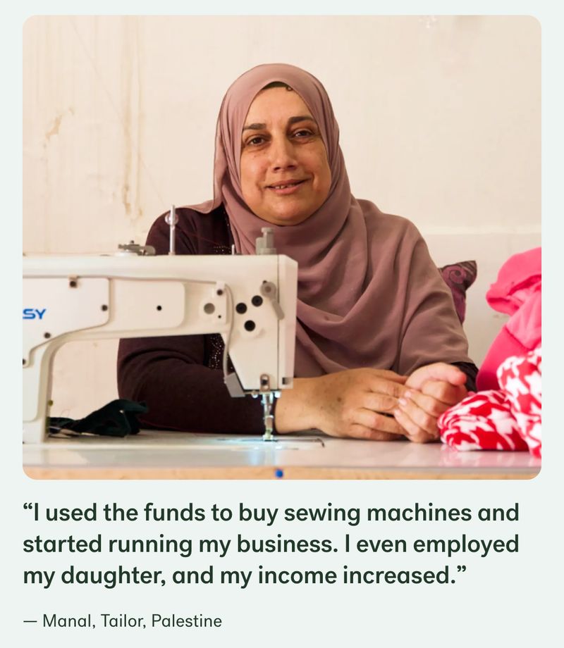
These types of stories humanize the donation request and add specificity. Rather than just donating to a general fund, contributors know that they’re helping Gnany with her agriculture business or Dienaba with her retail business.
This direct connection between a recipient’s story and the donation opportunity fosters empathy and urgency, making supporters feel that they play a crucial role in someone else’s success story.
Crisis and Solution Frameworks
The crisis/solution framework is particularly effective for nonprofit landing pages. This approach clearly identifies a problem, explains why it matters, and positions your organization—with the supporter's help—as the solution.
This framework creates urgency and purpose while giving supporters a clear role to play. When using this approach:
- Present the crisis in specific, vivid terms that create emotional impact
- Use data and stories together to establish credibility
- Position your organization as uniquely qualified to address the issue
- Make the supporter's role in the solution explicit and meaningful
This framework works because it follows a natural storytelling arc that humans find compelling, while creating a clear path to action.
Visual Storytelling Through Design
Your page's visual design elements can reinforce your narrative and emotional appeal. Consider how colors, typography, imagery, and layout work together to tell your story.
Use visual hierarchy to guide visitors through your narrative arc, from problem to solution to action. Images should support key points in your story rather than serving merely as decoration.
Progress bars, impact counters, videos, and other visual elements can add a dynamic, real-time component to your storytelling. These features help supporters visualize their participation in an ongoing narrative of positive change.
The Power of Impactful Storytelling
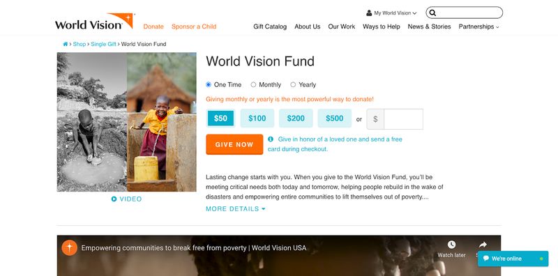
Nonprofit organization World Vision includes a powerful short video on its donation landing page, connecting viewers to its mission through real-life footage of the children and communities impacted by donor support. The video emphasizes hope and transformation, helping visitors to see the meaningful result of their generosity.
Landing Page Design Tips for Mission-Driven Organizations
Effective design for nonprofit landing pages balances aesthetic appeal with functional considerations. Every design choice should support your conversion goal while creating an experience that reflects your organization's values and mission.
Color Psychology for Nonprofit Campaigns
Colors evoke emotional responses and associations that can significantly impact conversion rates. Choose colors that:
- Align with your brand identity for recognition and consistency
- Evoke emotions appropriate to your cause (e.g., blue for trust, green for growth)
- Create sufficient contrast for accessibility and readability
- Highlight key elements like donation buttons through strategic contrast
Remember that cultural associations with colors vary globally. If your organization works internationally, consider how your color choices might be perceived across different cultures.
Typography for Readability and Emotional Impact
Typography choices affect both readability and emotional tone. For nonprofit landing pages:
- Use no more than 2-3 font families to maintain a clean, professional appearance
- Ensure sufficient size (minimum 16px for body text) and contrast for readability
- Choose fonts that reflect your organization's personality and mission
- Use typographic hierarchy to guide readers through your content logically
Typography should be consistent with your overall brand while prioritizing clarity and accessibility over decorative elements.
Accessible Design for All Users
Inclusive design ensures your landing pages are usable by everyone, including people with disabilities. This isn't just good practice—it's essential for organizations committed to equity and inclusion.
Prioritize nonprofit website accessibility by:
- Maintaining sufficient color contrast between text and backgrounds (WCAG 2.1 AA standard minimum)
- Including alt text for all images that convey information
- Ensuring forms are navigable and usable with keyboard-only input
- Testing your page with screen readers and other assistive technologies
- Making videos accessible with captions and transcripts
Accessible design benefits all users, not just those with disabilities. Many accessibility features improve usability for everyone, especially in challenging contexts like mobile devices or poor connectivity situations.
For comprehensive accessibility implementation:
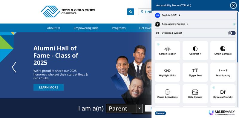
Accessible Design Makes Every Visitor Feel Welcome
Boys and Girls Clubs of America is one nonprofit that prioritizes accessibility through its thoughtful design choices. The site uses high-contrast color combinations to improve readability, and it ensures all images have descriptive alt text to support screen readers.
The site even features an accessibility menu that allows visitors to adjust their contrast, text size, spacing, and other elements to suit their needs.
Mobile Optimization Strategies
With mobile donations increasing yearly, optimizing for smaller screens is no longer optional. Mobile-first design considers the constraints and opportunities of mobile devices from the beginning of the design process.
For mobile landing pages:
- Use large, touch-friendly buttons (minimum 44x44 pixels)
- Keep forms as short as possible to reduce typing on mobile keyboards
- Ensure text is readable without zooming (minimum 16px font)
- Compress images for faster loading on mobile connections
- Test thoroughly on multiple devices and screen sizes
Remember that mobile users often have different intentions and behaviors than desktop users. They may be more location-aware, time-sensitive, and focused on immediate actions.
Testing and Optimizing Your Nonprofit Landing Pages
Creating an effective landing page isn't a one-time effort but an ongoing process of testing, learning, and refinement. Continuous optimization can significantly improve your conversion rates over time.
Setting Up A/B Tests for Continuous Improvement
A/B testing (also called split testing) compares two versions of your landing page to see which performs better. This data-driven approach removes guesswork from your optimization process.
Start with testing one element at a time, such as:
- Headlines and key messaging
- Images and visual elements
- Call-to-action text and button design
- Form length and field arrangement
- Suggested donation amounts
When running tests, ensure you have sufficient traffic to reach statistical significance before drawing conclusions. Tools like Google Optimize or Optimizely can help you manage tests properly, even with limited technical resources.
Understanding Key Landing Page Metrics
To improve your pages, you need to track the right metrics. Beyond simple conversion rates, consider:
- Bounce Rate: Percentage of visitors who leave without taking any action
- Time on Page: How long visitors engage with your content
- Form Abandonment: Where people drop off in your process
- Average Donation Amount: For fundraising pages
- Cost Per Acquisition: How much you spend to acquire each conversion
These metrics provide context for your conversion rate and help identify specific areas for improvement. For instance, if visitors spend time reading your content but don't complete your form, the issue might be form complexity rather than your value proposition.
Here are some nonprofit landing page metrics to keep in mind:
- Around 60% of visitors abandon nonprofit donation pages before completing a transaction.
- Key nonprofit donation pages see average conversion rates of 12%.
- The average one-time donation is $121, while the average monthly donation is $25.
To track and improve your overall website performance:
- Nonprofit Website Metrics That Matter: KPIs to Track for Mission Success
- Nonprofit Website Audits: A Comprehensive Guide for Evaluation
Common Landing Page Problems and Solutions
Certain issues appear frequently across nonprofit landing pages. Understanding these common problems and their solutions can help you improve your results quickly.
- High Bounce Rates: These often indicate a mismatch between your promotional message and landing page content, or slow loading times that frustrate visitors. Ensure your landing page fulfills the promise that brought visitors there and optimizes images and code for speed.
- Low Conversion Rates: Low conversion, despite good engagement metrics, may indicate friction in your conversion process. Simplify forms, clarify calls-to-action, and ensure your value proposition is compelling and prominent.
- Mobile Abandonment: This happens when pages work on desktop but create obstacles on smaller screens. Test your entire conversion process on various mobile devices and optimize accordingly.
- Mixed Messaging: Unfocused messaging confuses visitors about what action to take. Focus each landing page on a single conversion goal and remove competing calls-to-action.
Nonprofit digital strategy experts recommend regular audits of your landing pages to identify and address these common issues before they significantly impact your results.
For ongoing optimization and maintenance:
Common Nonprofit Landing Page Mistakes to Avoid
Even well-intentioned landing pages can fall short when they include these common mistakes. Avoiding these pitfalls can dramatically improve your conversion rates.
Unclear or Competing Calls-to-Action
One of the most frequent mistakes is including multiple calls-to-action that compete for attention. When visitors face too many options, they often choose none—a phenomenon known as "analysis paralysis."
Each landing page should focus on a single primary action. Secondary actions, if necessary, should be visually subordinate and not distract from your main conversion goal.
Review your landing pages for competing elements like newsletter signups, social media buttons, or links to other content that might draw visitors away before they complete your primary call-to-action.
Burying the Donation Form
For fundraising pages, placing your donation form below the fold (requiring scrolling to find it) can significantly reduce conversion rates. Visitors who are ready to donate immediately may leave if they can't quickly find how to do so.
Consider placing your form prominently in the upper portion of the page, alongside compelling copy that explains the impact of donations. This approach accommodates both immediate givers and those who need more information before deciding.
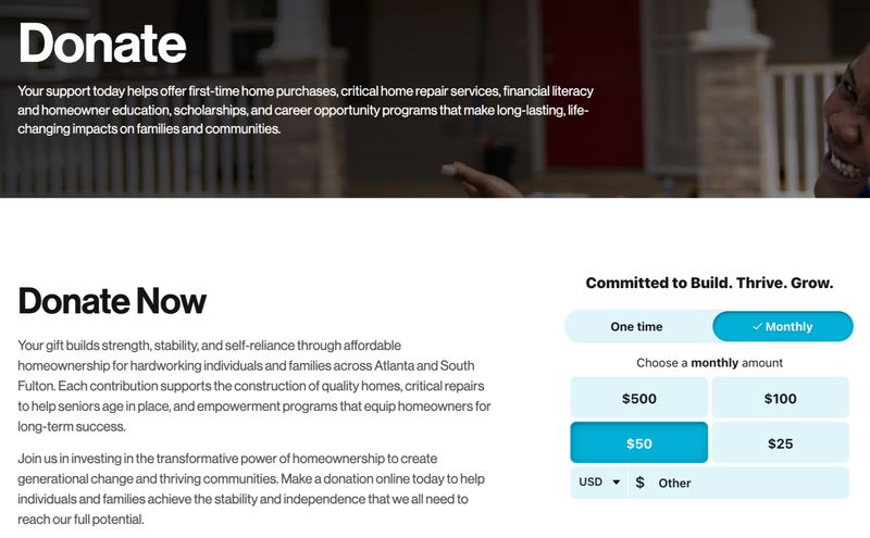
Blending Storytelling with Strategy: A Donation Form That Converts
When Trajectory worked with Atlanta Habitat for Humanity to redesign their website to serve multiple distinct audiences through a single platform, we placed the form on their donation page strategically above the fold. This made it immediately accessible without scrolling, with the goal of reducing friction in the donation process.
We paired this form with compelling storytelling, explaining exactly how donations fund support for hardworking individuals and families seeking affordable homeownership. The purpose of this language was to tie the act of giving directly to meaningful, long-term outcomes like stability and self-reliance, appealing to visitors’ hearts and minds.
Asking for Too Much Information
Every additional form field reduces your completion rate. Many nonprofits request information they don't immediately need, creating unnecessary barriers to conversion.
Audit your forms critically, asking whether each field is truly essential at this stage of the relationship. For donation forms especially, consider whether you could collect information like physical address, phone number, or demographic details later.
If you need certain information for legal or processing requirements, clearly explain why you're asking for it. This transparency helps reduce abandonment when some fields are unavoidable.
Neglecting Mobile Users
Despite the continuing growth of mobile giving, many nonprofit landing pages still provide a suboptimal experience on smartphones and tablets. This oversight can cost organizations significant support.
Beyond responsive design, consider the unique context of mobile users. They may be on the go, dealing with distractions, or using spotty connections. Design for these realities by:
- Minimizing page weight for faster loading
- Reducing the number of steps to complete an action
- Making buttons and interactive elements large enough for touch interactions
- Ensuring text is readable without zooming or horizontal scrolling
Remember that mobile optimization isn't just about how your page looks on smaller screens—it's about creating an experience tailored to mobile users' specific needs and behaviors.
Using Generic Stock Photography
Generic stock photos can undermine your authenticity and emotional connection. When visitors see obviously staged images that don't reflect your specific work, it can create disconnect and reduce trust.
Invest in authentic photography that genuinely represents your organization's work and the communities you serve. If budget constraints limit custom photography, consider:
- Using the best authentic photos you have, even if fewer in number
- Featuring staff, volunteers, and supporters in real situations
- Working with volunteer photographers who support your cause
- Creating original simple graphics rather than using generic stock photos
Authentic visuals build credibility and emotional connection in ways that stock photography simply cannot match.
Landing Pages for Nonprofits: Small Changes, Big Impact
Effective landing pages can transform your nonprofit's digital results, turning casual visitors into committed supporters. By following the best practices outlined in this guide, you can create pages that inspire action and advance your mission.
Remember that the most successful landing pages combine strategic thinking with emotional resonance. They speak to both heart and head, creating a clear path from initial interest to meaningful action.
Start by implementing these principles on one key landing page. Then measure results and apply what you learn to other pages. The iterative process of testing and refinement will help you develop landing pages that truly work for your unique organization and audience.
As you develop your nonprofit website design strategy, prioritize landing page optimization as a core component. The focused nature of these pages makes them ideal starting points for improving your overall digital performance.
Ready to implement these strategies? Here are additional resources: