Your nonprofit website is often the first point of contact for potential donors, volunteers, and the people you serve. It's your digital front door, open 24/7 to welcome visitors and tell your story.
But when was the last time you took a close look at how well that door is working? Many nonprofit leaders are so focused on their mission work that their websites become outdated without anyone noticing. Your website might be turning away supporters or making it harder for people to engage with your cause.
A website audit helps you identify what's working, what's not, and where there's room for improvement. This isn't just about looking pretty online – it's about making sure your digital presence effectively supports your mission and helps you reach more people.
In this guide, we'll walk through a step-by-step process to evaluate your nonprofit website. You'll learn practical ways to assess everything from first impressions to technical performance. By the end, you'll have a clear picture of your website's strengths and weaknesses, plus actionable steps to make it better.
Who Should Perform a Website Audit?
You don't need to be a tech expert to evaluate your website. Many aspects of a website audit can be done by your internal team – the people who know your mission best. Look at your website through the eyes of your supporters and the communities you serve.
For more technical elements, you might want help from someone with web expertise. This could be a volunteer with relevant skills, a board member, or a professional nonprofit web design consultant. The most important thing is having fresh eyes look at your site with your specific goals in mind.
Part 1: First Impressions Matter
Think about the last time you visited a website that immediately made you want to leave. Maybe it looked outdated, was confusing to navigate, or took forever to load.
Your nonprofit's website visitors make similar split-second judgments about your organization. In fact, it only takes 50 milliseconds – or 0.05 seconds – for visitors to form an opinion about your website.
Let's look at what makes a strong first impression.
Visual Appeal and Brand Consistency
When someone lands on your website, does it look like it belongs to your organization? Your website should be a natural extension of your nonprofit's personality and values.
Take a moment to look at your homepage with fresh eyes. Does it feel current and professional? 94% of a visitor’s first impressions of your website are based on design.
Next, consider whether your website reflects brand consistency. Are your colors, fonts, and images consistent with your other materials, like brochures, social media, and email newsletters?
60% of companies report that brand consistency has contributed to 10-20% of their growth. That’s because consistency builds trust and helps people recognize your organization across different channels.
Homepage Effectiveness
Your homepage design has an important job: quickly telling visitors who you are, what you do, and how they can get involved. It should pass the "5-second test" – if someone looks at your homepage for just five seconds, they should be able to understand your organization’s basic purpose.
Is your mission statement clear and prominent? Can visitors easily see the primary ways to engage with your organization? Check if your most important programs and services are accessible within one or two clicks from the homepage.
How a Clear Mission Statement Builds Trust and Drives Action
Let’s take a look at the mission statement and homepage Trajectory designed for District 2 Public Health Women, Infants, and Children (D2PHWIC), a vital program that provides healthy food options and essential resources to women, infants, and children across Georgia.
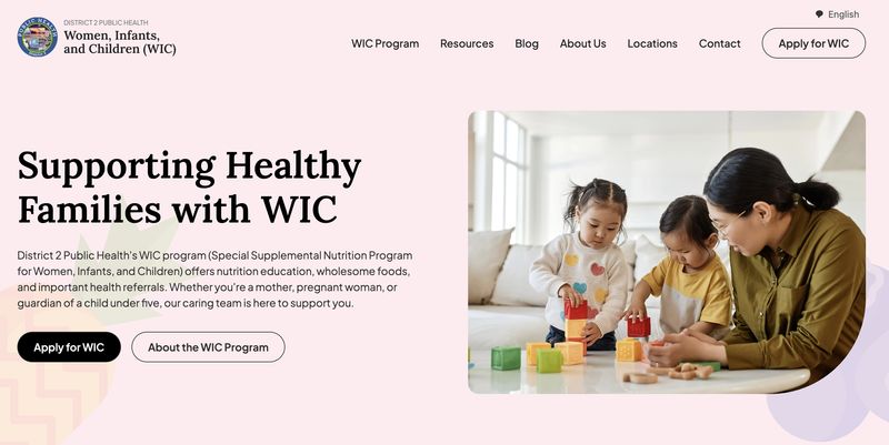
Right away, visitors can see that the goal of the organization is to support healthy families through WIC. This mission statement is clear and prominent, with supporting text that spells out exactly what the organization offers (nutrition education, wholesome foods, and health referrals) and who it supports (mothers, pregnant women, and guardians of children under 5).
The primary ways to engage with the organization are also instantly apparent – visitors can click one of the prominent call-to-action buttons to either apply for WIC or learn more about it. And for a simplified user experience, we ensured that the WIC application, program information, additional resources, and blog are all a single click away.
By combining a clear, purpose-driven mission statement with intuitive call-to-action buttons, the site informs visitors while also empowering them to take the next step, turning awareness into meaningful engagement.
You can learn more about Trajectory’s partnership with D2PHWIC and how we strategically redesigned the organization’s website to create a more intuitive design, with streamlined content and enhanced security that ensures a seamless user experience.
Mobile Responsiveness
More than half of nonprofit web traffic (57%) now comes from mobile devices, and this trend is only growing. Your supporters are likely viewing your website on phones and tablets, especially younger audiences and those on the go.
Pull out your phone right now and visit your website. Ask yourself:
- How does it look?
- Is the text readable without zooming?
- Can you navigate easily with your thumb?
- Do images resize properly?
A truly mobile-friendly site adjusts seamlessly to different screen sizes. 94% of nonprofit websites are optimized for mobile devices. Ensure you don’t fall into the 6% whose visitors face common mobile issues like:
- Tiny text
- Buttons that are too small to tap accurately
- Forms that are difficult to complete on a small screen
- Horizontal scrolling (having to swipe side to side to see all the content)
For more guidance on creating an effective nonprofit website:
- 21 Nonprofit Website Best Practices [With Real-life Examples]
- How to Structure Your Nonprofit Website for Maximum Impact: A Complete Guide
- What Should a Nonprofit Website Include (20 Must-Have Features)
Part 2: The Supporter Journey
Your website needs to make it easy for people to take action – whether that's making a donation, signing up to volunteer, or registering for an event. Let's examine each of these key nonprofit user journeys.
Donation Experience
For many nonprofits, online donations are crucial. 63% of donors prefer to contribute online with a credit or debit card, while only 16% prefer direct mail and 4% prefer cash. Despite these statistics, many organizations make the online donation process unnecessarily complicated, losing potential support along the way.
Here’s what you can do: try making a small donation to your own organization. Count the number of clicks required from the moment you decide to donate to the confirmation page. The best donation experiences take no more than 3-4 clicks and ask only for essential information.
Is your "Donate" button easy to find on every page? Does your donation form clearly explain where the money goes? Do you offer different giving options, including monthly recurring donations? These elements can significantly impact your fundraising success.
To further optimize your donation process and increase giving:
How The Greater Boston Food Bank Reduces Friction to Boost Donations
Let’s take a look at The Greater Boston Food Bank’s simple and effective donation form. Below, we’ll detail how the form makes giving quick and meaningful.
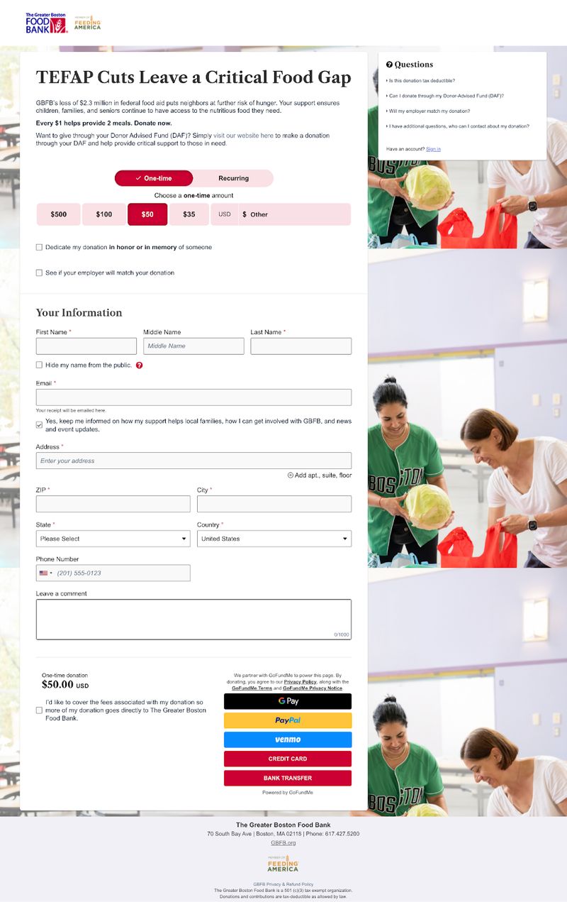
Here’s why this donation form works so well:
- Minimal Distractions: The page removes unnecessary navigation links, keeping the supporter’s focus on completing their donation.
- Clear Explanation of the Problem: The form immediately tells visitors that a loss of $2.3 million in federal food aid has put people at further risk of hunger.
- Impact Statement: It specifies that every $1 donated provides 2 meals, helping donors understand the tangible impact of their contribution.
- Flexible Donation Frequency: Donors can easily select between one-time or recurring donations to accommodate different giving preferences.
- Preset Donation Amounts: The form offers suggested donation amounts (e.g., $35, $50, $100, $500) to reduce decision fatigue and make it easier for donors to choose an amount.
- Multiple Payment Options: The form supports various payment methods, including credit cards, bank transfer, and digital wallets, ensuring convenience for donors.
- Trust Signals: The form includes links to the organization's privacy and refund policies, confirms its 501 (c)(3) tax-exempt status, and provides answers to frequently asked questions to build donor confidence.
If you’re looking for more proven strategies for optimizing your donation page, learn exactly what makes a high-converting donation page work, how to create an experience that donors love, and specific ways to test and improve your results over time.
Volunteer Engagement
Volunteers are the lifeblood of many nonprofits. Your website should make it simple for potential volunteers to learn about opportunities and take the first step toward getting involved.
Review your volunteer section through the eyes of someone who's never volunteered before. Ask yourself:
- Is information about the types of volunteer roles clearly explained?
- Do you describe the time commitment, skills needed, and impact of volunteering?
- Is the sign-up process straightforward?
Consider creating a dedicated volunteer page that answers common questions, shares volunteer stories, and provides a clear call-to-action for the next step.
Event Registration and Webinar Signup
Events bring your community together and webinars help spread your message. The registration process should be smooth and encouraging.
Test your event registration system by signing up for an upcoming event.
- Is the information clear about date, time, location, and what to expect?
- Can people easily add the event to their calendar?
- If there's a cost involved, is the payment process simple?
- After registering, do participants receive a helpful confirmation with all the details they need?
Email Sign-up and Communication
Your email list is a valuable asset for ongoing communication with supporters. The sign-up process should be inviting and set clear expectations.
Look for your newsletter sign-up form. Is it easily visible on your website? Does it explain what kind of content subscribers will receive and how often? A good sign-up form asks for minimal information (often just an email address) to reduce friction.
After someone signs up, do they receive a warm welcome message? This first email is your chance to make a good impression and start building a relationship.
Social Media Integration
Social media extends your reach beyond your website and provides another way for supporters to engage with your cause. Your website should connect smoothly with your social presence.
Check if your social media icons are clearly visible in your website header or footer. When visitors click these icons, do they open in a new tab so your website stays open? For content like blog posts or impact stories, do you include social sharing buttons to make it easy for readers to spread the word?
For deeper insights into optimizing your supporter experience:
- User Journeys for Nonprofit Websites: Understanding and Improving the Donor Experience
- Nonprofit Landing Page Best Practices: A Comprehensive Guide
How WWF Amplifies Its Mission With Social Sharing Options
The social media icons on this World Wildlife Foundation Canada story page make it easy for visitors to share the inspiring CN Tower Climb for Nature event with their networks.
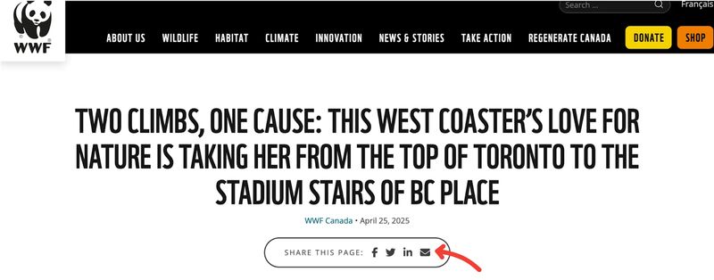
By clicking the icons beneath the story title, users can instantly email the story or post it to platforms like Facebook, X, or LinkedIn. This helps to spread awareness about WWF's conservation efforts, extend the organization's reach, and foster a sense of community among supporters passionate about protecting wildlife and nature.
Part 3: Content Effectiveness
Your nonprofit website content is the heart of your website. It tells your story, explains your work, and inspires action. Let's evaluate how well your content serves your mission.
Impact Storytelling
Stories are powerful tools for connecting people to your cause. They put a human face on your work and help supporters understand the real-world difference they're making.
Nonprofit websites with effective storytelling see donor retention rates of 45% – that’s an 18% increase from retention rates of nonprofits that do not incorporate storytelling into their websites.
We recommend reviewing your website for compelling stories about the people, communities, or causes you serve. Do you share specific examples of your impact, with real details that bring the story to life? Do you use a mix of statistics and personal narratives to appeal to both head and heart?
The most effective impact stories follow this simple structure:
- Present a challenge.
- Show how your organization addressed it.
- Highlight the positive outcome.
- Include a clear call-to-action so readers know how they can help create more success stories.
Nonprofit digital storytelling can transform how people connect with your cause and motivate them to get involved.
To enhance your nonprofit's storytelling capabilities:
Program and Service Information
Your programs and services are the core of your mission work. Your website should explain them clearly to both the people you serve and those who support your work.
Review each program description on your website, asking yourself:
- Would someone new to your organization understand what you do?
- Is information organized logically, perhaps by program area or population served?
- Do you clearly explain who is eligible, how to access services, and what outcomes to expect?
Consider creating a dedicated page for each major program. Ensure you have consistent information categories across all programs to help visitors compare and understand your full range of services.
For guidance on crafting compelling nonprofit content:
Blog and News Evaluation
48% of global nonprofit websites contain a blog or news section. A regularly updated blog or news section shows that your organization is active and engaged. It's also valuable for sharing timely information and perspectives related to your cause.
Check the freshness of your content. When was your last post published? Ideally, you should be adding new content at least monthly.
Next, review your recent topics. Do they align with your mission? Do they address subjects your audience cares about? Do posts include visuals and clear calls-to-action?
To develop a stronger content strategy:
Blog Statistics to Refine Your Strategy
Use these blog statistics to guide your nonprofit blog strategy so you can increase your website visits, generate more sign-ups, and boost donations:
- Brands that blog get 55% more website visitors.
- Brands with active blogs see 13 times more ROI than brands without them.
- Websites that prioritize blogging have 434% more indexed pages and 97% more inbound links.
- Long-form posts (over 3,000 words) generate 9 times more leads than short-form posts (500 words or fewer).
- 22% of bloggers post a new blog weekly.
Part 4: Technical Health
Technical issues can undermine even the most beautiful and well-written websites. These behind-the-scenes elements affect how well your site performs for visitors.
Website Speed and Performance
Nobody likes waiting for slow websites to load. If your pages take too long, visitors will leave before seeing your content. This is especially true for people using mobile devices or those with slower internet connections. For mobile phone users in particular, almost half (46%) will leave your website if it takes longer than 4 seconds to load.
Common speed issues include:
- Images that aren’t properly resized or compressed
- Too many large files loading at once
- Outdated or inefficient website code
- Too many plugins or third-party scripts
Many speed improvements can be made without technical expertise. For example, you can resize images before uploading them or use a free image compression tool like TinyPNG to reduce file sizes without losing quality.
Improve Your Website Performance With Google PageSpeed Insights
Use free tools like Google PageSpeed Insights to test your website's loading time. Enter your URL to receive a score along with specific recommendations for improvement. Pay special attention to your mobile score, as mobile users often have less patience for slow sites.
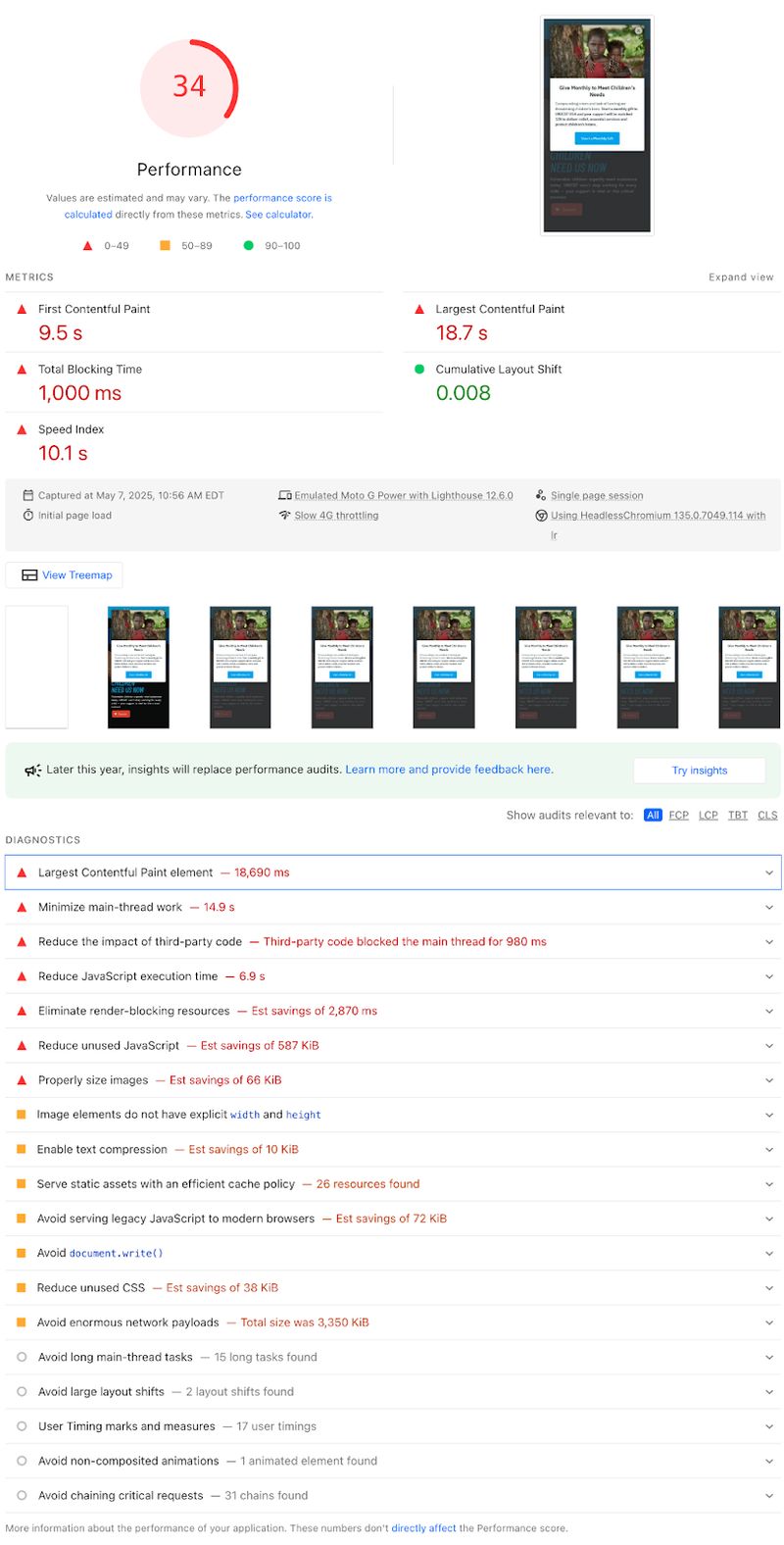
Let’s take a look at an example. Here’s what we found when we ran a Google PageSpeed Insights report for Unicef USA. (Note that you can switch between mobile and desktop to see what each set of users is experiencing.)
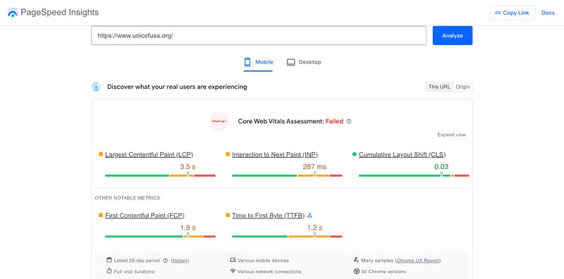
Interpreting the Core Web Vitals Assessment
Toward the top of the screenshot, you can see that Unicef USA failed its Core Web Vitals Assessment. This assessment is Google’s way of measuring user experience on websites.
Here’s a quick overview of the assessment’s three key metrics:
- Largest Contentful Paint (LCP): This measures how long it takes for the main content of a page to load. For a good user experience, LCP should occur within 2.5 seconds of when the page first starts loading.
- First Input Delay (FID): This measures interactivity—how long it takes for your site to respond when a user clicks a button or link. A responsive site should have an FID of less than 100 milliseconds.
- Cumulative Layout Shift (CLS): This measures visual stability—whether elements on your page unexpectedly change position as the page loads. A good CLS score is less than 0.1.
Each of these metrics links to a resource page that explains the metric in detail, how it impacts user experience, and how to improve it.
Interpreting the Performance Audit
Below the assessment, you’ll see a diagnosis of website issues broken into four categories: performance, accessibility, best practices, and SEO.
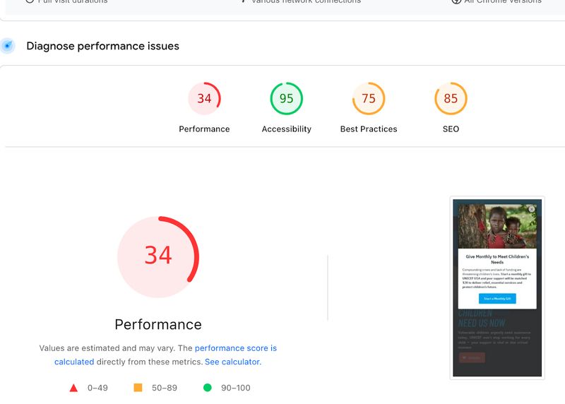
Here’s what each of these audit categories means:
- Performance: This measures how quickly your page loads and becomes usable for visitors.
- Accessibility: This evaluates how easily users—including those with disabilities—can navigate and interact with your site.
- Best Practices: This checks for common web development standards and security issues.
- SEO: This assesses how well your page is optimized to be discovered and ranked by search engines.
And here’s how they’re color coded:
- 0 - 49 (Red): Poor
- 50 - 89 (Orange): Needs Improvement
- 90 - 100 (Green): Good
You’ll see relevant metrics for each category, as well as diagnostics that your developer can use to improve the speed and efficiency of your nonprofit website. Be sure to click the dropdown arrow for each diagnostic element for more insights.
Discover further ways to identify what’s slowing down your site and get practical tips to make your website faster with our nonprofit website speed optimization guide.
For comprehensive security and privacy guidance:
- The Complete Guide to Nonprofit Website Security
- Do Nonprofit Websites Need a Privacy Policy? A Complete Guide
Search Engine Optimization Basics
Search engine optimization (SEO) helps people find your website when they search for related topics online. Even basic SEO improvements can significantly increase your visibility.
Start by checking if each page on your site has a unique, descriptive title tag that includes relevant keywords. This is the text that appears in browser tabs and search results.
Each page should also have a meta description – a brief summary that appears in search results and encourages clicks.
Your meta description should:
- Be around 150-160 characters long
- Use action-oriented language
- Clearly summarize the page content to encourage clicks
For local nonprofits, local SEO is especially important. Make sure your address, phone number, and service area are clearly listed on your website. Consider creating a Google Business Profile (formerly Google My Business) to improve your visibility in local searches.
On-Site Search Functionality
If your website has more than a few pages, an internal search function helps visitors quickly find what they're looking for. This is particularly important for resource-rich sites or those with many programs and services.
Test your site's search feature by trying several different searches and asking yourself:
- Do the results make sense?
- Are they presented in a helpful way?
- If you search for a common misspelling, does it still return relevant results?
A good search function should be forgiving of typos and understand related terms.
CRM Integration and Data Management
Your website should work seamlessly with your customer relationship management (CRM) system to track interactions and manage relationships with supporters.
Check how information flows between your website and database. When someone fills out a form on your site, where does that data go? Is it automatically added to your CRM, or does someone have to manually transfer it? Efficient data flow saves time and helps you respond quickly to new supporters.
Review your contact forms to ensure you're collecting the information you need without asking for too much. Every additional field reduces the chances that someone will complete the form, so focus on essential information only.
Accessibility Compliance
Web accessibility ensures that everyone, including people with disabilities, can use your website. Beyond being the right thing to do, accessibility may be legally required for some organizations.
Unfortunately, 98% of websites fail to comply with Web Content Accessibility Guidelines (WCAG). 78% of nonprofit websites are inaccessible to visitors with visual and hearing disabilities, despite the fact that 28.7% of adults in the United States have some type of disability.
If your nonprofit website suffers from accessibility issues, you risk deterring over a quarter of visitors who may have otherwise sought help from your organization, donated, or volunteered. You can avoid legal issues and fulfill your nonprofit’s mission to serve everyone by doing some basic accessibility checks.
Ensure that your nonprofit website has:
- Sufficient color contrast between text and background
- Alternative text descriptions for images
- Proper heading structure (H1, H2, H3, etc.) in logical order
- Forms and navigation that can be used with a keyboard only
- Videos with captions or transcripts
Free tools like the WAVE Web Accessibility Evaluation Tool can scan your site for common accessibility issues and provide suggestions for improvements.
Security and Trust Indicators
Website security is essential for protecting both your organization and your supporters. Security issues can damage your reputation and put sensitive data at risk.
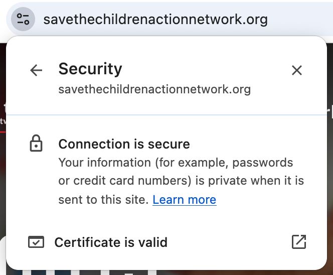
Verify that your website has an SSL certificate. Your URL should start with "https://" rather than "http://” to ensure an extra layer of security. This encryption protects information shared through your website, including donation details.
Previously, most browsers indicated a secure HTTPS connection by showing visitors a lock icon in their address bar. However, Google Chrome has replaced the lock icon with a “tune” icon, and many other browsers have followed suit.
You can click the icon next to your website’s URL to open up security information for your website, including:
- Connection security
- Cookies and site data
- Ad privacy
- Site settings
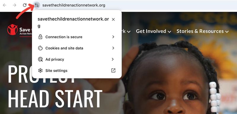
Clicking “connection is secure” will reassure you that your site is secure and that your SSL certificate is valid.
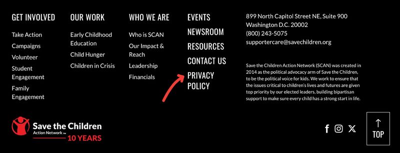
You should also review your privacy policy to ensure it accurately describes how you collect and use visitor information. This should be written in clear language and easily accessible from every page of your site. Most websites include a link to their privacy policy in their footer.
Part 5: Analytics and Measurement
You can't improve what you don't measure. Website analytics help you understand how people use your site and identify opportunities for improvement.
Setting Up Proper Tracking
Google Analytics is a free tool that provides valuable insights about your website visitors. If you haven't set it up yet, this should be a priority. If you already use it, check that it's correctly tracking all your pages and important actions.
Define meaningful goals in your analytics platform. For nonprofits, typical goals include:
- Completed donations
- Volunteer sign-ups
- Email subscriptions
- Resource downloads
When properly configured, you can see how many people complete these actions and which paths they take to get there.
Consider setting up event tracking for key interactions like video plays, form submissions, and file downloads. This gives you a more complete picture of how people engage with your content.
Key Metrics for Nonprofits
While there are countless metrics available, focus on those that directly relate to your nonprofit's goals. These typically include:
- Conversion Metrics: How many website visitors take meaningful actions like donating or signing up to volunteer? What is your conversion rate (percentage of visitors that convert)?
- Engagement Metrics: How much time do people spend on your site? How many pages do they visit? Which content keeps them most engaged?
- Traffic Sources: Where do your visitors come from? Are they finding you through search engines, social media, email, or direct visits? This helps you understand which channels are most effective.
To dive deeper into meaningful metrics:
Interpreting Your Data
Numbers alone don't tell the full story – you need to interpret what they mean for your organization. Look for patterns and trends rather than focusing on single data points.
Compare your current performance to past periods. Are key metrics improving over time? After making website changes, do you see positive impacts on important metrics? Use this information to guide future improvements.
Set realistic benchmarks based on your nonprofit's size and sector. A small local organization will have different metrics than a national nonprofit. When possible, look for industry reports that provide relevant comparisons.
Nonprofit Benchmarks for 2025
Here are some key statistics you can use to determine your own benchmarks for key metrics:
- The average main donation page conversion rate is 11% for desktop users and 8% for mobile users
- The average donation is $145 on desktop devices and $76 on mobile devices
- 55% of donation transactions and 70% of donation revenue come from desktop users
- Monthly giving accounts for 31% of all online donations
- Email contributes to 11% of all online revenue
Part 6: Creating Your Audit Action Plan
Now that you've evaluated your website, it's time to turn insights into action. This section will help you prioritize improvements and create a practical plan for implementation.
Prioritizing Improvements
Not all website issues have equal impact. Start by categorizing potential improvements based on two factors: importance and difficulty.
- High Importance, Low Difficulty: These "quick wins" should be your first priority. They might include fixing broken links, updating outdated content, or making simple design adjustments.
- High Importance, High Difficulty: These are major projects that require significant time or resources but have big potential impact. Examples might include a donation system overhaul or completely new nonprofit website design. Plan these carefully and consider professional help.
- Low Importance, Low Difficulty: If they're truly easy fixes, go ahead and make these improvements. Otherwise, they can wait until higher priorities are addressed.
- Low Importance, High Difficulty: Unless these address critical problems, put these at the bottom of your list.
Documentation and Reporting
Document your audit findings in a clear, actionable format. Include screenshots that highlight both problems and positive examples, specific recommendations for each issue, and notes about priority level.
When presenting findings to your team, board, or stakeholders, focus on how website improvements connect to your mission and organizational goals. For example, rather than just pointing out a confusing donation form, explain how improving it could increase donation completion rates and provide more funding for programs.
Implementing Changes
With limited resources, nonprofit teams need to be strategic about website improvements. Consider these approaches:
- Work With What You Have: Many content management systems (like WordPress, Squarespace, or Wix) offer settings and features you might not be using. Before seeking outside help, explore what's possible within your current platform.
- Leverage Volunteer Expertise: Board members, skilled volunteers, or pro bono professionals can help with specific improvements. Be clear about what you need and provide sufficient guidance to make their contribution successful.
- Phase Improvements Over Time: You don't need to fix everything at once. Create a timeline that spreads improvements over weeks or months, focusing on high-priority items first.
Nonprofit website maintenance doesn't have to be overwhelming when you approach it systematically and focus on high-impact changes.
For guidance on major website projects and choosing partners:
- Nonprofit Website Redesign Guide
- Nonprofit Website Development: How to Choose the Right Developer
- Nonprofit Website Costs: A Complete Pricing Guide
Conclusion: Making Website Evaluation a Regular Practice
A website audit isn't a one-time project – it's an ongoing process of evaluation and improvement of your nonprofit website. Your organization evolves, technology changes, and user expectations shift. Regular assessment helps your website keep pace.
Consider conducting a comprehensive audit annually, with smaller check-ins quarterly. Pay special attention before major campaigns or events when your website will receive increased traffic.
Remember that your website is one of your most powerful tools for advancing your mission. Every improvement you make helps you better serve your community and engage supporters. Even small changes can have a meaningful impact when they're focused on your visitors' needs.
By applying what you've learned in this guide, you're taking an important step toward a more effective online presence – one that truly serves your mission and the communities you care about.
Looking for inspiration or considering a platform change?