Your homepage is probably the most debated page on your entire website. The CEO wants the mission statement front and center. Marketing wants to highlight the latest campaign. Sales wants a demo button the size of a billboard.
But the best B2B homepages aren't the flashiest or the most creative. They're the ones that quickly tell visitors what the company does, who it's for, and why they should care. This article breaks down the specific elements that high-performing B2B homepage design gets right, with real examples and practical advice you can apply to your own site.
Why the Homepage Still Matters in B2B
There's a popular idea floating around that homepages don't matter much anymore. The argument goes like this: most visitors enter through blog posts, landing pages, or product pages via search. So why obsess over the homepage?
Because in B2B, the homepage isn't just a landing page. It's a credibility checkpoint. Buyers come back to it over and over during long sales cycles. They visit it after a referral to gut-check whether the company is legit.
They share it with colleagues on the buying committee. They return to it after reading a case study or blog post to reorient themselves and figure out what else the company offers.
The homepage is the one page that nearly every prospect will visit at some point during their evaluation. In a B2B marketing strategy where leads come from dozens of channels, the homepage is the common thread. That makes it the most visited, most scrutinized, and most consequential page on most B2B websites.
How B2B Buyers Actually Use Your Homepage
B2B visitors aren't casually browsing your homepage the way someone scrolls through a retail site. They show up trying to answer three questions fast:
- What does this company do? If the answer isn't obvious within seconds, they're gone.
- Is it for someone like me? They need to see their industry, their company size, or their problem reflected on the page.
- Is it credible enough to keep exploring? They're looking for proof that this isn't a waste of their time.
If the homepage doesn't answer those questions quickly, they bounce. And in B2B, you're often not dealing with a single visitor. You're dealing with a buying committee where decision-making is shared across multiple roles.
The VP of Operations wants to know about capabilities. The CFO cares about ROI. The IT director wants to understand the tech stack.
Your homepage needs to give each of these people a clear path forward, even though they're coming to the page with different priorities. Business owners, marketing directors, and operations leads all evaluate B2B sites differently, and the homepage has to work for all of them.
That's a tall order for one page. But the companies that get it right tend to share a few things in common, starting with what happens above the fold.
For more on this topic:
- B2B Buyer Journey Mapping: Building Websites That Convert
- B2C vs B2B Website Design: Key Differences That Impact Conversion
The Hero Section: Your 5-Second Pitch
The hero section is the most important real estate on your entire website. It's the first thing visitors see, and first impressions happen fast. Get this right and the rest of the page has a chance to work. Get it wrong and nothing else matters, because nobody will scroll far enough to see it.
Writing a Clear Value Proposition
Your hero headline should communicate what you do and who you do it for in one clear sentence. Not a tagline. Not a mission statement. Not something clever that requires three seconds of interpretation to understand.
There's an important difference between a value proposition and a slogan. A slogan is a branding exercise ("Innovation in Motion"). A value proposition is a clarity exercise ("We build custom automation systems for food and beverage manufacturers"). One sounds nice. The other actually tells the visitor something useful.
If you're struggling with your headline, try this simple framework: what you do, plus who you do it for, plus what makes you different or what outcome you deliver. You can refine the language later, but the structure should answer the visitor's first question before they even think to ask it.
Supporting Copy and the Primary CTA
Once the headline does its job, the subheadline should add one layer of detail or proof. Think of it as the second sentence of a conversation. The headline says "We help mid-market manufacturers modernize their web presence." The subheadline adds context: "200+ websites built on time and on budget since 2006."
Then there's the call to action. Your hero section should have one dominant CTA, not three buttons competing for attention. "Get a Free Consultation" or "See Our Work" gives the visitor a clear next step.
"Learn More" is vague and tells them nothing about what happens when they click. Be specific about what you're asking them to do, and make sure the button stands out visually from everything else in the section.
Rippling's homepage is a strong example of this done well. The headline "Run your business like a mastermind" is a value proposition, not a tagline. The subtext immediately clarifies what that means in practical terms: managing global HR, Payroll, IT, and Finance in one place. One bright orange CTA ("Create free account") dominates the section, and a 4.8-star rating with 13,000+ reviews adds a layer of social proof without cluttering the hero.

Notice what isn't here: no mission statement, no carousel of product features, no three competing buttons. Rippling sells a platform that touches HR, payroll, IT, and finance, but the hero doesn't try to explain all of it. The headline captures the benefit, the subtext adds one layer of specificity, and the CTA gives visitors exactly one thing to do next.
Establishing Credibility Fast
B2B buyers are skeptical, and they have good reason to be. Most of them have been burned by a provider who overpromised and underdelivered. The homepage needs to build trust quickly, especially for companies that aren't household names in their industry.
The good news is that you don't need a Fortune 500 client list to establish credibility. You just need to be strategic about how and where you show proof.
Social Proof That Actually Works
The most effective proof elements on B2B homepages tend to fall into a few categories:
- Client logos. Especially recognizable ones in your target buyer's industry. These work as visual shorthand for "companies like yours already trust us."
- Specific results or metrics. "Reduced lead response time by 40%" lands harder than "we deliver results."
- Industry certifications. ISO, SOC 2, AS9100. These matter more in some industries than others, but when they matter, they matter a lot.
- Testimonials with real names and titles. "Great company!" from "J.S." means nothing. A quote from a named VP at a recognizable company means everything.
Placement matters as much as content. These elements should appear high on the page, ideally right after the hero section. If a visitor has to scroll through three sections of marketing copy before they see any evidence that the company has done this before, you've already lost some of them. Case studies are one of the strongest trust signals in B2B, and the homepage should surface them prominently with a clear link to a dedicated case studies section.
Trust Signals vs. Noise
Not all trust content is created equal. A carousel of 20 client logos actually dilutes the impact compared to 6 carefully chosen logos that your target buyer will recognize. Awards nobody has heard of can hurt credibility more than help it, because they look like filler.
The best B2B homepages are selective about what proof they show. They pick logos their target audience will recognize, highlight results that match what prospects care about, and make claims that are easy to verify. If the homepage says "trusted by 500+ companies," a prospect should be able to find evidence of that somewhere on the site.
Burns & McDonnell, a major engineering and construction firm, shows how this works outside of SaaS. Just below their hero section, three bold metrics hit the visitor: "100% employee-owned," "75+ offices worldwide," and "Top 5% of U.S. AEC firms for safety." These aren't vanity metrics. They're the specific proof points that matter to the kind of buyer evaluating an engineering firm.
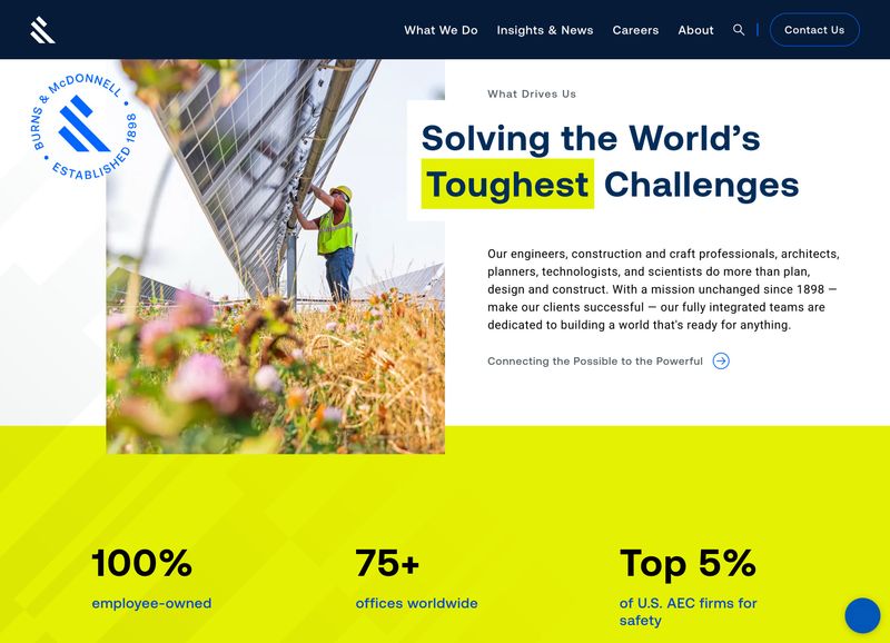
The "Established 1898" seal and the "Solving the World's Toughest Challenges" headline work together with those metrics to paint a picture of scale, longevity, and capability. Notice how each metric is chosen to address a different buyer concern: ownership structure signals stability, office count signals reach, and the safety ranking signals operational credibility. This is selective, strategic proof, not a wall of logos.
For more on this topic:
Showing What You Do (Without Overloading)
One of the most common mistakes on B2B homepages is trying to explain everything the company does on one page. The result is usually a wall of text that nobody reads, or a grid of 15 service cards that all blur together. The best homepages take a different approach: give visitors a clear overview and then guide them deeper.
Service and Product Overview Sections
A well-structured services or products section on the homepage should do two things. First, it should orient the visitor by showing the breadth of what you offer. Second, it should make it easy to drill into the area that matters most to them.
Each service or product card should answer two questions in one or two sentences: "What is this?" and "Why would I care?" Keep the formatting consistent, and link each card to a detailed page where you can go deeper. For companies with large product catalogs, this section might link to category-level pages rather than individual products. The goal is a map of your offerings, not an encyclopedia.
A repeatable card pattern or template for these overviews also makes the page easier to maintain. When a new service line or product category gets added, another card drops in. The structure stays clean, and the page doesn't grow out of control.
Organizing for Multiple Audiences
Many B2B companies serve different buyer types, whether that's by industry, by role, or by company size. Some sell both products and services. The homepage needs to help each of these audiences find their way without creating a confusing maze.
The most effective approach depends on the business. Some companies use audience-based navigation paths ("Solutions for Healthcare" or "Solutions for Manufacturing"). Others organize by problem ("Reduce Downtime" or "Improve Yield"). The key is a user-friendly structure that gives visitors a clear signal saying "this is for you" without forcing them to click through multiple levels to find relevant content.
Product-heavy companies like manufacturers and distributors face a particular challenge here. They need to balance breadth of catalog with clarity of navigation. The homepage can't show every product, but it should make it obvious how to find any of them. That usually means linking to well-organized category pages rather than trying to feature individual products on the homepage itself.
Grainger is one of the best examples of this pattern at scale. They sell over 1.5 million products, and the homepage doesn't try to feature any of them individually. Instead, a clean grid of 16 product category tiles ("Safety & Security," "Lighting & Electrical," "Tools & Test Instruments," and so on) gives visitors a map of the entire catalog in a single glance.
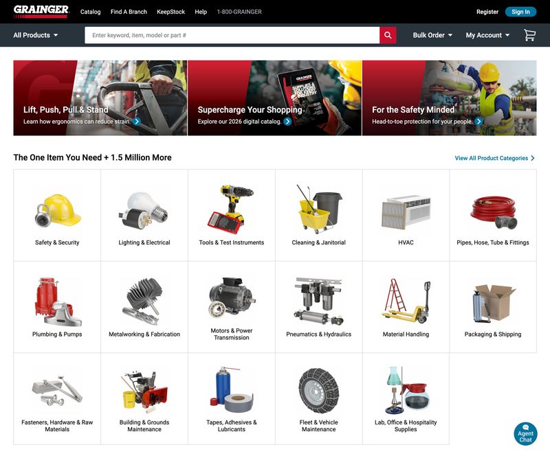
Each category tile uses a simple product photo and a clear label. There's no marketing copy on the tiles, no "Learn More" buttons competing for attention. The visitor sees their category, clicks it, and drills deeper. The headline "The One Item You Need + 1.5 Million More" acknowledges the scale without making it feel overwhelming. If a company with a catalog this massive can keep their homepage this scannable, any B2B company can do the same with a handful of services.
For more on this topic:
- B2B Website Navigation: Structure That Guides Complex Buyers
- B2B Website Messaging Framework: Copy That Resonates
Guiding Visitors to the Next Step
A homepage isn't a destination. It's a routing page. The best B2B sites make it clear where to go next, whether that's a service page, a case study, or a contact form. For most B2B companies, the homepage is the top of the lead generation funnel, and every section should end with a logical next step.
CTA Strategy Beyond the Hero
The hero CTA catches visitors who are ready to take action right away. But most B2B visitors aren't ready to fill out a lead generation form after reading one headline. The calls to action should evolve as the visitor scrolls and learns more about the company.
After the trust section, a "See Our Work" or "Read Case Studies" CTA makes sense. The visitor has just seen credibility signals, so let them dig into proof. After a services overview, "Learn More" links on each card guide them to detail pages.
Near the bottom of the page, once they've absorbed the full message, a stronger conversion CTA like "Schedule a Consultation" or "Get a Quote" catches the visitors who scrolled all the way down. This layered approach to lead generation works because it meets visitors where they are in the decision-making process.
Some companies also add functionality like chatbots, scheduling widgets, or CRM-connected forms as lead generation tools on the homepage. These can work well when they supplement a clear CTA rather than replace it. A Calendly-style scheduler next to a "Book a Call" button removes friction. A chatbot that pops up over the hero section before the visitor has even read the headline creates it.
The Role of the Homepage Footer
The footer is often an afterthought, but in B2B it serves as a practical navigation tool. Experienced buyers scroll to the bottom of the page looking for contact info, office locations, and a quick sitemap they can scan to understand the company's full scope. A good B2B footer includes:
- Contact information. Phone number, email, and physical address, especially important for companies where location matters.
- Organized page links. Key pages grouped by category (Services, Industries, Resources) so the footer acts as a mini-sitemap.
- Certifications and affiliations. A subtle but effective trust reinforcement at the bottom of the page.
Keep it clean. A cluttered footer with 60 links is just as unhelpful as no footer at all.
For more on this topic:
Design Patterns That Work for B2B Homepages
Certain visual and structural patterns show up consistently on high-performing B2B sites. These aren't fleeting design trends. They're proven patterns that work because they align with how people process information and what creates a good user experience.
Layout and Visual Hierarchy
Most effective B2B homepages follow a similar flow: hero section, then proof, then services or products, then how it works or process, then results or case studies, then a final CTA. There's a reason this pattern is so common. It mirrors the way a buyer thinks: "What do you do? Prove it. Show me more. How does it work? What results have you gotten? Okay, let's talk."
Visual hierarchy is simpler than designers sometimes make it sound. Bigger elements get noticed first. High contrast draws the eye. Whitespace gives content room to breathe and prevents the page from feeling overwhelming.
The biggest mistake to watch for is the committee-designed homepage where every stakeholder insisted their section be "above the fold," resulting in a cluttered mess that communicates nothing clearly. Good user experience comes from restraint, not from cramming more in.
Photography and Visuals
The best B2B homepages use real photography over stock images whenever possible. Custom photos of real people, real work environments, and real products build a level of trust that stock photography simply can't match. When a prospect sees a genuine photo of a team or facility, it signals a real company with real people, not a template site with placeholder images.
That said, not every B2B company needs the same visual approach. B2B SaaS companies and tech providers can lean into illustration, product screenshots, and abstract visuals that reinforce their brand. Manufacturing, professional services, and construction companies almost always benefit more from real photography that shows their people and their work. If you're in an industry where physical presence matters, invest in custom photography.
Animation and Motion
Animations can strengthen a homepage when they serve a purpose. Subtle scroll-triggered reveals that bring content into view can add polish. Animated data visualizations can make complex information easier to understand. Micro-interactions on buttons and cards can make the interface feel responsive and well-crafted.
The problem starts when animation becomes the design instead of supporting it. Heavy hero videos that take five seconds to load, parallax effects on every section, and elements that bounce around just because they can all slow the page down and distract from the message. A good rule of thumb: if the animation doesn't help the visitor understand something faster or draw their attention to something important, cut it.
Homepage SEO Considerations
The homepage carries the most authority of any page on the site, which makes its SEO setup particularly important. A few things to get right:
- Title tag. Include the company name and the primary keyword (usually the core service plus location or industry).
- H1 headline. This should be the value proposition, not "Welcome" or "Home."
- Internal links. Because the homepage has the most authority, every page it links to gets a boost. Link to the pages you most want to rank: core service pages, key landing pages, and your most important content.
A well-linked homepage helps every other page on the site perform better in search. Think of it as the authority hub for your entire digital marketing presence, distributing SEO value across the site.
McKinsey & Company's homepage is a strong example of hierarchy through restraint. The dark background creates natural contrast, a large serif headline ("What's your next brilliant move?") draws the eye first, and the content below is arranged in an asymmetric grid that guides the viewer from the featured report to supporting content without everything competing for attention.
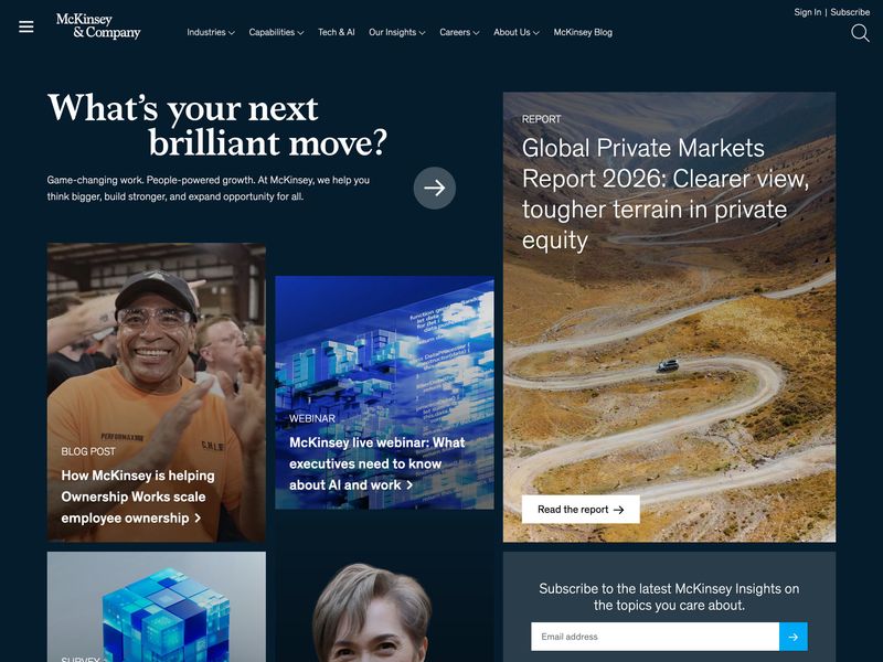
Look at how the page creates a clear reading path. The headline is the largest element, so it gets read first. The featured report on the right uses a large landscape photo and prominent typography to signal "this is the most important content." The blog post and webinar links below are visually smaller, creating a natural priority order. The dark background eliminates visual noise, and the generous spacing between content blocks means nothing feels cramped or rushed. This is the opposite of the committee-designed homepage where every section fights for equal billing.
For more on this topic:
- B2B Website Design Best Practices: The Complete Guide
- B2B Website SEO: A Technical and Content Strategy Guide
Common B2B Homepage Mistakes
Every pattern that works has a counterpart that doesn't. These are the mistakes that show up most often, and they're surprisingly consistent regardless of industry.
Leading With "About Us" Instead of Value
A lot of B2B companies open their homepage with their founding story, their mission statement, or a paragraph about their values. The problem is that the visitor doesn't care about the company yet. They care about their problem. They want to know if someone can solve it.
Lead with value first. Tell the visitor what you do for people like them. Then, once you've earned a few seconds of their attention, share the story further down the page or on the About page. The companies that flip this order (leading with "Founded in 1987, we are a full-service...") lose visitors before they ever get to the good stuff.
Too Many Messages, No Clear Priority
When every department gets a say in the homepage, the result is a page that tries to say everything and ends up communicating nothing. There's a useful exercise called the "billboard test": if someone glanced at the homepage for five seconds, could they tell what the company does? If not, there's too much competing for attention.
The fix isn't always a redesign. Sometimes it's just a prioritization exercise. Pick the one message that matters most. Make it big and unmissable. Everything else on the page supports that message or gets out of the way. The best homepages have a clear hierarchy where every element knows its place.
Ignoring Page Speed and Mobile
Heavy hero videos, unoptimized images, and bloated code kill B2B homepages. Poor web development choices that add four or five seconds to load time mean visitors leave before they see a single word of the carefully crafted messaging. Speed isn't a nice-to-have. It's table stakes.
And even though B2B sales happen in conference rooms and at office desks, a surprising amount of initial traffic comes from mobile devices. An executive checking their phone after a referral, someone clicking a link from social media, a buyer scanning their email on the way to a meeting. If the homepage doesn't work well on mobile, you're losing people before they ever sit down at their desktop to evaluate the company properly.
Basecamp's homepage passes the billboard test with room to spare. The headline "Wrestling with projects? It doesn't have to be this hard." tells the visitor exactly what problem the product solves. The illustration above it shows frustrated people drowning in scattered tools (Slack, Teams, Google Drive, Notion, and others), all crossed out, visually reinforcing the pain point before the visitor even reads a word.
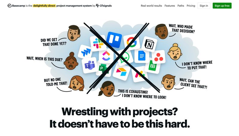
Basecamp handles project management, team communication, file storage, scheduling, and more. None of that is mentioned in the hero. Instead of listing features, they lead with the problem their buyer is feeling right now. One headline, one illustration, one green "Sign up free" button. The tagline at the top ("the delightfully direct project management system") adds context without competing for attention. This is what prioritization looks like: the company decided what the single most important message was and gave it the entire page.
For more on this topic:
- B2B Website Speed Optimization: Performance That Impacts Revenue
- B2B Website Content Strategy: From Awareness to Decision
B2B Homepage Design by Industry
Not every B2B company has the same homepage priorities. The elements that matter most shift depending on the industry, the buyer, and what's being sold.
Manufacturing and Industrial
Manufacturing homepages need to communicate technical capability and reliability above all else. The hero section should lead with what the company builds or services, not corporate platitudes about "innovative solutions." Showcasing facilities, equipment, and the scale of operations builds confidence that the work can actually be delivered.
Trust signals like certifications (ISO, AS9100, ITAR) carry more weight in manufacturing than in almost any other industry. These should be visible on the homepage, not buried on an About page. Product pages are often a major destination from the homepage, so the navigation needs to handle large catalogs organized by product line, application, or industry served.
Professional Services
Law firms, consultancies, accounting firms, and engineering firms all sell expertise and relationships. The homepage should lead with the problems they solve, not a list of practice areas or service lines. "We help mid-market companies navigate complex M&A transactions" is more compelling than "Our Services: Mergers & Acquisitions, Corporate Law, Litigation."
Team credentials matter here more than in most industries. Featuring partner bios, relevant experience, and client types on the homepage helps prospects evaluate whether the expertise matches their needs. Case study outcomes (without breaching confidentiality) can be powerful proof points.
SaaS and Technology
B2B SaaS companies have more room to lean on product demos, interactive elements, and feature breakdowns on the homepage. A SaaS website often serves as the starting point of a product tour, and free trial or demo CTAs are typically the primary action.
Animation and motion design tend to play a bigger role on a SaaS website than on other B2B sites, because the product itself is often visual and interactive. Showing the product in action on the homepage, whether through an embedded demo, a product screenshot, or an animated walkthrough, can be more convincing than any amount of copy.
Rockwell Automation's homepage shows what this looks like in practice. The hero rotates between content, but the real story is below it: a resource bar with links to Downloads, Knowledgebase, Literature Library, Product Catalog, Training, and Advisor. These aren't afterthoughts buried in the footer. They're front and center, because Rockwell understands that their technical buyers visit the homepage to find specific information quickly.
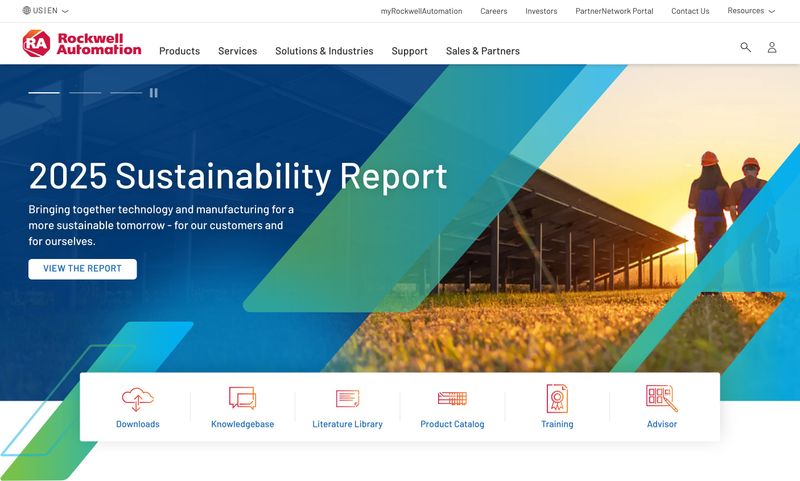
The hero imagery shows real workers in hard hats at an industrial facility, not stock photos of handshakes in conference rooms. The navigation includes "Solutions & Industries," "Products," and "Services," reflecting how manufacturing buyers actually think about their needs. This is substance over flash. A SaaS company might lead with an animated product demo, but a manufacturing site needs to show that the company can actually deliver at scale, and Rockwell does that by putting practical resources where visitors can reach them immediately.
For more on this topic:
- The Complete Guide to Manufacturing Website Design
- Manufacturing Website Best Practices: What Actually Drives Growth
Measuring Whether Your Homepage Is Working
A homepage can look great and still underperform. The only way to know if it's actually doing its job is to measure it.
Key Metrics to Track
Start with bounce rate, but interpret it carefully. B2B homepage bounce rates tend to be higher than interior pages because the homepage serves so many different visitor types. A bounce rate that would be alarming on a service page might be normal on a homepage. The more useful question is whether the visitors who don't bounce are going where you want them to go.
Beyond bounce rate, there are a few other metrics worth watching:
- Scroll depth. Are people seeing the full message? If most visitors only see the hero section and the logo bar before leaving, everything below might as well not exist.
- Click-through to key pages. Track clicks to services, case studies, and contact pages. This tells you whether the homepage is doing its job as a routing tool.
- Time on page. Combined with scroll data, this gives a sense of engagement and whether visitors are actually reading or just bouncing around.
- Heatmaps and session recordings. These reveal usability issues that raw numbers miss, like a CTA that nobody notices or a section that everyone skips.
When to Redesign vs. When to Iterate
Not every underperforming homepage needs a complete overhaul. Sometimes the fix is a headline rewrite that clarifies the value proposition. Sometimes it's moving social proof higher on the page. Sometimes it's simplifying a CTA that had too many options.
The signs that point toward a full redesign rather than incremental changes include: the page structure doesn't match how buyers actually think, the visual design is so outdated that it hurts credibility, or the underlying platform makes changes too slow and expensive. If headline changes and CTA placement can be tested within the current setup, start there. A few targeted changes to user experience and messaging can often move the needle more than you'd expect.
For more on this topic:
Start With the Hero
If there's one takeaway from this article, it's that the best B2B homepages prioritize clarity over cleverness. Every element on the page, from the hero headline to the footer, should help the visitor understand what the company does, trust that it can deliver, and figure out what to do next.
Start with the hero section. If the value proposition doesn't clearly communicate what the company does and who it's for, nothing else on the page matters. Write a headline that passes the five-second test. Pair it with one focused CTA. Get that right, and the rest of the page has a foundation to build on.
From there, work your way down. Audit the current homepage against the elements in this article. Where is it strong? Where are there gaps? It doesn't take a full rebuild to see improvement. Sometimes the biggest wins come from the smallest changes to the most visible section of the page.