Most B2B companies treat their website like a digital brochure. Something you build once, post a few photos, and forget about. But here's the thing: your website should be your hardest-working salesperson.
If you've ever had a prospect reach out who clearly didn't understand what your company does, that's a website problem. If your sales reps keep emailing the same PDFs and explainers to every new lead, that's a website problem too. And if your team spends the first half of every sales call just getting people up to speed, your site isn't pulling its weight.
Website strategy isn't only about what's on the site. It's also about how people find you, whether through search, email, referrals, or social, and what happens once they arrive. The goal is to connect those dots so your sales team spends less time educating and more time closing.
This guide walks through how to align your website with your actual sales process. We'll cover:
- Where most B2B sites fall short
- How to structure your site around the buyer journey
- The specific strategic decisions that turn a website from a digital placeholder into a real sales asset
Why Most B2B Websites Don't Support Sales
Here's a pattern we see all the time: marketing builds the website. Sales works separately. And nobody connects the two. The result is a site that looks nice but doesn't actually help anyone sell anything.
You can usually spot this disconnect pretty quickly. Sales reps are constantly resending the same explainer documents because the website doesn't cover what prospects need to know. Leads fill out a contact form but have no real understanding of what you do or how you work. The site is full of feature descriptions and capabilities, but it never talks about the problems your buyers actually care about. And there's no clear path from "just browsing" to "ready to have a conversation."
The Root of the Problem
The root cause is almost always the same. The website was built around what the company wants to say, not what the buyer needs to hear. It's natural to want to lead with your product specs, your certifications, and your history. But your prospects are coming to your site with a specific problem in mind, and if they can't quickly see that you understand that problem, they'll move on.
This is often a messaging issue at its core. If your website copy doesn't speak to real business challenges, even great design won't save it. The good news is that once you see the disconnect, you can start fixing it.
Example: Leading With the Buyer’s Problem
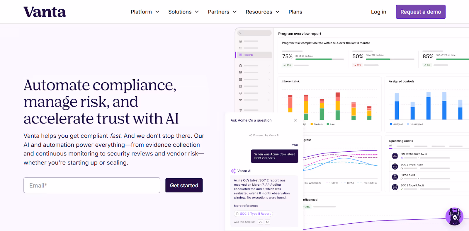
Let’s take a look at an example from AI-powered trust management platform Vanta. The company’s homepage hero leads with the buyer's problem, not the company's product list. Instead of naming features, the hero message speaks directly to what buyers are trying to accomplish—getting compliant quickly, reducing risk, and building trust as the business grows.
For more on fixing the messaging disconnect between your website and your buyers:
- B2B Website Messaging Framework: Copy That Resonates
- B2B Website Content Strategy: From Awareness to Decision
Map Your Sales Process Before You Touch Your Website
Before you think about page layouts or color palettes, take a step back. Document how your sales process actually works today. Not how you wish it worked, but how it really plays out when a prospect goes from "never heard of you" to "signed contract."
This matters because the answers to a handful of key questions should shape every decision about your website. They determine what pages you need, what content goes on each one, and how you organize your navigation.
The Questions That Matter
Sit down with your sales team and work through these together:
- Where do most leads first hear about you?
- What questions come up on every first sales call?
- What objections do you hear most often?
- What information do prospects need before they're ready to commit?
- How long is your typical sales cycle?
- Do you sell to more than one type of buyer, like technical evaluators versus executive decision-makers?
The answers might surprise you. Your sales team talks to prospects every day, and they know things about buyer behavior that never make it into a marketing meeting.
Why This Shapes Everything
Understanding these answers changes the way you build your site:
- If your sales cycle is six months and involves multiple stakeholders → Your website needs enough depth to support a long evaluation process.
- If prospects always ask the same three questions in the first call → Those answers should be front and center on your site.
- If you serve multiple audience types → Your site needs to account for that too.
An operations manager at a manufacturing plant has very different questions than the CFO approving the budget. Different buyers have different concerns and different levels of technical knowledge. Your website strategy should acknowledge those differences, even if it's as simple as separate service pages or tailored messaging for each role.
Example: Organizing Website Navigation Around Buyer Types
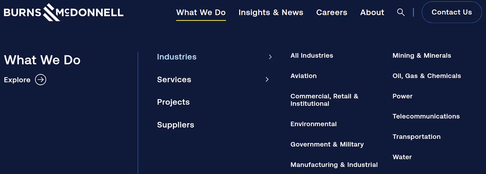
Engineering, architecture, and construction firm Burns & McDonnell organizes its content around the types of buyers it serves, not just its internal departments. By segmenting navigation into industries, services, projects, and suppliers, the site allows different audiences to quickly self-identify. Visitors can find relevant information easily without needing to understand how the firm is structured internally.
For a deeper dive into mapping out exactly how buyers move from awareness to decision:
- B2B Buyer Journey Mapping: Building Websites That Convert
- B2B Website Content Strategy: From Awareness to Decision
Align Your Website to the Buyer Journey
Once you understand your sales process, the next step is structuring your website to support buyers at every stage. Not everyone who visits your site is ready to pick up the phone. Some are just starting to research a problem. Others are comparing you against competitors. And some are ready to move forward but need one last push.
Your website should serve all of them.
Awareness: Help Them Understand the Problem
These visitors are early in their process. They might not even know they need what you sell yet. Maybe they're a plant manager searching for "how to reduce equipment downtime" or a nonprofit director looking for "best practices for donor communication." They have a problem, but they haven't started shopping for a solution.
At this stage, your website's job is to build trust and get them to stick around through:
- Blog Content: Start with blogs that address common industry pain points.
- Educational Resources: Guides and checklists give visitors something valuable and position your company as a knowledgeable resource.
- Clear and Jargon-Free Homepage Messaging: Anyone landing on your site should immediately understand what you do and who you help.
The goal isn't to sell here. It's to be genuinely helpful so they remember you when they're ready to take the next step.
Example: Using Educational Content to Build Early-Stage Trust
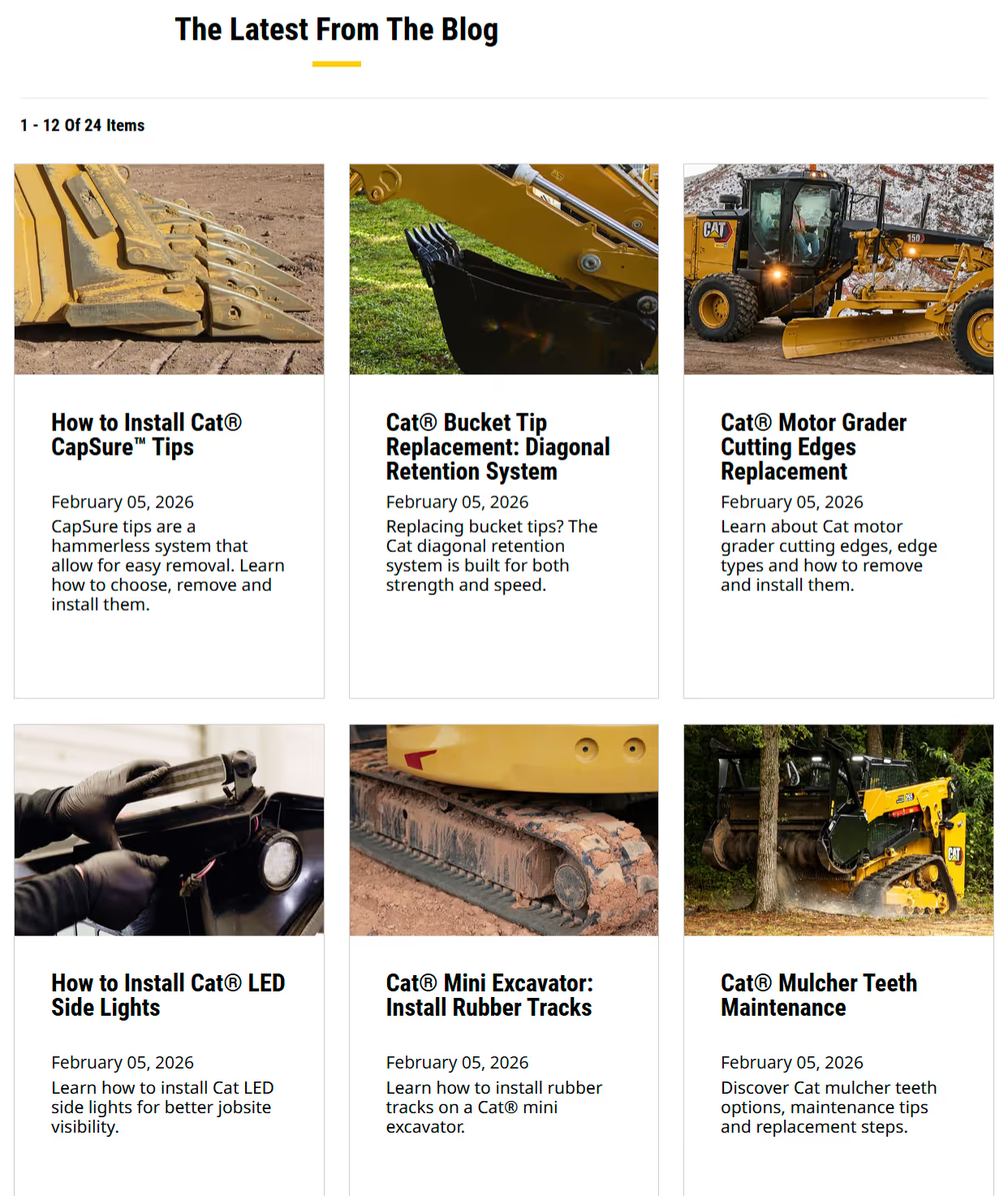
Leading construction and mining equipment manufacturer Caterpillar offers educational blog content that helps early-stage buyers see their company as a trusted resource. This approach positions Caterpillar as a helpful expert first, making the eventual buying decision feel lower risk.
Consideration: Show Them You're the Right Fit
These visitors know they have a problem, and now they're comparing their options. They're looking at your site alongside your competitors, and they're trying to figure out who they trust most.
Your service pages need to clearly explain your process and what makes you different. Not in vague terms, but in a way that helps a prospect see themselves working with you.
Examples that go a long way here include:
- Case studies
- Project examples
Include real results to show prospects how you've solved problems similar to theirs.
Trust signals also matter a lot at this stage, like:
- Testimonials
- Client logos
- Industry certifications
- Awards
Trust signals help a skeptical buyer feel more confident. If someone is choosing between two engineering firms and one has a page full of project results and client endorsements while the other just lists services, the choice is easy.
Example: Case Studies That Help Buyers Visualize Results
Let’s take a look at a case study from software solutions provider PCT. Their website showcases a variety of case studies highlighting success stories in industries like automotive, aerospace and defense, industrial machinery, medical technology, and more. This aerospace product case study explores the challenges their client Jacobs Engineering was facing, the solution they came up with—and the breakthrough PCT technology they turned to—as well as the results.
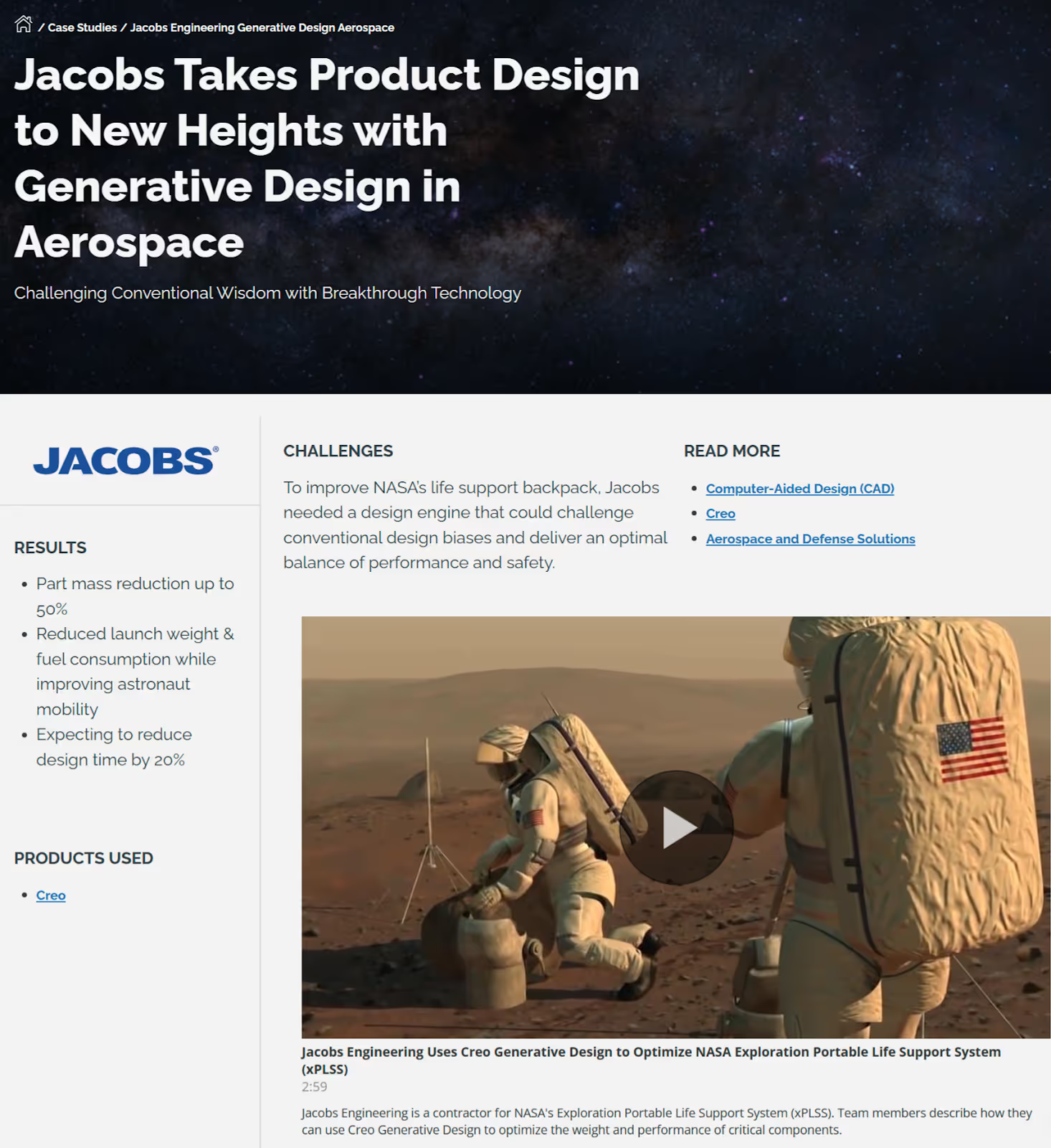
Concrete statistics like “Jacobs realized part mass reduction of up to 50%, resulting in significant fuel savings and improved astronaut mobility” help buyers quickly understand the real-world impact of the solution and envision similar outcomes for their own engineering challenges.
Strong case studies pages like this one help consideration-stage buyers see proof that you deliver results.
Decision: Make It Easy to Take Action
These visitors are close to buying. They've done their research, they like what they see, and they just need the final push. This is not the time to make them hunt for the next step.
Every key page on your site should have a clear, visible call to action. And "Contact Us" isn't always enough. Be specific about what happens next. "Schedule a 15-minute consultation" or "Request a project estimate" tells the buyer exactly what they're signing up for and reduces the hesitation that comes with vague CTAs.
Your contact or inquiry form should be simple and low-friction. Don't ask for 15 fields of information when three will do. If possible, offer some pricing transparency or at least an investment range so buyers can self-qualify.
To tip a hesitant prospect over the edge, add FAQ sections that address final objections, like:
- Timelines
- Process
- What to expect after signing
The goal at this stage is straightforward: remove every barrier between "I'm interested" and "Let's talk."
Example: Clear, Low-Friction Calls to Action for Decision-Ready Buyers
Rather than just “Contact Us,” contact management platform Contactbook invites users to “Request a demo” or “Start free trial.” Both of these options clearly signal what will happen next, reducing friction for buyers who are ready to evaluate the product.
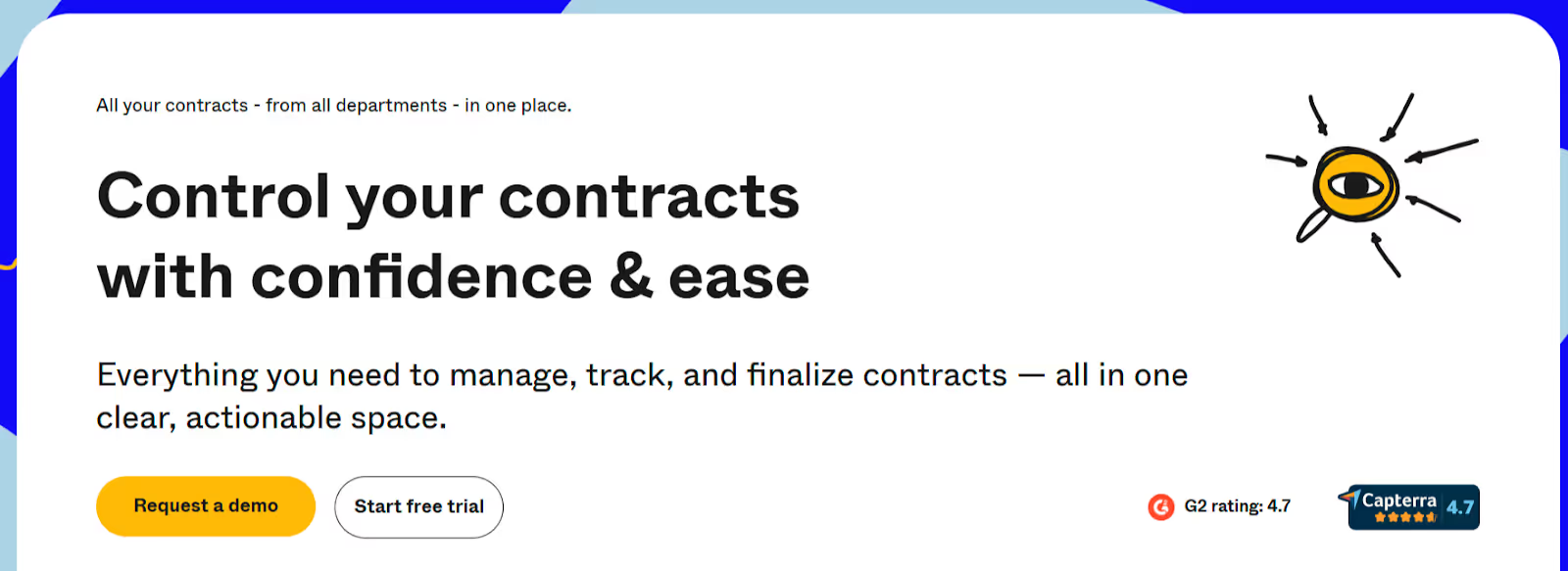
Remember: a specific, low-friction call to action makes it easy for decision-ready buyers to take the next step.
For deeper dives into each stage of the buyer journey and the elements that support conversion:
- B2B Website Content Strategy: From Awareness to Decision
- B2B Website Trust Signals: Building Credibility That Converts
- B2B Website Conversion Optimization: A Data-Driven Approach
Six Website Strategy Decisions That Directly Impact Sales
Beyond aligning to the buyer journey, there are specific strategic decisions that make or break whether your site actually helps your sales team. These aren't flashy design trends. They're practical choices that directly affect whether prospects become leads.
Navigation That Matches How Buyers Think
One of the most common mistakes on B2B websites is organizing navigation around the company's internal structure instead of how buyers actually think. If your main menu reads like your org chart, you're making visitors do extra work to find what they need.
Instead, organize your site around buyer questions and problems:
Rather than "Solutions > Platform > Module A" → Try "How We Help > [Specific Problem You Solve]."
Think about what a prospect would be looking for and label your navigation accordingly.
Keep it simple. If someone can't find what they need in two clicks, it might as well not exist. Complex mega-menus and deeply nested pages create friction, and friction kills conversions.
Messaging That Speaks to Buyers, Not to Yourselves
Lead with the problem you solve, not the product you sell. This sounds obvious, but it's incredibly hard to do when you're close to your own business. There's a concept called the "curse of knowledge," and it applies perfectly here. You know your product so well that you forget what it's like to be someone encountering it for the first time.
Use your customers' language, not internal jargon. If your prospects call it "equipment maintenance" and you call it "asset lifecycle management," go with what they'd say. Your website isn't for you. It's for the person trying to decide whether to call you.
Example: Plain-Language Messaging That Speaks to Buyer Outcomes
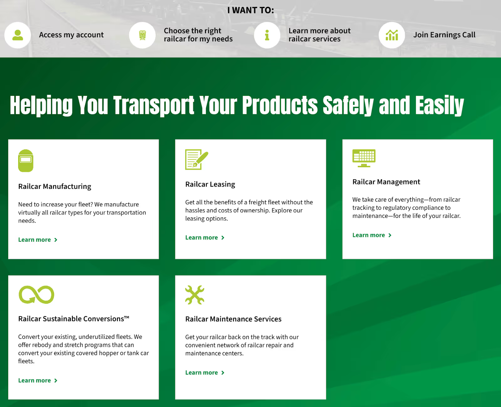
Let’s take a look at Greenbrier Companies’ homepage. This freight railcar manufacturing, leasing, and maintenance website uses clear, buyer-focused language that helps prospects immediately understand how it can help them. Plain-language messaging focused on the buyer’s problem or outcome, like “We take care of everything—from railcar tracking to regulatory compliance to maintenance—for the life of your railcar” immediately tells visitors how Greenbrier’s railcar management services make life easier for fleet managers, logistics leaders, and rail asset owners who are responsible for performance and compliance.
Performance, Mobile Optimization, and Accessibility
A slow website sends a signal, and it's not a good one. Research shows that almost half (47%) of people abandon a website that takes three or more seconds to load. If your site takes five or six seconds to load, it’s likely a prospect will never even see your content. They'll hit the back button and try the next company on their list. Site speed directly affects bounce rates and the quality of leads you receive.
Your site also needs to work well on phones and tablets. B2B buyers do more mobile research than most companies realize. In fact, over 50% of B2B search queries take place on smartphones. A prospect might look you up on their phone after a meeting or during a conference. If your site is hard to read or navigate on a smaller screen, you've lost that moment.
Accessibility matters too. Making your site usable for people with disabilities isn't just the right thing to do. It's increasingly a legal and business consideration, especially for companies that work with government or enterprise clients.
Content That Answers Sales Questions Before They're Asked
Here's a simple exercise that can transform your website: ask your sales team to write down the ten questions they hear most often from prospects. Then make sure your website answers every single one of them.
Think about it. If every prospect asks "How long does a typical project take?" and that answer is buried in a PDF that your sales rep emails after the first call, you're wasting everyone's time. Put it on the website. Create a dedicated FAQ page, weave answers into your service pages, or write a blog post that tackles the question in depth.
This approach does two things:
- Saves your sales team time
- Pre-qualifies leads so that conversations start further along in the process
When a prospect reaches out and they've already read your process page and FAQ, your first call becomes a real discussion instead of a 101 session.
Example: Answering Common Sales Questions Directly on the Website
Los Angeles-based design-build firm Letter Four clearly answers common questions about their design process, pricing, build phase, and fire rebuilds on their FAQ page. They also offer a quick contact form that makes it easy for prospects to submit additional questions.
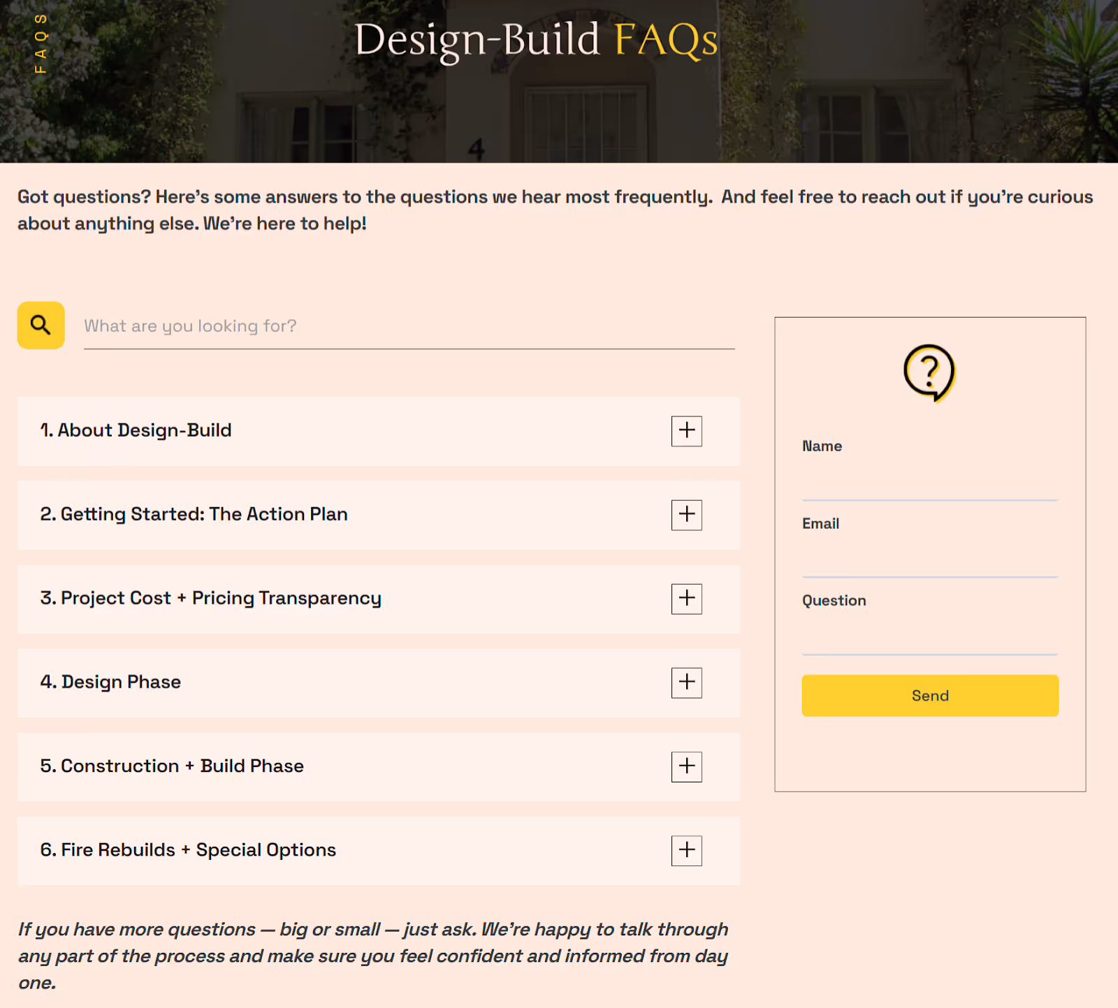
By answering common questions directly on your site, you save your sales team time and help leads arrive better informed.
A Clear CTA Strategy Across the Entire Site
Not every page on your site should have the same call to action. A blog post aimed at someone in the awareness stage might end with "Download our free guide." A services page aimed at someone in the decision stage should say something like "Schedule a consultation."
The key is matching your CTAs to where the buyer is in their journey. If you ask someone to "Request a Quote" when they're still just learning about the problem, that's too much too soon. And if you only offer a guide download on your pricing page, you're missing the moment.
Aim for one clear primary action per page. When you pile on multiple competing CTAs, visitors get overwhelmed and often do nothing at all.
Building Your Site With Search Visibility in Mind
A beautiful website that nobody can find is a wasted investment. Search engine optimization (SEO) should be part of your website strategy from day one, not something you bolt on six months after launch.
This doesn't mean you need to become an SEO expert. But it does mean thinking intentionally about how buyers will discover you through search.
Be sure to:
- Align Content to Buyer Questions: Structure your pages around the topics and questions your buyers are actually searching for.
- Clarify Pages for Search: Use clear, descriptive page titles and headings so search engines understand what each page is about.
- Group Content by Topic: Organize related content into topic clusters so that search engines recognize your expertise on a subject.
- Strengthen Your Technical Foundation: Make sure your site's technical foundation is solid with fast load times, clean URLs, and a logical sitemap.
When your website is built with search visibility in mind from the start, it becomes a tool that actively brings new prospects to your door rather than just serving the ones who already know your name.
For more on the strategic decisions that shape effective B2B websites:
- B2B Website Navigation: Structure That Guides Complex Buyers
- B2B Website Design Best Practices: The Complete Guide
- B2C vs B2B Website Design: Key Differences That Impact Conversion
How to Know If Your Current Website Is Helping or Hurting Sales
Sometimes you don't need a full B2B website redesign. You just need to honestly assess whether your current site is doing its job.
Here are a few questions worth asking.
- Start With Your Sales Team: Ask them: "Does the website come up in sales conversations? And when it does, is it positive or negative?" If your reps are actively avoiding sending prospects to the site, that tells you everything you need to know.
- Look at Your Analytics: Are visitors making it to your key pages, like services, case studies, and contact? Or are they bouncing from the homepage? If most of your traffic never gets past the first page, something isn't connecting.
Dig Into Lead Quality
Check the quality of your leads. Are the people filling out your forms already familiar with what you do? Or are they confused about your offerings and reaching out with questions the site should have answered? If your sales team is spending the first call explaining the basics, the website isn't doing enough work up front.
Review your sales cycle length too. If deals are taking longer to close than they used to, your website might be part of the reason. When prospects don't get the information they need from your site, every step in the sales process takes longer.
Use Real Data, Not Just Gut Feelings
Beyond gut checks, use real data to evaluate your site. Tools like heatmaps and session recordings can show you exactly where visitors get confused and where they drop off.
Track the metrics that tie directly to sales, like:
- Form submissions
- Qualified lead volume
- Which pages prospects visit before booking a call
If the answers to these questions are discouraging, that's actually good news. It means there's a clear opportunity to improve, and you know exactly where to start.
For more on evaluating and improving your website's performance:
- B2B Website Speed Optimization: Performance That Impacts Revenue
- B2B Website Maintenance Checklist: Monthly Tasks That Matter
- B2B Website Redesign: When to Update and How to Plan
- Website ROI: How B2B Firms Calculate Payback
Bringing Sales and Marketing Together Around Your Website
The best B2B website strategies don't happen when one team builds the site and another team just uses it. They happen when sales and marketing collaborate from the beginning and keep collaborating after launch.
Too often, marketing owns the website and sales never weighs in. Then the site launches and sales immediately notices gaps: "Why isn't our process explained anywhere?" or "Where are the case studies for our biggest service line?" These are fixable problems, but they're much easier to prevent than to patch after the fact.
Making Alignment Practical
Aligning sales and marketing is about small, repeatable habits.
- Include Your Sales Team in Website Planning From the Beginning: Your sales team doesn’t need to approve every design decision, but their input on buyer questions, objections, and common conversation paths is invaluable. Create a shared document of the top buyer questions and objections your team encounters, and use it as the foundation for your website content.
- Set Up a Regular Feedback Loop: Maybe it's a monthly check-in where sales shares what they're hearing from prospects and marketing updates the site accordingly. Share website analytics with your sales team so they know which pages prospects are viewing before calls. This kind of insight helps reps personalize their conversations and close more effectively.
- Think About How You Drive Traffic to the Site: Email campaigns, social media, paid advertising, and networking events should all connect back to a website that's ready to receive those visitors. When your traffic sources and your site content are aligned, every marketing dollar works harder.
This Isn't a One-Time Project
The most important thing to remember is that aligning sales and marketing around your website is an ongoing process. Your buyers' questions change. Your offerings evolve. Your competitors shift their positioning. The companies that treat their website as a living, breathing part of their sales process, rather than a project that ends at launch, are the ones that see the best long-term results.
For more on turning your website into a lead generation engine:
- B2B Lead Generation: Proven Strategies for Local Market Growth
- B2B Website Conversion Optimization: A Data-Driven Approach
Your Website and Sales Process Belong Together
Your website isn't separate from your sales process. It's the front end of it. When the two work together, your team closes more deals with less friction. Prospects arrive better informed, conversations start further along, and your sales cycle tightens.
Getting this right takes effort, but it doesn't have to be overwhelming. Start by talking to your sales team and mapping the questions they hear every day. Use those answers to shape your site's content and structure. Then build from there, one improvement at a time.
If your website feels disconnected from how you actually sell, that's a solvable problem. And it's exactly the kind of challenge we help companies work through every day.
